Looking to add rows corresponding to each unique column header

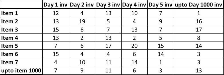
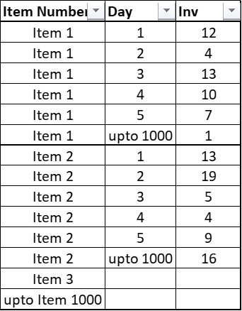
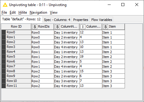
This is the data format I have but am unable to visualize variability by days for each item. Would like to transform this data into the below output format for ease of Charting and Graphs. Once all the data is in row format, filters and pivots can be used on column headers.

Inventory sample - desired output

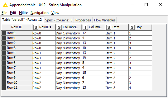
Look forward to suggestions. End visualization goal using Pivot / Knime is to have “Item Number” on x-axis, “Inventory” on Y-axis and “Day” as a filter.

Here’s something that can get you started:

  1. Starting data:

    image

  2. Unpivoting node gets you columns

    image

  3. String Manipulation to extract the day number

    image

Then you can clean things up by removing unnecessary columns and renaming the ColumnNames column to Inventory.

4 Likes

Very helpful. Thanks for the quick revert. Also, is there a way to visualize this data using KNIME?

Hi @akashmittalin,

maybe have a look at the different options in

Another option would be to visualize it in another tool Excel/Tableau/PowerBI - and using knime to feed in the data

2 Likes

This topic was automatically closed 182 days after the last reply. New replies are no longer allowed.