Hello, I’m pretty new to knime and was just wondering if I could do something. So I have an hourly dataset and 2 of my variables are temperature and PM2.5, which is basically the haze/air pollution levels. Is there a way I can compare a range of temperatures to average PM2.5 values? Like when the temperature is 0-10 degrees, PM2.5 average is etc… Any help is appreciated, thanks!
Hi,
You can start with Binner nodes and continue with Group by. For plotting you can use plots in java script view (Plotly).
1 Like
Hello, what binner nodes are you talking aabout Sorry not too familair with this
Hi,
This https://nodepit.com/node/org.knime.base.node.preproc.autobinner3.AutoBinnerLearnNodeFactory for example. Type ‘binner’ in the node repository search to find them
Done it aand it looks good except the bins are of single numeric value E.g 5, 10, is there a way the bins can be a range? E.g 0-10,10-20
Hi,
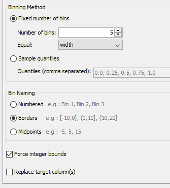
in the configuration of Auto-Binner in the section Bon naming select Borders
Thats what I did but it doesn’t give me the range
Hi,
In my case with this settings
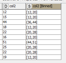
The result is
What are your settings?
Oh I see its good now. Also, do you know if its possible to transfer this to the TABLEAU program for visualisation?
Hi,
I have no experience with Tableau. But you can read this
https://www.knime.com/node/20440
https://docs.knime.com/2019-12/tableau_integration_user_guide/index.html
1 Like
Hi @FiidisksDiduui,
it is possible to integrate Tableau with KNIME. Here is link to the latest documentation about it currently related to 4.2.0 KNIME version:
https://docs.knime.com/latest/tableau_integration_user_guide/index.html#legacy
Br,
Ivan
This topic was automatically closed 182 days after the last reply. New replies are no longer allowed.