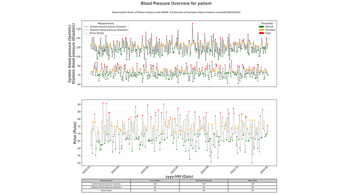
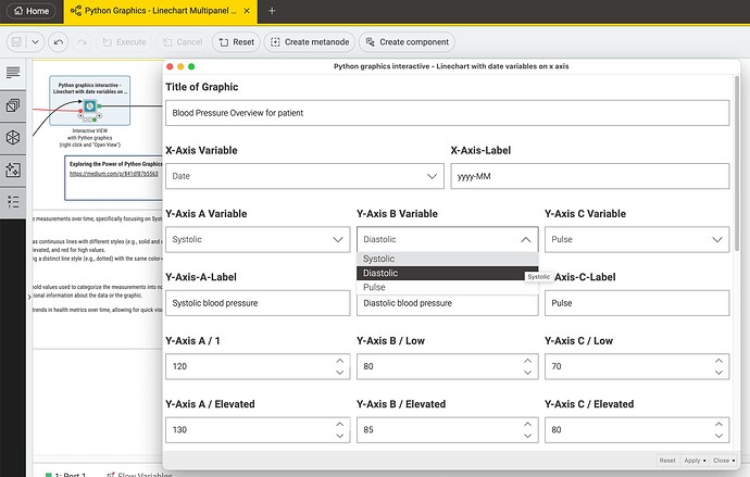
@marieclaire you can take a look at this variation with KNIME Data Apps and Python graphics (using just the bundled Python version so no big installation necessary). You can add 3 columns to the chart and enter 3 thresholds for each value along with some labels.
The elements of the chart can be configured in the dialogue of the component so the framework can also be used for values other than blood pressure and pulse and no need to go deep into the code itself.
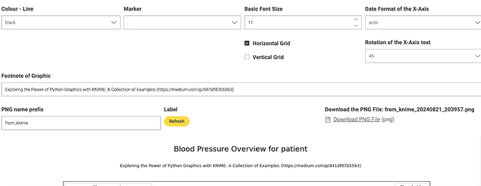
The date axis can be configured like in this example - you can let the system make the decision which scale to use and you can rotate the labels on the x axis.
The results will be stored as a .PNG file to be used in other programs.


