Hi,
I am facing problems in plotting a Graph while using one to many node. I was using query in my Database Reader:
(SELECT TIME,
MAX(CASE WHEN (USER = ‘RAM’) THEN USER ELSE NULL END) AS RAM,
MAX(CASE WHEN (USER = ‘SEN’) THEN USER ELSE NULL END) AS SEN,
MAX(CASE WHEN (USER = ‘BEN’) THEN USER ELSE NULL END) AS BEN
FROM
XYZ
WHERE TIME >= CURRENT_TIMESTAMP - INTERVAL ‘24’ HOUR
GROUP BY TIME)
But, now i would like to modify it to more dynamic(in short, i don’t want to write query), seems it s not working proper for me.
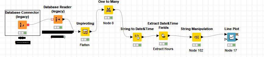
Below is my workflow, m i missing something?
Can you post your workflow with some example data? If your actual data is confidential, maybe some dummy data instead.
When you say you don’t want to write the query, are you saying you want to implement the query logic with KNIME nodes instead?
Also, when you say it isn’t working properly - can you be more specific? The visualization, or the data extract, or…? A step-by-step list of what you want to accomplish would be useful here. The more detail the better.
Hi @ScottF,
i thought of posting dummy data in the form of Excel Sheet. But, with dummy data its working as expected. But with my original data, it is not the case.
If you observe my Query, it is nothing but to convert rows values to columns. Same i’m able to achieve using “one to many” node.(instead of writing a query, i can use one to many node)
But, the problem is i’m not able to plot expected Graph(Visualization of Graph is not as expected, not even readable)
But yeah, here i struggled a bit to take a replica of it. I have given an example below
Here’s something to play with. I took your workflow and modified it in a few ways
incorporated a simple component that allows you to enter a DateTime range that you want to filter on
line plot with axes formatting (no string manipulation needed)
scatter plot with colors assigned. This is a bit of a weird way to display the data, but gets around the problem of overlapping when users are logged at the same time, and more discretely shows the pings.