Hello,
I have problem about visualizing my data on a diurnal curve.
Here is the problem:
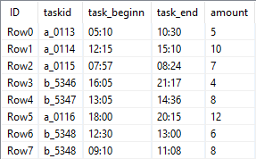
A table with a certain amount of tasks looks like this.
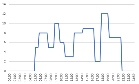
How can I visualize the sum of task value on a diurnal curve looking similar to this?
I already created another table where I have all time values from 00:00 to 23:59 with an intervall of 1 minute.
I stuck at the next step:
How can I check if the task beginn is equal or less than the timestamp and the taskend is equal or greater than the timestamp? I don’t think that the rule engine node will help because I have two different tables.
My idea was it to create a simple line plot based on a table with two columns (timestamp and sum of task value).
I am curious to see which solution will be posted here and whether I am right or wrong with my approach.
Thanks in advance.
Best,
Peter