I have a dataset from customers with their names, postal codes, lat and lon.
I want to find agglomeration areas.
These customers are in Germany.
With DBScan, I want to say, if in a radius of 10km exists 5 customers, than is it an agglomeration area.
My main problem is, that the customers are is given with lat and lon and through this, I cant make the correct radius epsilon.
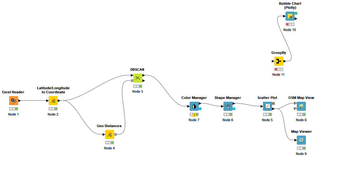
You can use the Latitude/Longitude to Coordinate node from Palladian extension to convert the longitude and latitude values to coordinates and then using Geo Distances you can calculate the distance values to pass to the DBSCAN node.
Using DBSCAN, you may have clusters with data points which can have distances more than the epsilon (10 Km here). You may need to divide the clusters afterwards.
thank you, it works.
what do you prefer me how to plot the dataset in a scatter plot.
how should i choose the axis?
I want to show agglomeration areas of the customers
There can be a base long and lat (e.g. your store coordinates) which serves as 0,0. then you can calculate distances (x,y) for each customer and display them in a scatter plot.
For better representation I suggest using Map Viewer or OSM Map View. If you use a Color Manager node before these nodes, you can colorize the points based on clusters.
Yes I did it. I used the OSM Map view.
But I wanted also a scatter plot.
Is it not better to make on the X-Axis the “number of values in the clusters” and on the Y-Axis: the coordinates, to show agglomerations?
If you want to represent the clusters and the number of instances, you can aggregate values and count them based on each cluster and use the output for Bubble Chart (Plotly). You can use the mean value of lat and long as x and y for each cluster (or the distance between the mean and your base location).
Yes I did. It works.
Do you know, which dimension the epsilon in DBSCan works for the haversine formula?
E.g. is epsilon=2 → 2kilometers or 200meters or 2meters?