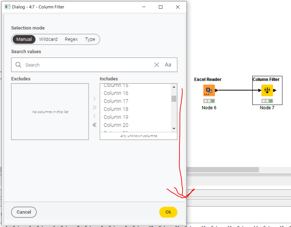
I’ve noticed that some new nodes in version 5.0.0 have strange looking dialogs that seem to have a new ‘sparse’ look and feel. Take the new Column Filter dialog for example: how can I increase the vertical height of the Includes and Excludes lists? They barely show 6 columns which makes it hard to scroll down to pick fields when you have lots of fields. Could the list expand vertically as the dialog window is resized please? Scrolling and finding is much easier on the eye when you can see more of the list.
Also, may I ask why the font size and padding is bigger than the old tool? It’s way less efficient in terms of pixels and screen space. Thanks
Thank you for your feedback @J_Knime_Work ! I have reported it internally. While our developers look into that, maybe the search bar can be your friend there.
I move your thread to the category Feedback and Ideas. Also, I would suggest posting future feedback in the dedicated thread for Version 5: