Hybrid Graph

Fellow Knimers,

I don’t use charts often in Knime, hence I thought asking on the forum would get me a fast answer. I’m thinking of creating a hybrid graph - a mixed graph of a line chart and a bar graph.

hybrid graph

The image above is one I found on the net, just to show an example.

  1. Is it possible to create such a graph in Knime AP? If so, can someone point out to a workflow in the hub if you know of an example of this kind of project? I don’t even know what to call this type of graph, so I came up with the name hybrid graph.

  2. If the answer is yes, but requires Python, is there any alternative at all?

  3. Is it possible to have a graph like the image above but with a twist? I’m thinking of having two different Y-Axis ranges - there should be another Y-axis on the right hand-side for the second variable with its own range of values. The reason for this is because both of my variables have a really different set of range values - one is too small and another is too big - hence if they share the same Y-axis, the line chart might not be visible.

If there is no available workflow already in the hub, and you’ll need some data to work with to create a new workflow, I’ll provide the data.

Thank you in advance.

1 Like

@badger101 I think the easiest thing to do would be to find a Python code on the net for Matplotlib or Seaborn which are included in the bundled Python of KNIME - and then adapt the code to fit your needs like in these examples. Also If you could provide sample data it might be easier to create a workflow that does what you want.

https://hub.knime.com/search?type=Workflow&tag=python,graphic&sort=best

You can also turn that into a dashboard with flexible settings if you want (link to video in the article):

Similar approaches can be done with R - so if you have a code for ggplot2 that also might work

https://medium.com/low-code-for-advanced-data-science/the-beautiful-violin-plot-that-has-it-all-create-graphics-with-r-and-knime-components-b45464428d19

4 Likes

@mlauber71 , thank you, that answers my Q1, and hints for Q3 too. As for Q2, I have looked at the native Knime nodes after writing this thread, and I can’t see any suitable nodes to create such graph without some coding. I have come to a conclusion that what I want isn’t possible as of now.

Regardless, if you’d like to add such a graph in your hub space, you may use my data here:
forum data hybrid graph.xlsx (160.5 KB)

Unfortunately, I won’t be able to test out what you’ll be working on, as I don’t intend to go down the Python rabbit hole due to my lack of coding knowledge.

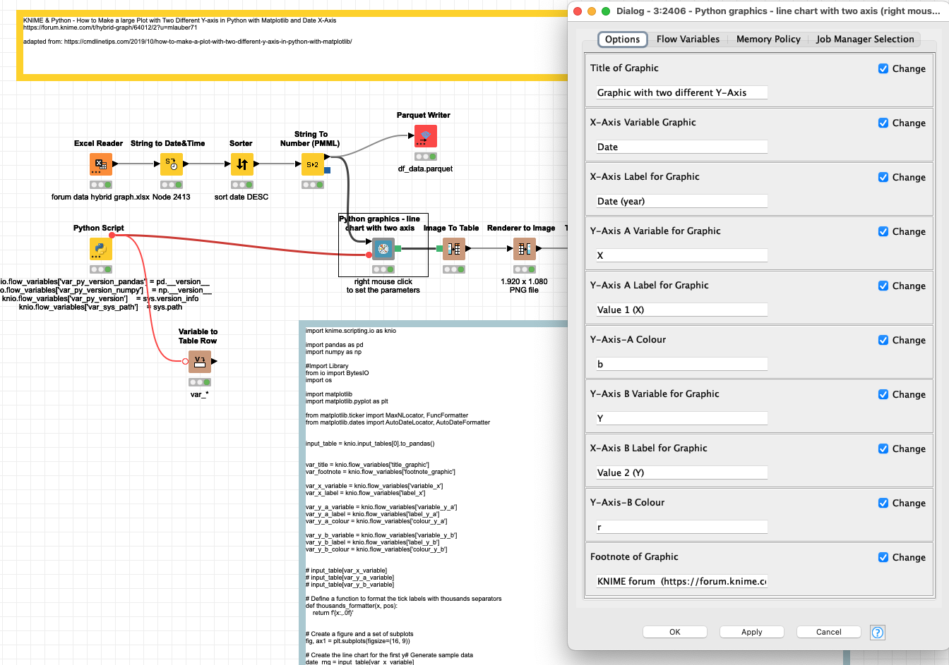
@badger101 well I can only encourage you to give some Python code a try. Once you have established a framework (or you just take the examples I have provided) you can quickly adapt them. Then you can throw in some ChatGPT and you can handle a wide range of graphics. Like the sample you have provided:

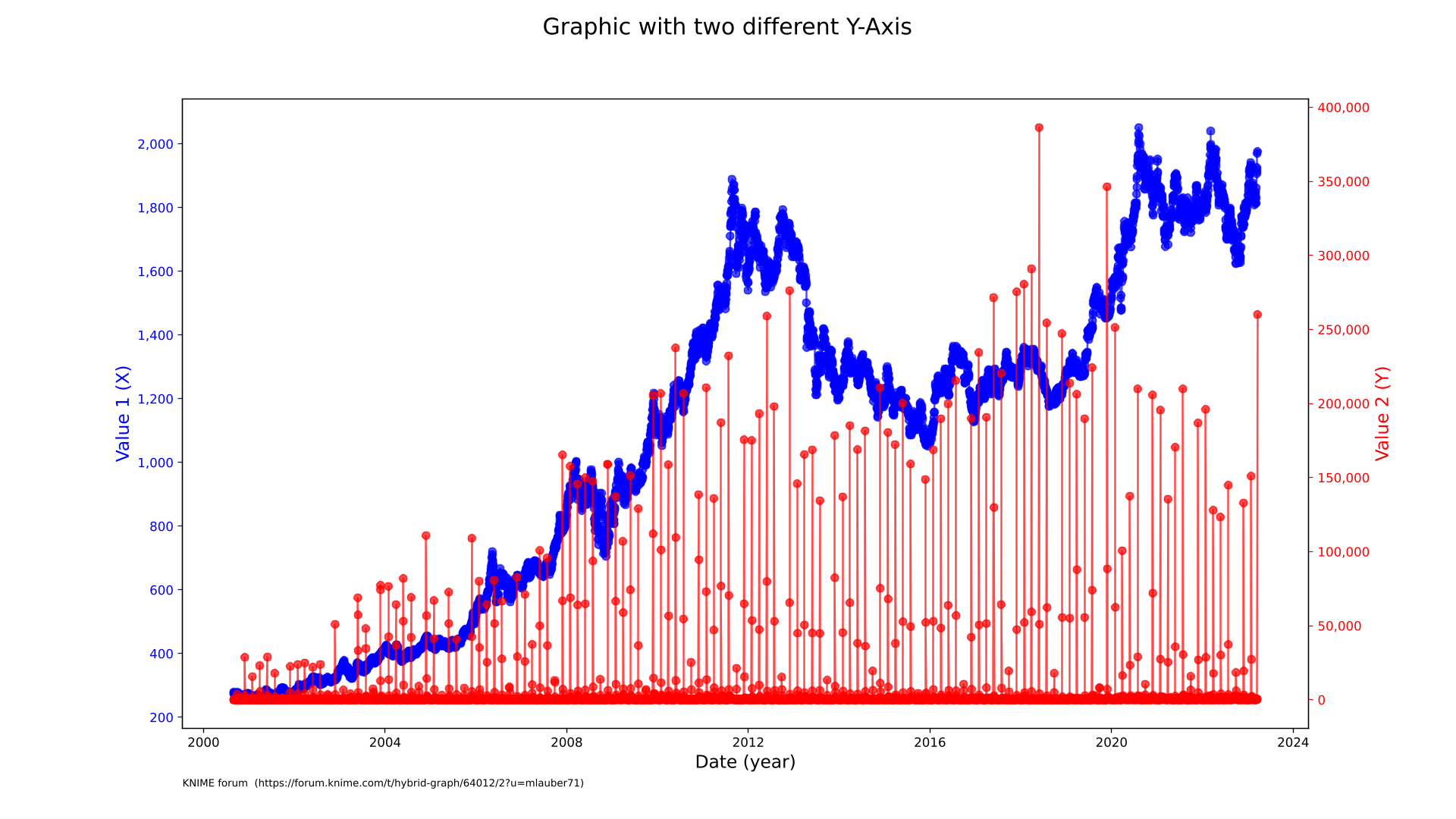
With the help of a component you can now reuse this example for all such charts, and edit the description and also the colour of the axis (within reasonable limits). The axis should mostly adapt themselves.

5 Likes

Oh my ! That looks awesome @mlauber71 - thank you for sharing!

I’ve marked it as a solution even though I haven’t tested it since I haven’t installed Python on my computer.

I really appreciate it and I hope it would be useful to other people, even though I might not end up using it!

1 Like

No need for big installations. This will work with just the bundled python in knime you can install as an extension:

And always remember this :slight_smile:

2 Likes

I see now. I’ve never came across the article before you showed it to me. After reading that, I think there’s a possibility that I’ll try it out tomorrow. If all I need for this particular workflow is the Python Integration Extension, that changes things for me.

Now that this is becoming a possibility, I have a heads up question. In the screenshot image you attached above, I see that there is an isolated Variable to Row Node. May I ask what’s its role by itself down there? :rofl: @mlauber71

2 Likes

This part has no particular function, I think at some point I wanted to check the package versions in the integrated Python environment. I could get rid of that since it makes the code look more complicated. Also you might want to check out the article and the video about the dashboards. This looks complicated first but once you get the idea you can adapt that and work with some copy paste.

Most graphic code is fairly simple. One can switch out the core syntax and add Flow variables already used and you get new charts and can integrate that in the knime world. Also there seem to be a new generation of interactive python views but I have not done much with that.

Alrighty, and another thing, can I ask that you make the Variable X’s Y-axis to also start with zero, similar to what you did to the Variable Y’s Y-axis? (I’m aware that the raw data doesn’t have a zero as the minimum value)

Edited: Scratch that! Truncated y-axis is fine for a line chart for this data. I’ll use it as is.

1 Like

Hi @mlauber71 , just updating here:

  1. I’ve read the Medium article & watched the YouTube vid.
  2. I’ve installed the Python Integration Extension and downloaded your workflow.
  3. I was able to play around with the workflow with success.

Here’s what I love:

  1. I love the level of thought you put into the the configuration setup - you gave it an extra mile as you allow the users to enter a subtitle/caption under the graph image, and the ability to adjust colors.
  2. I love how the graph adjusts the granularity of the info shown for the dates. I found that a longer timescale gives off only the years and a shorter timescale gives off the detailed dates.

I’ve removed the Parquet Writer and the Row to Variable Node since they don’t do anything that are of use to me. I’ve also compiled almost everything into a dummy component just to see if it works inside a component, and it does.

I think I’ve achieved what I wanted with your help. Thanks so much!

P.S. As I scoured the net, I found quite a few Python codes to programmatically create and display support & resistance lines for stock trading charts. But I wonder if the Knime Python Integration Extension can accommodate these custom scripts with its in-built bundled packages, without having to deal with Conda.

2 Likes

You are welcome :slight_smile: Hope you got a little bit into code (with KNIME you can have it all :smile:)

That would depend on what packages are being used. Maybe you have a link and that could be the topic of another forum debate. Also KNIME did expand the packages that are delivered with the bundled version. So if there is a very popular one they might add it.

But also the conda thing is not as complicated as it looks once you have ‘allowed’ yourself to toy around with it (delete, re-install, use several environments and so on) - it takes the myth out of that somewhat :slight_smile: - maybe the next thing…

1 Like

@mlauber71 , I do have two tasks related to this thread, one of them involved one of your workflows, and the other involves this Python code I mentioned. I’ll create a new thread for these two tasks and will tag you in a moment :slight_smile:

2 Likes

This topic was automatically closed 7 days after the last reply. New replies are no longer allowed.