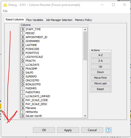
The poor usability of the Column Filter dialog is still an issue for me. Contrast it with, say, Column Resorter that scales correctly as you resize the dialog window height.
I can’t understand why Column Filter was designed to show such a small windows - if you have a lot of fields it’s difficult to scroll and choose with such a small window.
Other issues:
- Font size is too big, resulting in inefficient use of space
- Insane amount of vertical padding between lines, also needlessly using up space
- Text appears gray, fuzzy and dull on a 4K monitor. Looks OK on HD monitor though
How can I get Column Filter to look more like Column Resorter please?