Nice fresh look, but before you consider switching off the old UI make sure that all features available in the old user interface are available in the new one. I am sure most users wouldn’t want to loose functionality for the sake of making a nicer looking interface!
At the moment I can see that some functionality from old workflows is not supported by the viewers. As an example, if you run ‘Building a churn predictor model’ in hte new UI, you are unable to see the red and blue color coded output (predicting churn or no churn) in the output table.
Hi team KNIME.
I just looked at the new UI, and just want to say…loving it. Looks so elegant, I cannot wait till full functionality is available. This UI will turn a lot of heads if you ask me.
Love the table view at the bottom. As data engineer I always look at the data when working with it and now so much easier and better looking.
Really dig the feel of the new UI! my biggest issue picking up Knime was just navigating the clunky UI. I think this will help people pick up the concepts much quicker but a power user would end up needing to swap back to the old UI until more features are brought over to this new one.
Agree with many other wish list items in this thread so adding mine here as well.
Need to be able to edit node annotations
Wish there was a way to group nodes together so they can always be moved around the canvas in a group easily without creating a metanode. I do this now by putting them in giant Note boxes but they aren’t attached so once you move one, you have to resize everything.
Bring back the node alignment tools
Bring back the double click node inserts it connected to the selected node (helps build workflows quickly)
ctrl+space should quick search the new repository, not bring up the old one
Need a way to pin ‘Favorite’ nodes. Perhaps another section on left side tool bar just for favorites?
Knime should auto-connect the new node when you dragged and dropped near another node on the canvas.
Should be able to sort and filter the data preview window for quick checking (love that you can now select and copy data from here btw)
Just tried it. There’s a lot of potential, but my immediate criticisms are:
The list of nodes is horribly cluttered, with no apparent structure to it. If looking for a node from the community, you’re presented with a massive jumble. Some grouping by vendor, node type (source, loop, input, output) etc. would help a lot. I realise you provide filters, but once I’ve installed all my usual plugins I’m presented with >100 filter options in no particular order.
Native molecular structure rendering in the node output table is 100% essential for your biotech customers. We need to be able to view resizable structures. We also need to be able to copy the underlying object (e.g. SMILES) from the table, as we can currently with the old UI. I can’t recommend to my team that they use the new UI until proper chemistry support is in place. I hope it’s on the roadmap, since losing this functionality would be a >10 year retrograde step!
You might be aware of it already, but nodes that are auto-generated e.g. by the #imagej#image-processing extension currently don’t show up in the node repository of the new UI.
In particular, I’m missing all the nodes of the FMI KNIME Plugins (that do show up fine in the standard UI).
thanks. i guess I don’t need to try it out then at all because the concerns you mention would impact my work in the exact same way.
I quote this part because in every application that did a redesign, this was the outcome. The old, somewhat ugly looking but functional UI got replaced by something better looking but generally much less usable. Like Windows 8 or Windows 11 (task bar…), pgadmin4,…
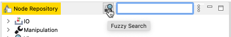
The only real thing the current UI is lacking is a fuzzy node search but else a tree view that uses little space is just so much more usable.
Thank you for your valuable feedback – we will make sure that your feedback will be considered for the next releases, however promises can not be made as of if and when they will be implemented. The preview was released to be able to gather feedback in order to incorporate necessary changes. This prevents a situation whereby products and features (like described) were released without sufficient community feedback, which would make our products less usable and functional.
We are currently in the middle of the development process and will further improve it with the upcoming releases.
I categorized the feedback into different topics and tagged you.
Modern and current user interface
The current user interface will still be around for some time. You will maybe also be able to switch between the current user interface and the future web based interface back and forth – but someday in the future the current user interface will not be maintained anymore. @John-k@richards99@kienerj
We also have ideas to add some similar functionality like the current bendpoints/handles on the curved connections. But currently there are other things that are more important for now (like opening multiple workflows, having an embedded KNIME Explorer, Workflow Annotations …).
Currently we have a default grid (based on 5px), that is for now not configurable and can not be switched on/off by the user. But there is a hidden feature to move nodes around without the grid snapping by holding the “Option”/“Alt” key after starting with the drag – then you can move it around based on 1px. @EvanB@mlauber71@leftyhyzer16 – Aligning and arranging nodes and annotations like now is on the list but has at the moment not the highest priority. For us it would be good to know what exactly you are looking for. Is the current auto format option all you need?
Until now there is only a first proof of concept implementation about the workflow outline for the Modern UI. But also this has for now, as far as we received the feedback not the highest priority @Thiemo.Kellner@leftyhyzer16 — For what exactly you are using it? Are you using it to navigate around in huge workflows?
Table Output View
The current table view at the bottom, is for now the first iteration – we are currently working on an enhanced version of the table view to enable more renderers e.g. images, chemical structures. We would be happy to present it to you once it is ready so that you can try it out and see if it works for your use cases. @richards99@Experimenter@witschey@leftyhyzer16@rsherhod
Node configuration
In the future we want to have all of our dialogs do appear in the new style. As we have a lot of nodes this will take some time, but we will definitely work on that as we need our dialogs to based on web technologies… There are some ideas about opening/displaying them at the side, for the current select node without any additional modal dialogs @EvanB, @tgb417@Christopher41 — but, it will take some time to develop all the necessary pieces.
Copy and paste
@sahak08 we have already started with the development of copy and paste for nodes and also, later on when the annotations are editable, to copy and paste annotations.
Node repo
We already considered additional views like they are now available (the tree view, the list view, when someone is searching via the fuzzy search) and also different filtering options. But also this is at the moment not scheduled for development @rsherhod
We already had a similar idea, to add favourite nodes on top of the other nodes within a dedicated category or some additional filter options somewhere in the node repo. @Christopher41@leftyhyzer16
Auto wiring nodes with the current selected one after double clicking it in the node repo is on the list and there is an internal ticket for it – but it is not yet scheduled for development. NXT-1083
General ui feedback
Additional panels e.g. like the KNIME Explorer …, will be added in the future and are not in the current released preview @denzilsdn
Panel management will be more important for us and also for the users, when we have more than two panels. The current ui is completely configurable – what we will provide in the future is not clear yet. There is nothing planned, but we are already aware of this. @denzilsdn
We will optimise the dedicated space of the top app header in the future as soon as we will have the possibility to open up multiple workflows with tabs. The app header just provides the necessary space for the future to display these future tabs here. @Experimenter
We are already thinking about a dark theme for the future, but for now it is not scheduled for development. I think the complete workflow bench needs to be optimized for that, right @Ema ?
For “Execute and Open View” there is already an internal ticket. We are not sure if it will make it into the next release. – NXT-1123. One question about that is, do you really need two different buttons (or like it is now two different context menu options)? I think this could be optimised and the logic if there is an execution needed or not, should be handled via the user interface – so the current plan here is, just to have one activated button, that will change its state depending on if the view the view is executed or not, but in the end it opens up the view. @EvanB
Problems
@brkylmz Could you please give us more details about your installation or the workflow that you tried to open up. Have you tried it also with a new KNIME Analytics Platform installation?
@Experimenter node lockup? Sorry I don’t get this completely, could you please give me some more details about that.
@imagejan – I have created an internal ticket for it – NXT-1161, regarding your problems with the nodes that are not shown up in the node repository.
Current KNIME Analytics Platform
@kienerj Fuzzy Search is available in the current user interface by activating the button near the current “Node Repository Search” input field. In the Modern UI we are using in the node repository fuzzy search by default.
If you have any additional feedback or questions, feel free to reply.
The auto-align function is great to help organizing a workflow. What I would really like (for quite some time now) is that the text beneath the node would be taken into consideration when aligning the nodes. I very often use the text beneath the nodes to document and describe what is going on so that hopefully no further boxes are needed but the texts would overlap if they are too large. So just (?) take them into account when aligning the nodes.
Also it would be great to be able to form groups of nodes that would be handled together (I can imagine the concept is not so eays) but it would be great to help with the organization and also acceptance of workflows. I do get the feedback that KNIME workflows do look crowded and not very intuitive (I am not sure pages of pure code are more intuitive but anyway). One will always have to put some effort into arranging and organizing. If KNIME could further help with that that would be great.
Maybe start with combining boxes and groups of nodes that can be grouped together and be then automatically organized. That would make my life much easier
I’d certainly be happy to look at any new renderers, particularly for chemical structures, as when they’re developed.
Re. the node repo. I can see that this new UI presents an opportunity to improve the way users navigate installed nodes, beyond the typical tree structure. In the current UI, you mostly have to know where something is, or exactly what it’s called, to be able to find it. That’s not ideal. Maybe if plugin developers could assign their nodes a series of common key words, which could have an ontology applied to narrow down browsing, e.g. assigning “Converter”, “Chemistry”, “RDKit” to all its RDKit to and from nodes. It sort of looks like that’s where you’re going, but I think you’ll need help from the node devs to tidy up their plugins.
I haven’t had a chance to use the Modern UI preview much as yet but I have been reading with interest other’s comments which in many cases reflect my views from what I have seen. I fully intend to give more detailed feedback on the good and the not-so-good, as I think this is very exciting, and in my quick plays there are some great new features (and many existing missing features that I am sure (hope!) will be added).
There is one thing though (probably not an obvious thing) that right now got me so excited that I thought I’d share it:
One thing that really bugs me in the existing/old UI when dealing with large workflows in KNIME is the ability to move a node or a group of nodes easily around the workflow when they go “off screen”. The choices are to either select the group of nodes, then zoom out, and drag them (but on large workflows you can kind of “lose your place” in terms of where you want to drag them to), or you can drag them a bit, then scroll, then drag a bit more, then scroll and so on until you get to where you want to drop them.
I was hoping that the modern UI would resolve this by giving us the ability to drag off screen and have the workflow scroll automatically as we do. I was disappointed to find this still doesn’t behave that way… BUT… one other thought was that they keyboard cursor keys can scroll the scrollbars, so wouldn’t it be nice if whilst dragging with mouse, the cursor keys could activate the scrollbars?
Well, on the old UI, it doesn’t work that way… but in the modern UI preview… It does! So I don’t know if this is intentional, or a side-effect but whatever it is, please don’t lose that new functionality.
I have now found that when working on a large workflow, if I want to move a node or group of nodes “off screen” and place it precisely, I switch to the modern UI, select the nodes, then drag them off screen and whilst continuing to drag I use the keyboard cursor keys to scroll the desktop beneath them… Happy Days!
For anyone wanting to learn more about this newly improved UI, please join the webinar we’re hosting for a quick overview and Q&A on recently released KNIME Analytics Platform 4.6.0 & KNIME Server 4.15!
July 14, 2022 5:00 PM - 6:00 PM UTC +2 Berlin 10:00 AM - 11:00AM -5 Chicago
Register for the webinar and get highlights on the latest version:
A preview of the sleeker UI
Better Python scripting
New visualization nodes
An improved Snowflake integration
…and more!
Followed by a summary of the community feedback and a Q&A with our experts, @carstenhaubold and @roberto_cadili. Come prepared with your questions and get a sneak peek into what’s coming next.
The modern ui is quite intuitive and sleek… while geek would find more tools at sight while preparing the work flow. I couldnt find the example workflow link in the modern ui…and how we can open the hub workflows in new ui.
Thank you for taking the time to respond! Adding all my comments below.
The auto formatting piece works pretty well so that would be a good middle solution, but I do like the other options (spacing and align) as the auto formatting doesn’t always react the way I want it to.
Workflow Outline - Yes for massive workflows, it is super helpful for quickly navigating to certain parts of it.
Table Output - I don’t have any science or render use cases, but would be happy to review any new iterations as you work through them.
New node repository - very very difficult to find nodes that you know are in a particular category or contribution but cannot remember exact name. Please let us have the old version!
Workflow editor
Not being able to open 2 workflows, metanodes, components side-by-side is very retrograde
The various animations (appearing buttons, frames around nodes, flow variable ports) are very distracting and cause an almos motion-sickness effect when moving the mouse around
The font is not very readable
Where is the node description?
How do I find my workflows? Open them? Swap between them?
Node output
Can no longer open multiple output tables in separate windows and compare outputs - this is a fundamental use case
My big question have tried this is “Why?”
The current UI works really well - nothing about this is an improvement, and much is a retrograde step, making an easy-to-use product very difficult to use to do even the simplest things, and makes many comon KNIME tasks impossible. Please tell me the old UI will remain available, otherwise likely to start looking for alternatives
Basically, I like the new UI - especially the visibility of the node out-ports as sliders below. However, after playing around a bit I had some issues…
How to enter a component?
Having entered a Meta-Node (double-clicked) finding the way back to the embedding WF is not that easy, as there is no text near the ‘>NAME_OF_METANODE’ indicating this feature
Maybe the ‘Help’ text of a node can be presented as a std. slider too
Thanks for your feedback. To clarify a few of the points you made: We intentionally put the preview online very early, knowing that certain critical functionality is missing. Sorry, if this hasn’t been clear from our intial post or postings in this thread. So, yes, multiple tables or workflows open, node descriptions discoverability, will be implemented and we’re more than happy to receive your feedback (see also summary above). Actually, the idea of the early release is and was to get feedback from users like you early on - we want to get that right. I understand that we need to get the balance right for users who are using KNIME AP since a long time and new or not to long-term users (from which we got lots of feedback). On the one hand we want to make onboarding and first steps much easier and less complex, on the other hand we don’t want to take away all the features KNIME AP has today for our experienced users - believe me, that’s not the easiest task
So, please keep the feedback coming, we’ll provide updates to the new UI/UX when they are available in the nightly build here in this thread and want to work with all of you to, again, get it right. And just to be sure: we won’t take away the old UI until the new one has at least (relevant) value parity with the existing platform.
Hi @s.roughley , I agree with you that there is a lot currently missing from the new UI but I am sure the KNIME team will address these over time. I too would not wish to lose functionality and my initial reaction to this was similar to your own… and then I went looking to see if there was anything it could do that was better than the existing UI… and I found some!
I mentioned them in an earlier comment, but thought I’d try my hand at demonstrating. I find myself switching to the modern UI as part of my work now, especially if working on a large workflow, simply because there are these ease-of-use things in there that I cannot do with the old UI.
This short video shows those specific features (3) and (4) in the list below, along with a couple of usability things that I think are much nicer in the new UI. Try doing each of these in the old UI, and I think you’ll see what I mean
There is no audio, and it’s not a polished video(not HD I’m afraid as my free video s/w doesn’t support it) but the features it demonstrates are as follows:
(1) You can join flow ports without having to right click and “show flow ports”. Just hover and they appear. And unused flow ports no longer clutter the interface. A nice touch.
(2) You can “reverse join” nodes. i.e. you can join from destination to source which is a surprising “ease of use” feature when you have just dropped the destination node at one side of you screen and you can now just track back from it.
(3) You can join to a node that is “off screen” by dragging the connector with the mouse while then using the keyboard cursor keys with the other hand
(4) You can drag a node to somewhere “off screen”, again by dragging with the mouse and using the keyboard cursor keys with the other hand.
Those last two are a huge bonus for me… that the old UI doesn’t support this is in my view the biggest usability issue of the existing KNIME UI.
All of the above are great for productivity. I switch to the UI preview just to use these features when needed, and then switch back. Best of both worlds!
Actually 1), 3) and 4) are also possible with the current UI:
Just drop a connection to the top left of a node. It will then attach to the hidden flow variable port (which will appear once the connection is establish). Same goes for the outgoing port, just start dragging at the top-right corner of the node.
If you hold the mouse with a dragged item at the border for 1-2 seconds it will start to scroll.
Thanks @thor … lol… I (clearly) never knew that. I knew that you could drop a connection onto an invisible flow port but I never found a way to drag from an invisible port. I just tried it and found it mostly responds to my attempts by starting to draw a selection rectangle (which is probably why I never discovered it could be done). That improves once you know it can be done, and you find the specific place to drag from.
As for moving off-canvas by hovering at the edge… I never discovered that and even now I know it exists, it seems pretty hit and miss in my attempts. Maybe I’m just not yet doing it right but I’m not surprised I never discovered it. I have now achieved it but haven’t worked out exactly what I had to do to make it work… seems I have to hover at some exact correct point or it just ignores my attempt. Hovering “beyond” the edge doesn’t seem to work, and from an “intuitive” point of view that is where I would have expected to hover, or even just expect the canvas to move if I move the mouse to the edge of the screen … and I still haven’t found a way to move the canvas both left or right and up or down in the same movement which is really easy with the preview’s cursor keys.
Useful to know, but I think it proves the point that the modern UI is a little more intuitive in terms of flow-port visibility, and (in my opinion) far easier to control in terms of moving off-canvas. (because the cursor keys just work to scroll the canvas. Of course, on the old UI the cursor keys have a different function, and this is something that is currently missing from the preview…
All-in-all I am mostly happy with the old UI and whether the future is a modern UI retaining the features of the old UI, or the old UI gaining some usability features of the modern UI, I’d be happy
[Edit - Ok I persevered and I now understand how the scrolling works on the old UI (I think), you have to have the mouse hovering at a point just inside the canvas in a region of a few pixels next to the canvas edge. Touch the scrollbar, or canvas edge, or go beyond the edge of the workflow canvas and it won’t work. To scroll diagonally you have to hover the mouse in a similar small region just inside the corner of the workflow canvas. Yes it works, but with the requirement for very specific mouse positioning I think it is likely to give me RSI ! ]