So there is a growing interest in visualisation of the black box of the various algorithms, and Partial dependence plots is once such means.
Can we implement a partial dependence plot in KNIME ? If so how/ if not is there a work around
if you want to plot a single line partial dependence the top part of the attached workflow will do for you.
I am using the parameter optimization loop to do it with some flow variables…
this way you can try a different row and a different column by providing different input to the metanode
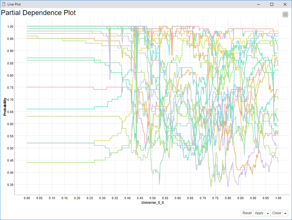
in the bottom part you can also plot a group of rows for which the partial dependence should be similar
if it is not similar it will be hard to interpret, but you can still tell if there is any strong global behavior in the model.
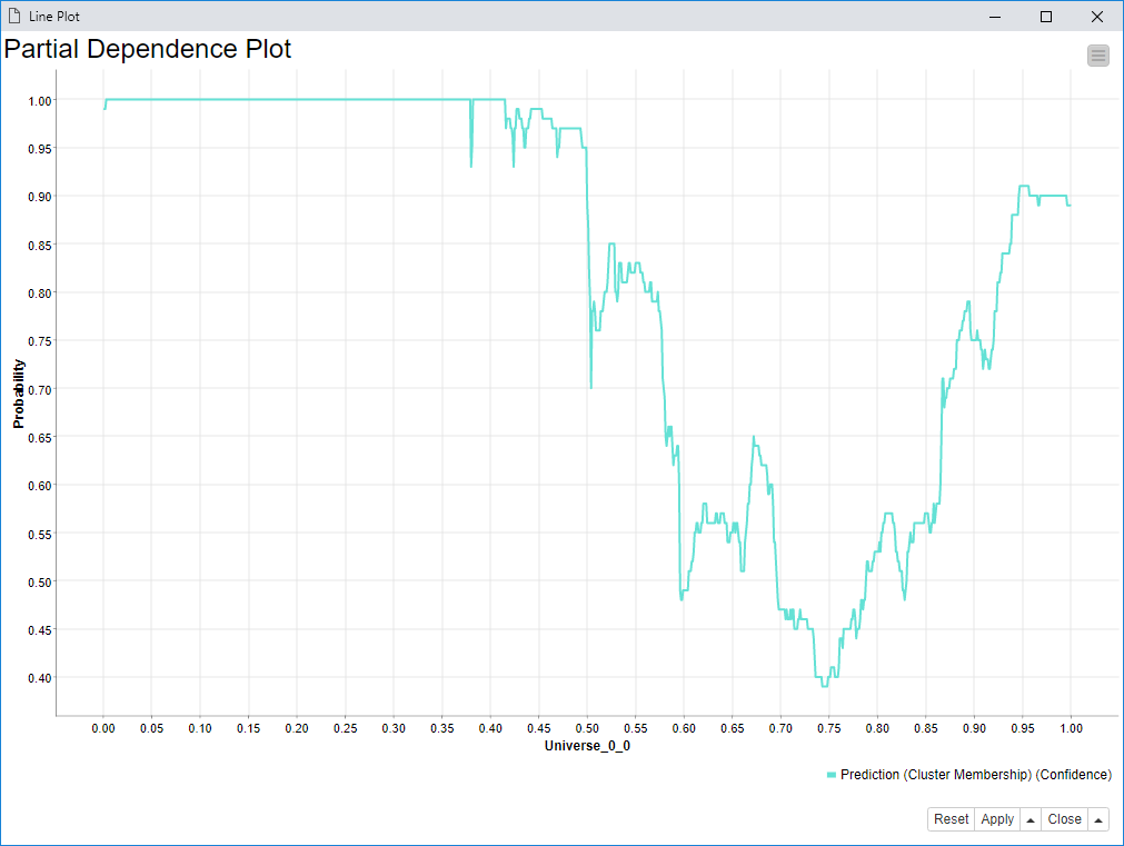
As you can see in the figures of my last post,
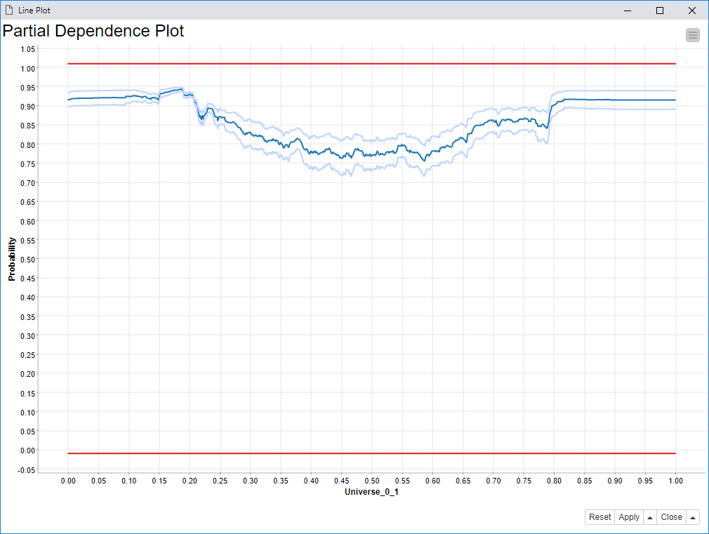
the line plots y axis has bounds retrieved from the min and max of the data displayed,
while you might want them fixed,
so that you are able to see the full probability domain between 0 and 1.
You can find a workaround here, which makes this possible.
It also makes you edit the color of the displayed curves with the color manager node.
Thanks Pablo,
How about individual conditional expectation plots, Accumulated Local Effects (ALE) Plots
Can you please share work flows for them.
Cheers Adarsh
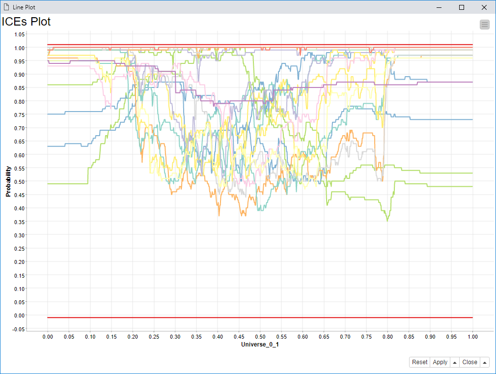
the workflow I have published before was only able to visualize the partial dependence (PD) of a single instance.
That is in other terminology what you call Individual Conditional Expectation (ICE).
I show how to compute the partial dependence related to a set of instances in this other workflow attached here: ICE_and_PD.knwf (131.3 KB)
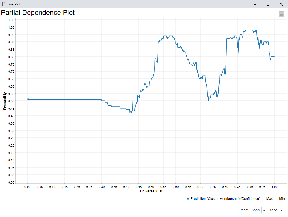
The final result is about going from this intricate plot of many ICE curves:
I also computed not just the average prediction for each step of the x axis,
but also the variance displayed by two pale blue curves (avg +/- sd^2)
as you can see the partial dependence plot is hiding lots of complexity compare to the ICE plot.
that is why it is important to represent under a single PD curve, similar ICEs
on which it makes sense to compute an average.
This work has been done already with matplotlib (Python)
by clustering ICEs together that looks similar.
That is anyway computationally expensive depending on how many instances you are dealing with and how much you are sampling the feature on the x axis.
Next post should be on how to do the Accumulated Local Effects (ALE) Plots in KNIME.
I will need to bin the instances on the feature on the x axis and compute a probability change
using only the instances belonging to a given bin as I move in the sampled domain.
Of course this is possible with KNIME, but for now I wanted to publish this partial solution