This worflow shows how to use SHAP and Shapley Values Loop nodes and it creates Stacked Bar Charts similar to Force Plots for you to compare and understand the explanations. Disclaimer: color scale is hardcoded on the single explanation.
OTHER: SHAP (SHapley Additive exPlanations) - Python Library on GitHub https://github.com/slundberg/shap#citations
PAPER: Explaining prediction models and individual predictions with feature contributions, Štrumbelj and Kononenko, 2014 https://link.springer.com/article/10.1007/s10115-013-0679-x
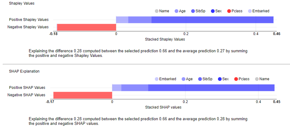
We are using the titanic dataset explaining why this particular person survived.
Her name was Vestrom, Miss. Hulda Amanda Adolfina
The model gives 66% of probability she survived the sinking of the Titanic, when she actually did not survive.
Most of the mistake of this Random Forest model is due to the fact this person was young (only 14) and female as you can see from the explanation (blue bars). Despite this she also embarked in 3rd class (red bar).