The dashboard is very simple and consists of a title, two dropbown buttons for previous and reference period, a table summarising some statistics (mean, std dev, min, max of the selected period) and a line chart.
Just used a table view for the previous 12 months comparison (expressed as sales ratio, although other calculations could have been done). But i couldnt resist a summary of all comparisons in a heatmap for extra points… or points lost. Probably used too many nodes.
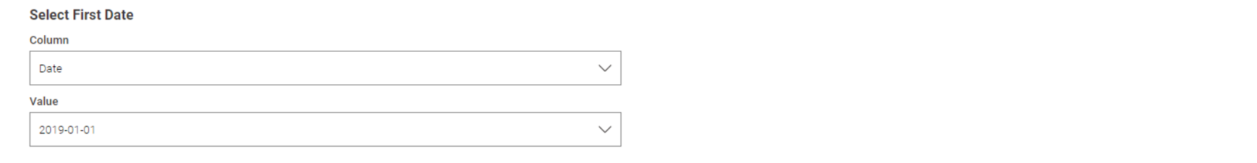
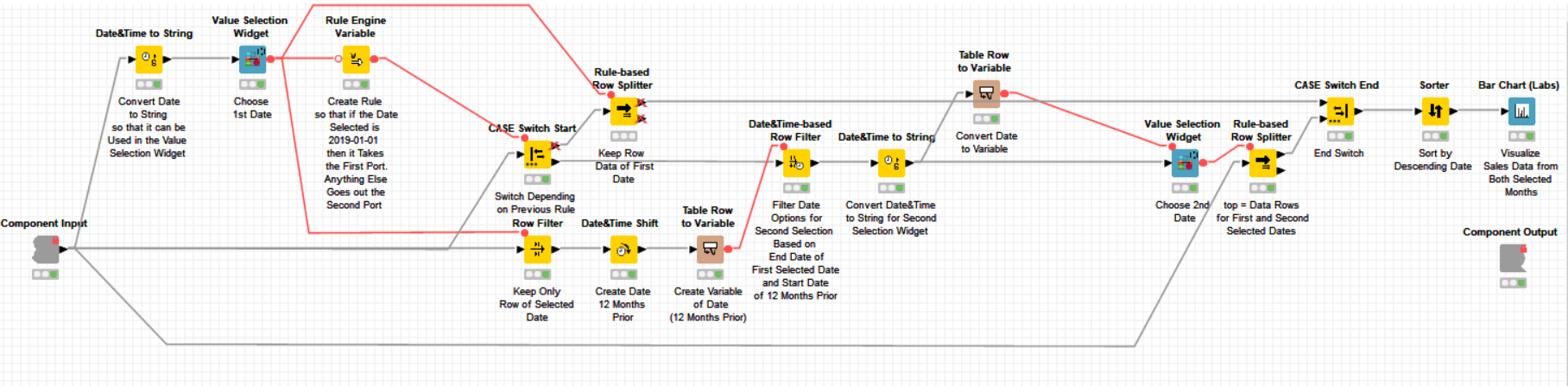
Firstly the workflow reads the data using the -Excel Reader- node and is then followed by an interactive Component. Inside the component, the Date column is converted to a String so that it can be handled by the -Value Selection Widget- node. This node allows the user to select the first date of interest.
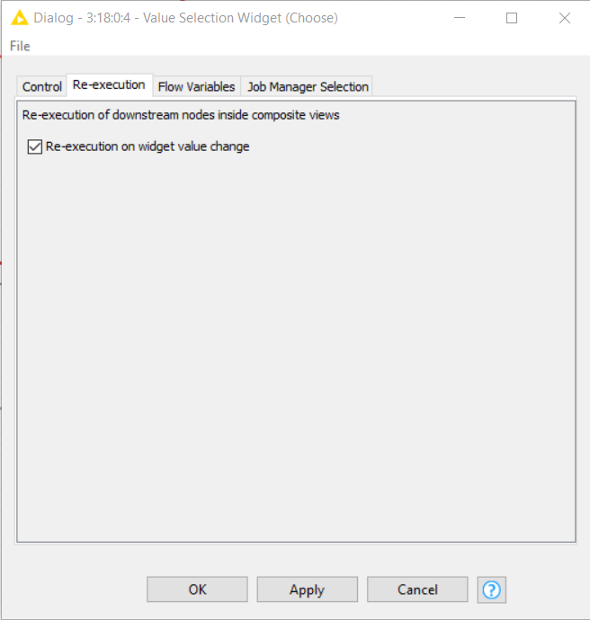
Initially, I set this up with a -Refresh Button Widget- node, however I learnt an alternative method to this during my training session at the KNIME Summit yesterday
Therefore, I have now used the re-execution configuration within the -Value Selection Widget- node itself:
A -CASE Switch- is then used so that a different path is taken depending on whether the earliest date is selected or any other date is selected. If the first date is selected, then only this is visible within the interactive view:
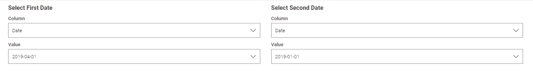
However, if any other date is selected then a second dropdown list becomes visible. The options in the dropdown list are restricted to the prior 12 months and this is achievable by using the -Date&Time Shift- node, converting the shifted date to a variable and using a -Date&Time-based Row Filter-.
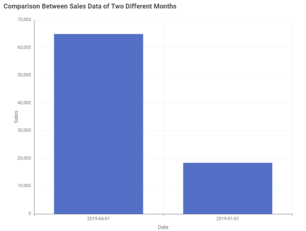
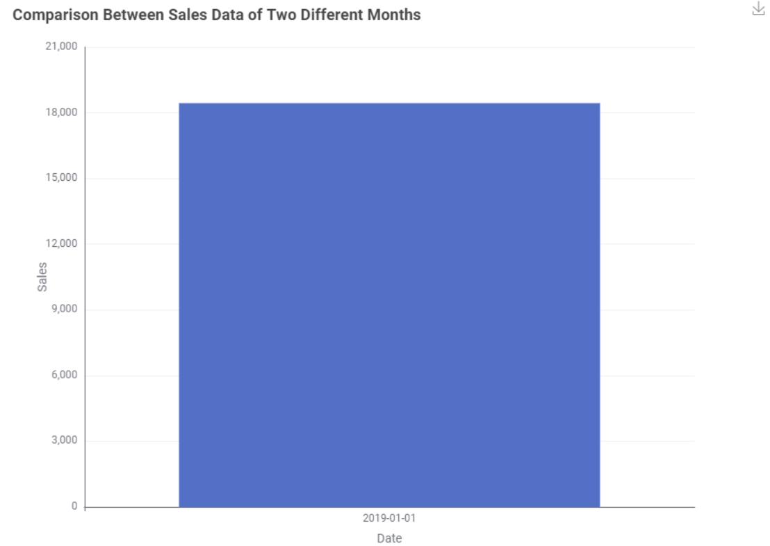
After making the date selections, the sales data is shown in a bar chart using the -Bar Chart (Labs)- node with the data from both selected dates displayed side by side, with the first selected date on the left hand side and the second selected date on the right:
Hi folks, as always on Tuesdays here’s our solution to last week’s challenge!
We were very impressed with the level of detail of some of these solutions , and are very thankful for the time you all have invested on tackling this challenge.
We hope you learned a thing or two about data apps design, and expect to see you tomorrow for a new challenge!
Thanks!, I will try to replicate similar functionality from other tools like PowerBI or Tableau, then select any date to begin the comparative study and not only compare to a unique specific previous month, because this point only shows the increase or decrease versus two months, and if seeking tendency or pattern sales, is it necessary chose more than one month