This is my solution.
I started studying KNIME yesterday and this is my first workflow I made.
I noticed that my solution does not take into account the stock split, but I could not handle it properly.
If you give me feedback, please reach me out.
My go at this:
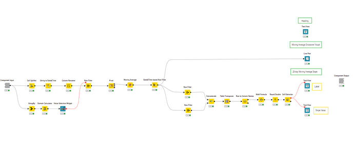
- user selects a date range to analyse Top/Bottom Movers
- MA is calculated for all stocks in the selected time window
- Top/Bottom 10 companies by moving average difference for first and last value in the date range are identified
- closing prices of those companies are plotted for the selected date range
https://hub.knime.com/-/spaces/-/~CthB935qmoiGH4y4/current-state/
Hi!
Here is my solution - I tried to find some algorithm to find successful companies and a way to automatize printing the plots for this companies for manual checking
Hello KNIMErs
Thank you to the KNIME team for this challenge, and because of starting a new season too. I always learn quite a lot from these challenges. There are a hundred of deploys to aim about this companies’ stocks challenge; but at the end, I decided to keep it within the challenge request, and as low code as well.
Here is my take:
Keep it coding ![]()
Hi KNIME,
Please find my solution below to answer the questions : What companies have an upward trend for the most recent data? And what companies have a downward trend?
This can be answered by exploring the lest table.
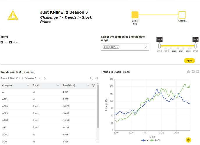
I did a data app to include the table of the trends over the last 3 months and to visualize the values over time.
You can filter by trend, company and dates.
The trend filter allows you to filter the table.
The company and dates filter the graph.
The solution is on the KBH : JustKNIMEIt_Challenge1_Jerome_2024 – KNIME Community Hub
Revisited my finance topics from school to find inspiration for this challenge.
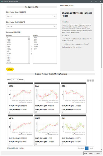
Decided to build a dashboard showing each counter’s MA slope for the past 20 days, showing which ones are on an upward trajectory and use that information to then filter the data and plot a stock price vs MA line plot.
Solution
Trends in Stock Prices
Kind of a last moment upload, but here is my solution. Fun challange!
Hi All and @alinebessa ,
Such a great challenge , got me thinking for some time.
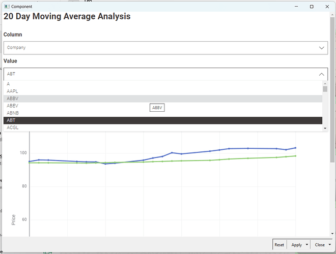
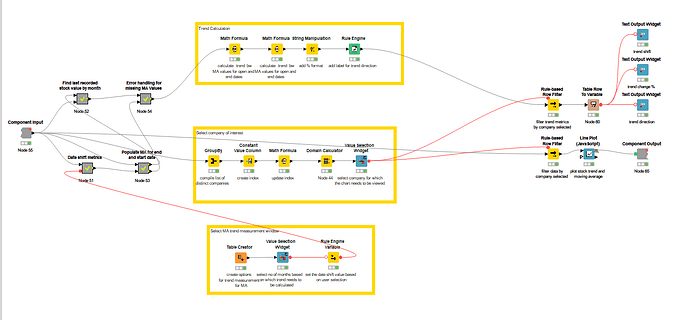
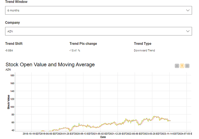
For the solution at Stock Analysis, I have built a Dashboard, which lets the user select the number of months they want to use for trend analysis, and the company of interest , and produces the following results:
- Trend Shift, Trend change % and the label (upward, downward and trend)
- Line chart for the company of user’s choice
The last component can be run in interactive view to check outputs.
Please let me know if you have any feedback!
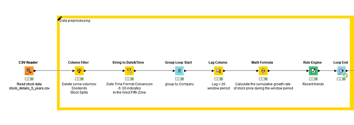
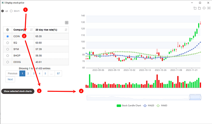
Hello everyone, this is my workflow.
In my work, the trend is calculated as follows:
(Sn - Sn-d) / Sn-d
where, d=20 window size
The interactive interface is as follows:
Welcome to our community, @mwilliams!
Welcome aboard, @wisnupo! Stick around and you’ll see how much you’ll learn from this community! <3
Welcome to our community, @sulfloweres! If you check other people’s solutions, you may find different ways of handling stock splits. ![]() A feedback I’d give you is that it’s a great practice to label your nodes, explaining what they’re doing. This heavily increases the legibility of your solution, and also helps with debugging later.
A feedback I’d give you is that it’s a great practice to label your nodes, explaining what they’re doing. This heavily increases the legibility of your solution, and also helps with debugging later.
Thanks for the acknowledgment, @gonhaddock! It means a lot to us. <3
As the challenge is in simple category here is my try for simplest approach to identify the stock as uptrend / downtrend
As it is mentioned in challenge that recent trend has to be identified. I have considered simple moving average on maximum date …
open for suggestions
Hi,
I’m really happy can be joining this event!!
here is my solution to the questions :
Enjoy this event, guys!!!
![]() Here’s our solution to this season’s first Just KNIME It! challenge!
Here’s our solution to this season’s first Just KNIME It! challenge! ![]()
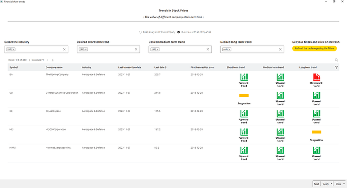
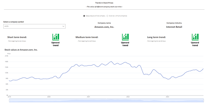
![]() We have two solutions here: a very simple one, that does not use data apps and should be configured and re-executed manually, and a more complex one that leads to a dashboard with a dropdown (for you to pick a company) and the corresponding trend visualization.
We have two solutions here: a very simple one, that does not use data apps and should be configured and re-executed manually, and a more complex one that leads to a dashboard with a dropdown (for you to pick a company) and the corresponding trend visualization. ![]()
![]() As always, thanks for your amazing and creative solutions!
As always, thanks for your amazing and creative solutions! ![]() Stay tuned to our social media today to see last week’s highlights – with shoutouts to our community!
Stay tuned to our social media today to see last week’s highlights – with shoutouts to our community!
![]() See you tomorrow for a new challenge!
See you tomorrow for a new challenge! ![]()
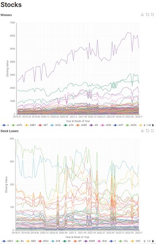
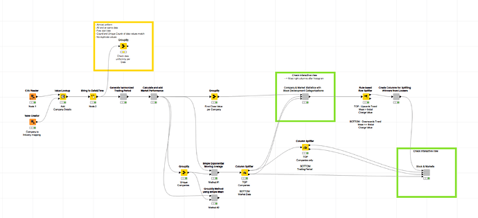
- Two Interactive Views (Detailed Stats & Graphs split by winners and losers)
- Statistics and performance categorizations
- Including meta information about respective market development
Hello everyone,
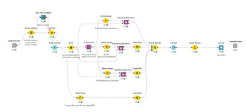
I created a workflow that can compute Simple Moving Average (SMA) for 20-50-100 days for each selected company. Also, in reality it’s crucial to consider more than 1 metrics before making any decision to buy or sell! So, this workflow also can calculate Exponential Moving Average (EMA).
Just_KNIME_it_3.1-Baharan

