Hi Everyone ![]()
Here is my solution this week:
I decided to start by filtering the data and keeping only the most recent year as this is most relevant to know the possible cost for this year. I also decided to calculate the Expense Values per year, so that a mean value could be calculated using both the 2-year and 4-year data.
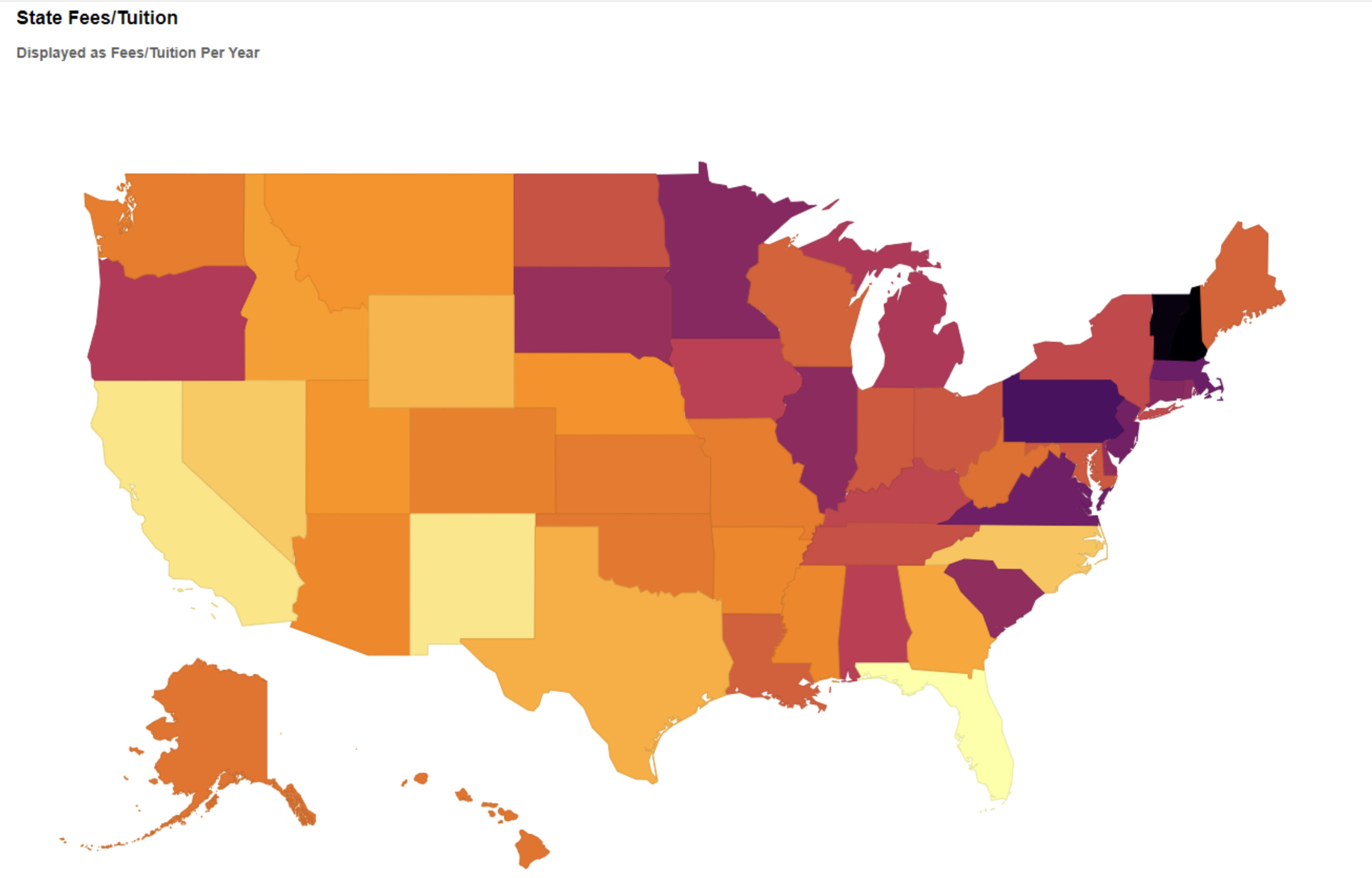
In the interactive component, the user can select the Type of University using the -Single Selection Widget- node:

This filters the data, which is then displayed for both the Fees/Tuition and the Room/Board using separate -Choropleth Map- components:
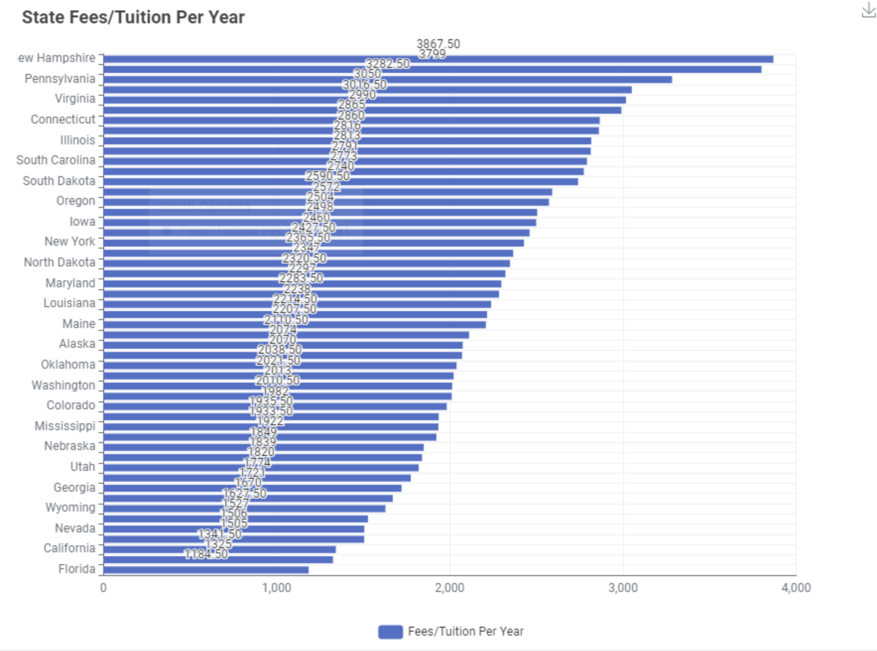
Also as a simple Bar Chart:
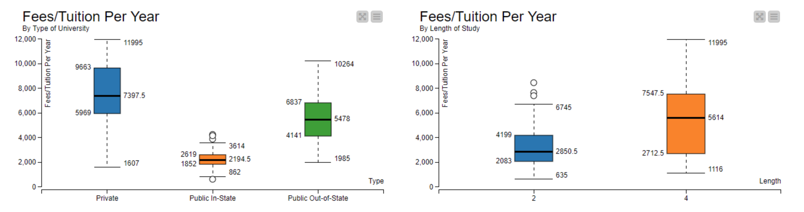
I have also displayed unfiltered data using the -Conditional Box Plot- node, showing the Fees/Tuition for each type of University and each length of study. I have also repeated this for the Room/Board:
On average, private Universities are more expensive than public, but the states with the cheapest tuition fees are not necessarily the cheapest to live in and vice versa. For example, California has a high mean living cost but low tuition fees if going to a Public In-State University. Therefore, both choropleth maps should be reviewed when making a decision.
You can find my workflow on the hub here:
Best wishes
Heather