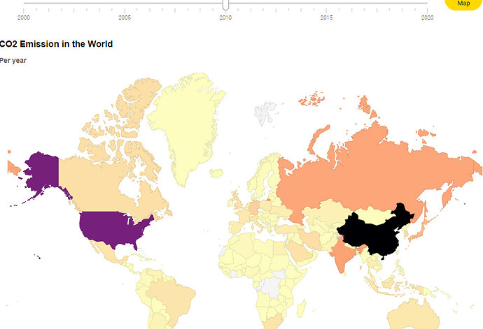
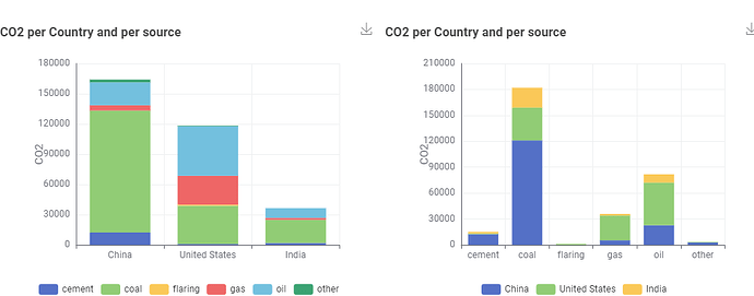
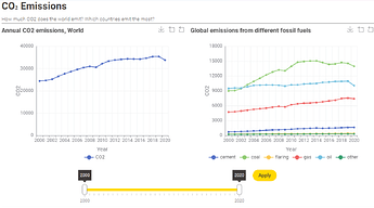
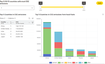
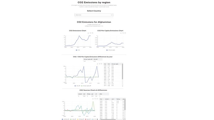
My submission for Challenge 3
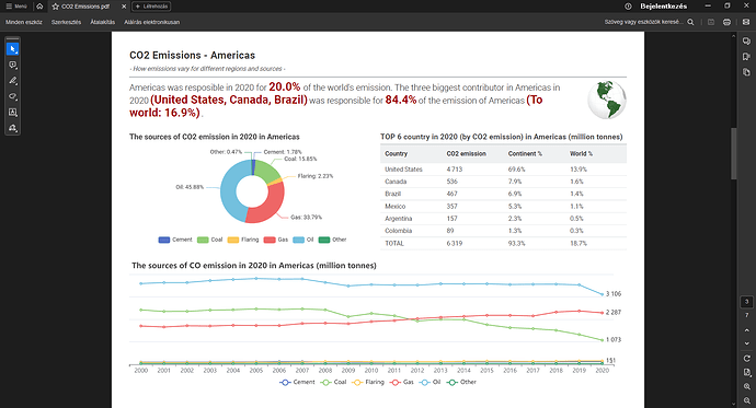
My version for Challange 2. This topic is very dear to me so I took extra time to fine tune my pdf ![]()
Here is my solution!
Happy KNIMEing!
Hi Team,
My solution is uploaded.
Did some nice reporting, but some of them are not compatible with the Report Template Creator and “Export reporting or Enable Reporting” within the component, to save the result as a PDF.
That is why, you have first a nice and interactive reporting, and then, exporting as a PDF the views that are compatible with this reporting feature.
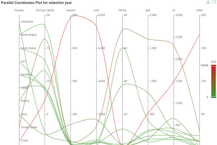
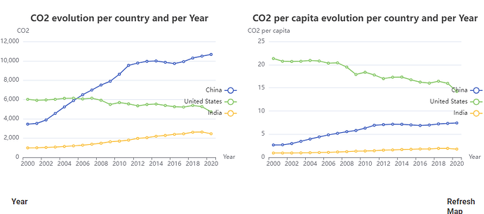
Interesting to see that China increases the CO2 in total but it decreases its CO2 per capita over time.
Hi,
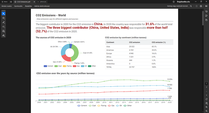
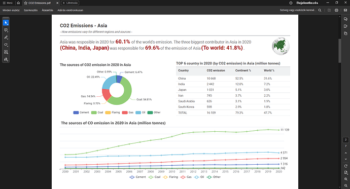
I forgot to upload the pdf BIRT report of my workflow. The pdf report is not the prettiest but is useful enough to reach the following important conclusion:
China, the world’s number one CO2 emitter, does not actually pose a significant per capita problem for the world, a fact that challenges our preconceived notions and invites further exploration.
The same holds true for India, which was the second most populous country in the world in 2020.This leads us to a compelling conclusion: the global CO2 emissions issue is primarily a
population-related challenge, necessitating immediate attention and action rather than a problem specific to emissions from a particular region. This conclusion is reinforced by the fact that the top three largest CO2 emitters in Figure 1 (China, the United States, and India) are also the top three countries with the largest population in the world for 2020, only in a different order: first China, then India, and then the United States.
I hope you agree with this conclusion after reading the report. The report only includes some of the workflow charts; it only consists of the important ones.
Thank you.
Carlos
default_report.pdf (154.5 KB)
Dear everyone,
I would like to address a mistake in my previous comment. In point 2, I incorrectly assumed that the CO2 per capita column was measured in MtCO2 per million people. Upon further review of the 2023 IEA’s CO2 emissions report, I realized that the correct unit for this column is tCO2 per capita, which stands for metric tons of CO2 per capita.
I have already updated my workflow and report accordingly. Fortunately, the graphs and conclusions remain unchanged; only the labels need adjustment.
I appreciate your understanding.
Best,
Carlos
default_report.pdf (153.8 KB)
Quite an eye opening challenge about climate change. Created simple report with line plot and stacked area plot.
Also got a animated bar plot from the community, and used it to show the movement in the top CO2 emissions per capita.
Trying to make a geospatial view part of the dashboard as well in subsequent versions.
CO2 Emissions - JKISeason3-2 - Leo_Wynter
Hello,
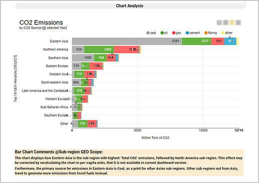
Just to say. I’ve updated my workflow with customized comments, for all the chart combinations available in the dashboard report; then, becoming more dynamic.
BR
Welcome to our community, @HSCH! Hope you enjoyed this challenge!
![]() Here’s our solution to last week’s Just KNIME It! challenge!
Here’s our solution to last week’s Just KNIME It! challenge! ![]()
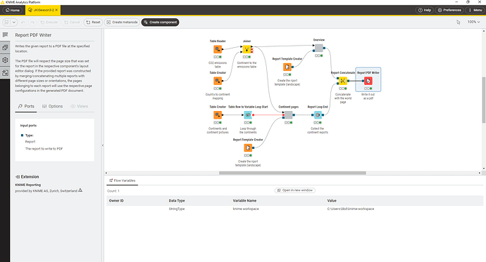
Last week’s topic was pretty serious, and your dashboards and reports reveal lots of insights on CO₂ emissions. ![]() Thank you all for the very inspired and eye-opening solutions! In our approach, we create one report per country, which you can choose based on its emission ranking.
Thank you all for the very inspired and eye-opening solutions! In our approach, we create one report per country, which you can choose based on its emission ranking. ![]()
![]() We hope to see you this coming week for a new challenge!
We hope to see you this coming week for a new challenge! ![]()
Thanks @alinebessa for creating this challenge! Somewhat of a late entry due to the long weekend, but here is the dashboard, and the workflow. The workflow can be accessed here.
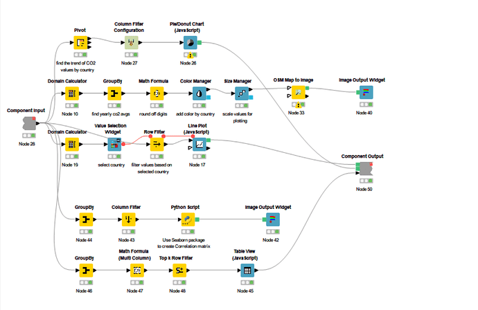
I choose to create a dashboard with the following views :
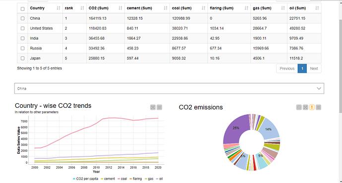
- Top 5 countries ranked by CO2 emission levels and the respective other industry levels
- Line plot for different factors, that can be filtered by country
- Donut plot for CO2 levels in the year 2013
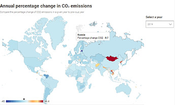
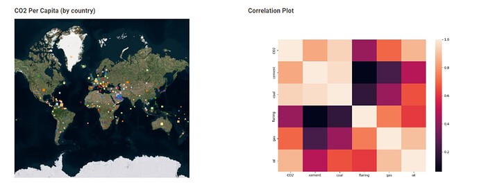
- Geomap for understanding Per Capita CO2 by region
- And finally, the correlation btwn CO2 and other industries.
Looking forward to the next challenge!
Hello fellow KNIMErs,
Here is my solution to challenge 2… also late.
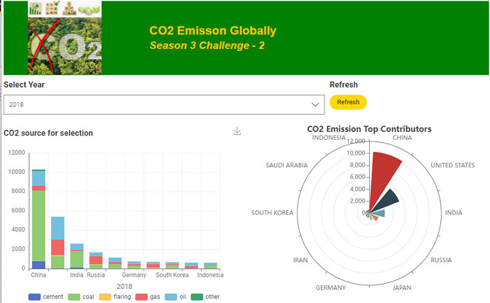
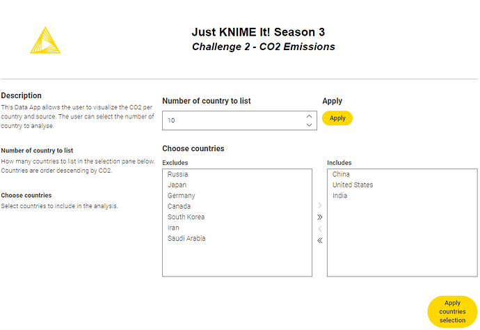
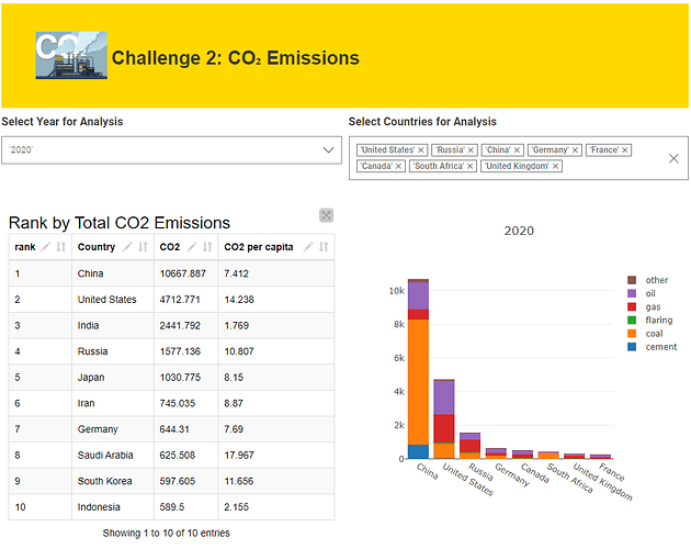
I approached the problem by building a data app that allowed exploration of the data in a few different ways. The top line of the visualization allows users to select a year for analysis and tabulates the top ten emissions countries for that year. Next to the table there is a bar chart that stratifies the total CO2 emissions by the source types. For the bar chart, you can also customize which countries to monitor.
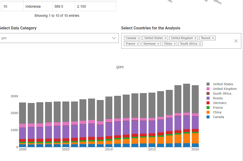
The second line of the data visualization similarly allows for a custom view of countries of interest in a bar chart format where each bar is for a given year. For the bar charts, the data column is selected by drop down to allow you to view by emmision source type.
All of that was fun. Then i added the reporting functionality to the component:
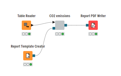
… but unfortunately, i relied 100% on my favorite views, which seem like they are not supported… ![]()
i started to experiment with a few that are supported and maybe… just maybe… i will migrate to them some day.
Hope you like it!
This looks really sharp… i bet there is a lot we can learn from your fine tuning. thanks very much for the effort and for sharing!
Thank You! I really liked the legacy nodes as well as you can format them with CSS. Sadly you cannot use them in your reporting enabled component ![]()
This challenge was for exploring to me how can you handle custom formatting of text and diagram with “not legacy” nodes.
What i found:
- You can add the same custom CSS styling for the text view node if you throw as a variable (it’s very useful and I used it in my solution, you can check if relevant for you)
- You can use the generic e charts node (with KAI) for nearly every possible visualization, and the visualizations can be customized in even more depth than with CSS (I used it in my solution as well)
Hope it’s a little bit of help to you to deep dive into the reporting enabled components! ![]()
Hi,
this is my late solution for this nice challenge.
It was the first time i used the reporting funciton that i can’t get running direct out of the node repository due to missing report ports or if manually added missing data.
Copied from the submitted solution it works without additional ports in the component setup but as already posted by l6fader, unfortionately not with all kind of plots.
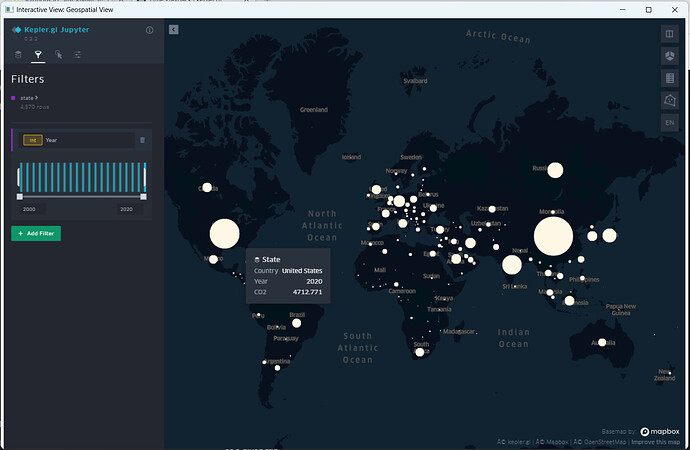
It also was the first time i used gespatial view for displaying data. Thanks to mwiegand for that part of the workflow.
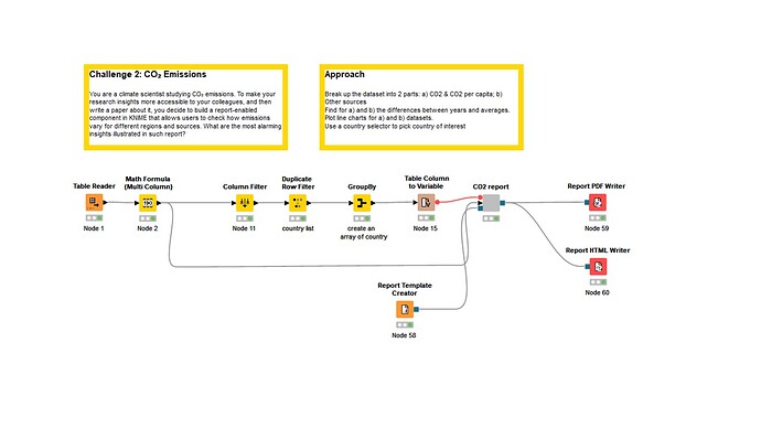
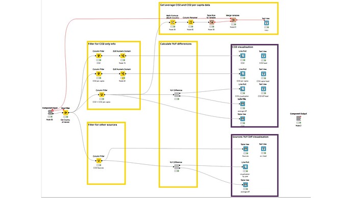
Took a single country approach to this challenge.
Approach
Break up the dataset into 2 parts: a) CO2 & CO2 per capita; b) Other sources
Find for a) and b) the differences between years and averages.
Plot line charts for a) and b) datasets.
Use a country selector to pick country of interest
This topic was automatically closed 90 days after the last reply. New replies are no longer allowed.
