Wow, outstanding visualization and report! Kudos to You @tark !
2 Likes
![]() Good morning, everybody!
Good morning, everybody! ![]()
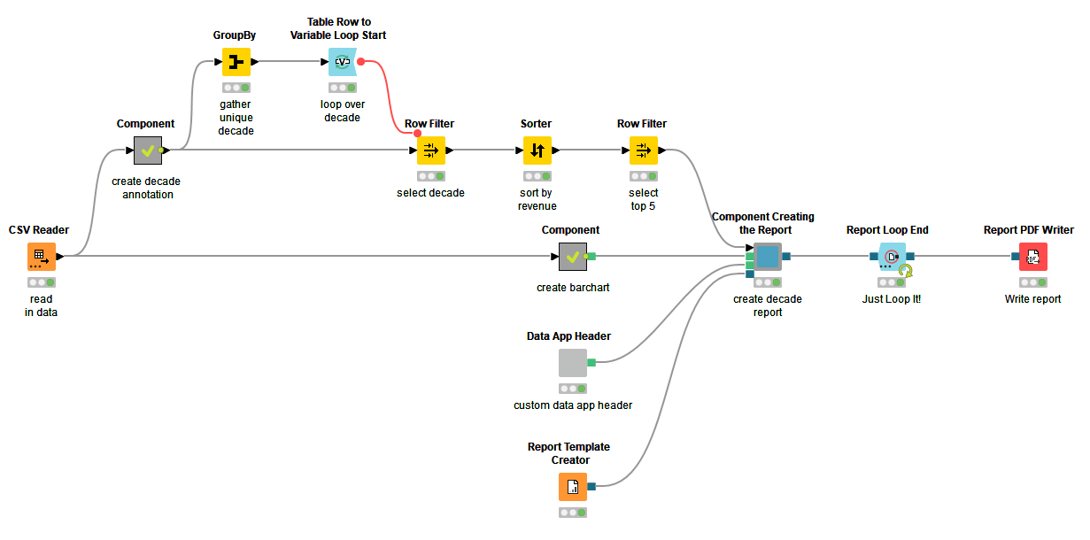
![]() As always on Tuesdays, we just posted our solution to last week’s challenge. A little bit of preprocessing, a reporting loop (the star of this workflow!), and some more reporting magic to tidy everything up.
As always on Tuesdays, we just posted our solution to last week’s challenge. A little bit of preprocessing, a reporting loop (the star of this workflow!), and some more reporting magic to tidy everything up.
![]() Wow! Some great visualizations here as always! Thanks for your commitment to our challenges, folks!
Wow! Some great visualizations here as always! Thanks for your commitment to our challenges, folks! ![]() See you tomorrow for a Pokémon challenge!
See you tomorrow for a Pokémon challenge!
4 Likes
Hi all!
im back after a 16-challenge hiatus! I will be spending the next weeks catching up, but this is only the first challenging i can still post a response… better late than never…
i never use the reporting capability of knime so my solution is rather basic:
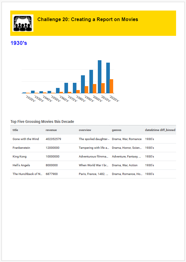
I learned how to make a simple report based on the community hub examples that features a plotly based bar chart, our beloved data app header on each page and a table with the main features from the top 5 movies by decade. i didnt totally understand what the ask was for this. pardon the lack of creativity!
example page from the .pdf:
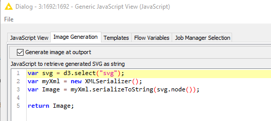
handy tricks you may like: i had to use a couple work arounds to make my generic javascript nodes work in the report, since this view is not supported. for the plotly bar chart, the visualization is generated as an svg so you can generate an image of the view (not normally needed for a component) using this handy code someone from knime gave me ~7 years ago:
However, that really cool data app header introduced by @AnilKS is not generated as an svg, so i could not get that code to work… the work around was to recreate the code that generates the header using d3… it looks like this:
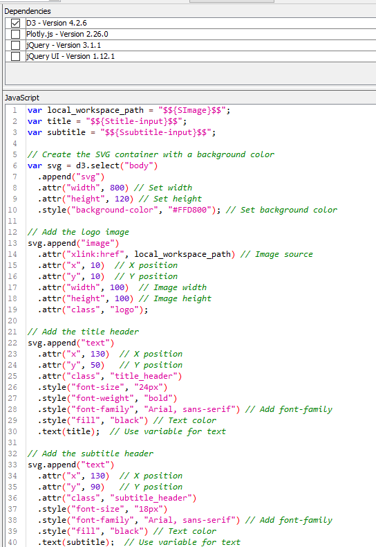
the image will then be created as normal and can be passed to an image view inside the report component.
Enjoy!
L
This topic was automatically closed 90 days after the last reply. New replies are no longer allowed.