Thank you for your question. How to visualize your data depends on what you are interested in. KNIME Analytics Platform offers a wide range of visualization possibilities. I would recommend the JavaScript views under Views/JavaScript in the node repository. Here you find many options including Scatter Plots, Box Plots, Parallel Coordinates Plots, Sunburst Charts, etc. The nice thing about them is that you can combine them in a composite view via a wrapped metanode. Here is a video on how to do this: https://www.knime.com/knime-introductory-course/chapter5/section3/composite-views
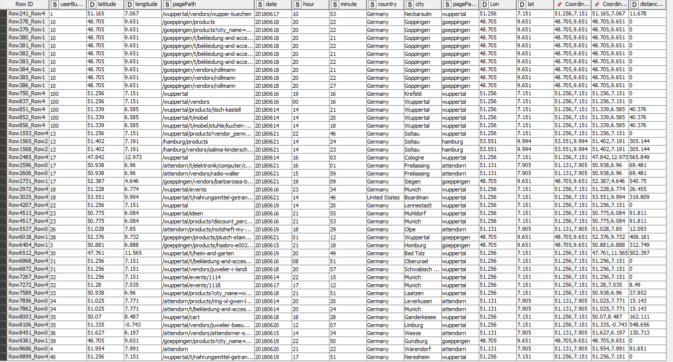
If you want to visualize Geolocation data, you can use the KNIME OpenStreeMap extension (available from KNIME Labs). Check out our nice examples under 03_Visualization /04_Geolocation KNIME EXAMPLES server.