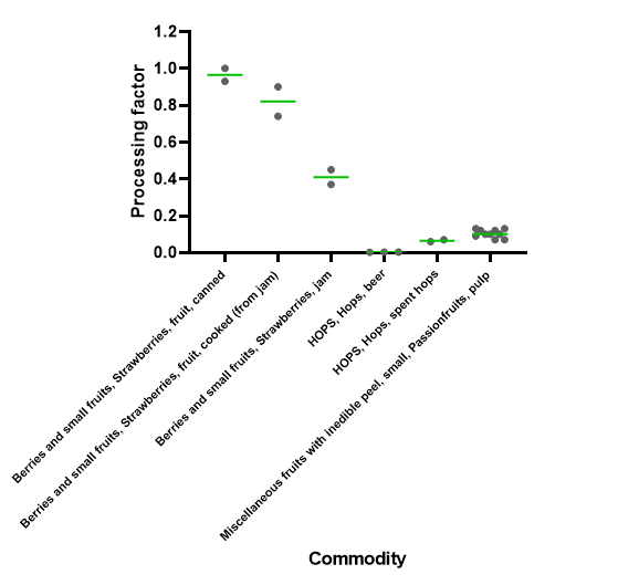
Currently, I am trying to do this with the Scatter Plot (Plotly) node (see example workflow).
Is there a possibility to adjust the dot size, to show the median as line (if not to add a legend like median green, individual values grey), to adjust the labels of the X-Achses so that the whole name is shown?
Thanks in advanceExample_Scatter_Plot.knwf (42.3 KB)
If you have a complete set of observations for each type of fruit (as opposed to just the median and other points), an easier way to approach this might be to use a Box Plot or Violin Plot (Plotly) node instead, which will calculate and display medians, quartiles, and outliers for you automatically.
Thanks for your answer. However, am I right that neither the box plot node nor the violin plot node can show indiviadual values? Is their a possibility to adjust the point/dot size in any plot node (similar to managing colors with the color manager)?
I also have the problem that the labels on the x-achses are quite long and that there is noch possibility to formate the achses or the labels of the achses. Do you know of a way to do this?
That’s right, the box plot/violin plot are intended to show how variables are distributed, and typically don’t show individual values as points (except in the case of outliers).
You could try the Size Manager to change the size of points.
Currently axes in the Javascript Views aren’t rotatable. We do have an open ticket for this, however (AP-9658).