As I mentioned in a previous topic, I’m learning how to make plots/charts with Matplotlib in Python, so I’m sharing what I have created in case the workflows are useful to other KNIMErs
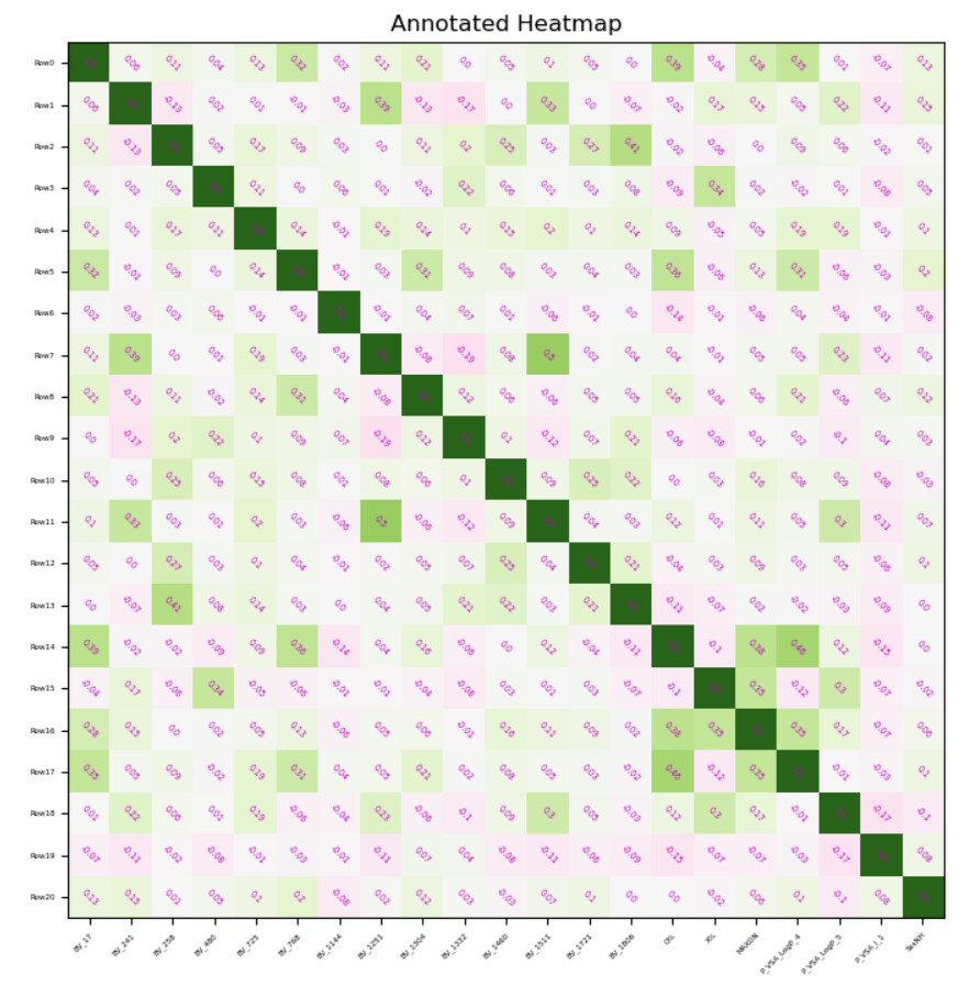
This time I’m sharing an Annotated Heatmap generated using the -Python View- node and a series of selection widgets to select colours and labels.
Sharing the Python code for improved searching on Google etc.
import knime.scripting.io as knio
from io import BytesIO
import numpy as np
import matplotlib
import matplotlib.pyplot as plt
import pandas

#vertical axis
vertical = knio.flow_variables['vertical_axis']

#horizontal axis
horizontal = knio.flow_variables['horizontal_axis']

#color map to use
c = knio.flow_variables['colour_scheme']

#input data
data = knio.input_tables[0].to_pandas()
matrix = data.select_dtypes(include='number').to_numpy()

# print(matrix)

#plot creation
fig, ax = plt.subplots()

#image size
im = ax.imshow(matrix,cmap=c,vmin=-1,vmax=1)

# We want to show all ticks...
ax.set_xticks(np.arange(len(data[horizontal])))
ax.set_yticks(np.arange(len(data[vertical])))

# ... and label them with the respective list entries
ax.set_xticklabels(data[horizontal],size=knio.flow_variables['label_size'])
ax.set_yticklabels(data[vertical],size=knio.flow_variables['label_size'])

# Rotate the tick labels and set their alignment.
plt.setp(ax.get_xticklabels(), rotation=45, ha="right",
         rotation_mode="anchor")

# Loop over data dimensions and create text annotations.
for i in range(np.size(matrix[1,:])):
    for j in range(np.size(matrix[:,1])):
        text = ax.text(j, i, matrix[i, j],
                       ha="center", va="center", color=knio.flow_variables['font_colour_indentifier'], size=knio.flow_variables['font_size'],rotation=knio.flow_variables['label_angle_int'])

#plot title set
ax.set_title(knio.flow_variables['title_input'])

#resizing
fig.tight_layout()
#plt.show()

# Create buffer to write into
buffer = BytesIO()
# Create plot and write it into the buffer
plt.savefig(buffer, format='svg')
# The output is the content of the buffer
output_image = buffer.getvalue()

# Assign the figure to the output_view variable
knio.output_view = knio.view(fig)  # alternative: knio.view_matplotlib()