5.5 now puts the config for many nodes on the right side. With that change came the loss of the settings icon on the nodes that appear over there.
This is a slight quality of life reduction, and I’d ask it be returned. Here’s why:
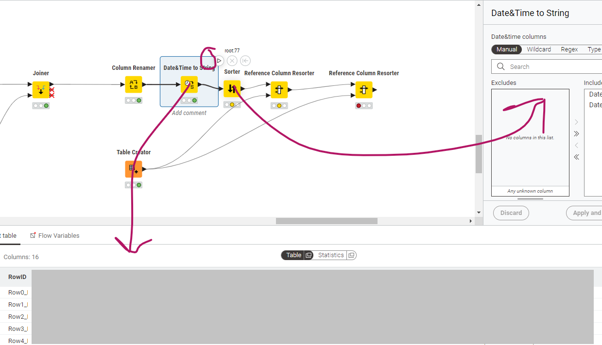
In this example, I want to see the the output of the “Date&Time to String” node while configuring the Sorter node. This was possible in 5.4.4 as I could hit the Joiner nodes settings button (see circle) and it wouldn’t affect the preview display at the bottom.
With the new UI, I now have to open the table in a separate window, which is time-consuming.
So I’d like to petition for the return of the gear icon (and the settings can still open in the right side).
I agree with you @ajackson . I think you meant “Sorter” when you referred to “Joiner” but I see what you’re getting at.
I feel the the gear icon, the double-click and the “open config” shortcut key should all be restored for the modern UI nodes that are now configured in the side panel in the interests of consistency and a less confusing UX, although I admit I hadn’t considered your particular use case of being able to see data from a different node when clicking the gear icon.
Whilst I don’t know for sure, I think that may have been overlooked because it feels to me like it was a “lucky side effect” of the way the gear icon was previously implemented (ie clicking it for some reason didn’t steal focus from a selected node) rather than being a design decision.
The trouble is that people do get used to such side effects and it becomes painful when they are taken away.
Oops - thanks @takbb, yes I meant Sorter. And I think your response sums it up perfectly, especially about consistency. I was even training others on my team to use the settings/gear icon that way and they were finding it very useful.
I’d also love to see an option to allow us to choose to pop the config out.
I often work on a small screen and have to constantly resize the results panel up and down to be able to get a good picture of the settings of a node.
With the previous UI, the node would sit on top and I’d be able to see all of the settings at with usually no scrolling.