Appo
November 2, 2022, 4:07pm
1
Hello !
I’m struggling with the color manager node to apply colors to my Bar Chart…
I applied this: Workflow Color
Result is not really clean.
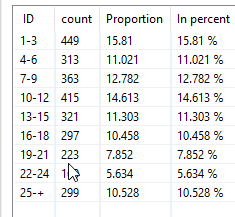
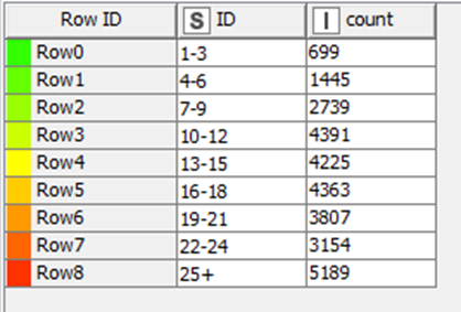
My data is the following:
I just want to be able to give a color to each ID for my Barchart to plot.
If i plug directly to the node color manager i get the colors i want to apply to my Bar Chart however if i plug in directly it in the second input port my bar chart becomes grayed out…
Would you be able to help me ?
Cheers
Hello @Appo
BR
2 Likes
Appo
November 4, 2022, 10:15am
3
It is the workflow i mentionned but i might have messed something up…
I also don’t really want to apply a shade of color according to the value. The values (bins in my case) that i want to give a color are fixed.
Here i have the colors attributed to the row.
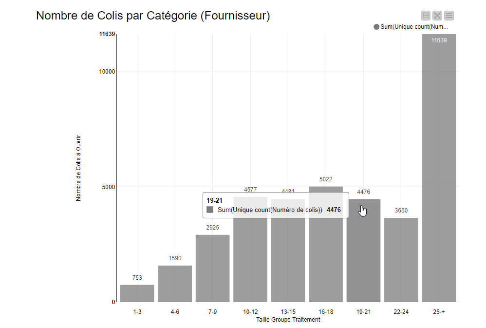
If i plug this table to a scatter plot it get this: Just need to replace the dots by bars…
Appo
November 4, 2022, 10:56am
4
Edit:
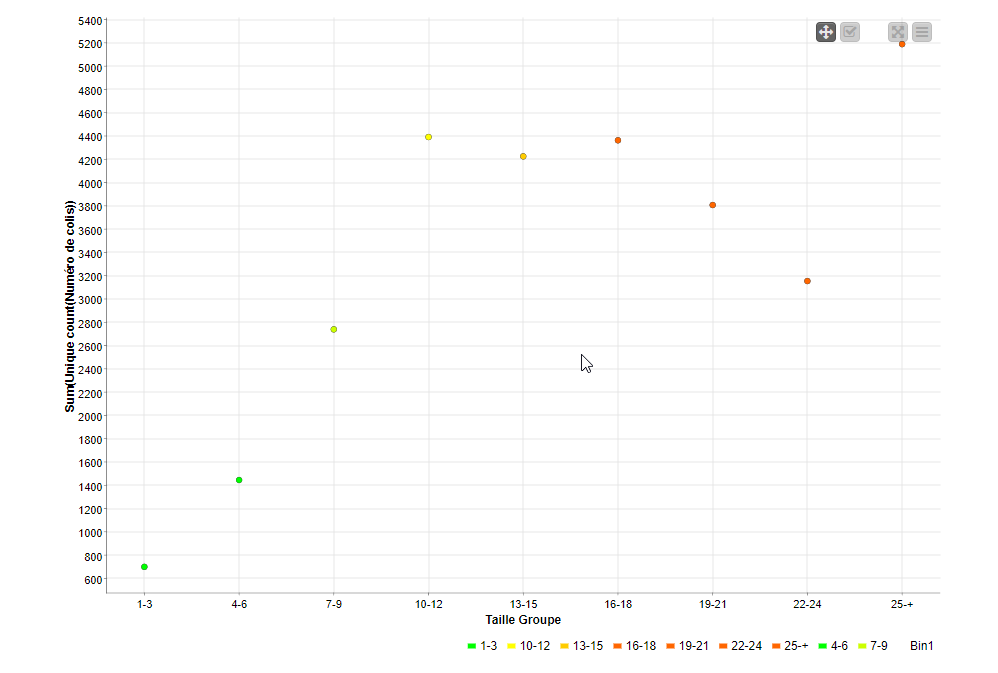
I get something cleaner however right now the colors are not the one i defined earlier…
1 Like
Hello @Appo
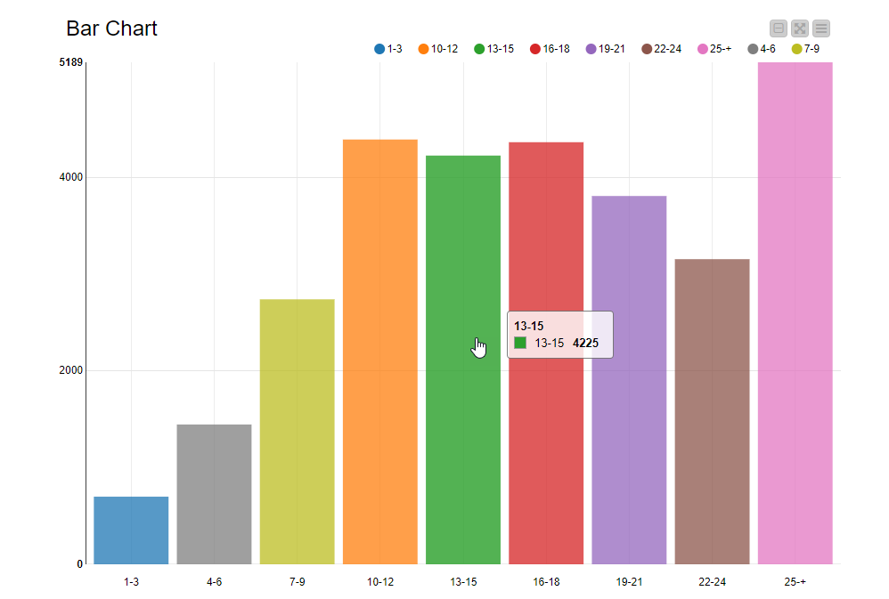
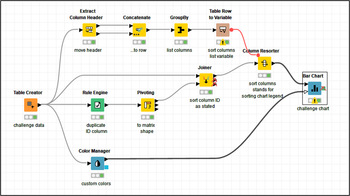
Have a look to this workflow to see, if It fits to the challenged chart.
20221104_Applying_Colors_Bar_Chart_v0.knwf (83.7 KB)
I hope this can clarify in some degree a possible node arrangement to achieve the chart, with customized colors, and a sorted legend at once.
BR
1 Like
Appo
November 6, 2022, 8:51am
6
It is exactly what i wanted, thank you very much.
Neat trick to sort the columns to rearrange the legend !
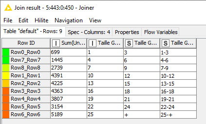
I definitely messed up on my joiner where i joined on the row id…
Cheers !
1 Like
system
November 13, 2022, 8:52am
7
This topic was automatically closed 7 days after the last reply. New replies are no longer allowed.