Hello!
I’ve tried to do a time series analysis using AutoSarima Node. I use a dataset with a span of 1 year back to predict its movement in the next 3 days.
But, I have a problem, namely, the AutoSarima Node cannot predict well.
that is hard to say without having the data and seeing the workflow. Could you share some with us?
Just maybe there is no good prediction to make and what are you considering as good?
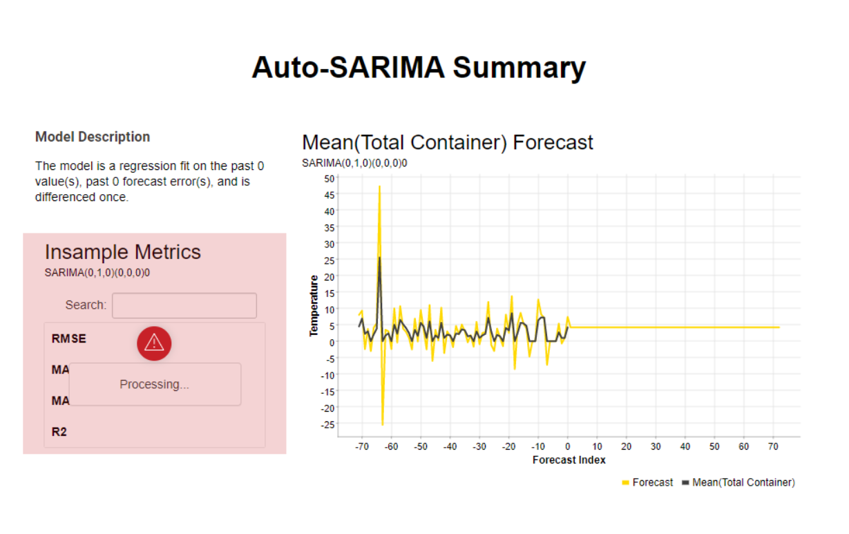
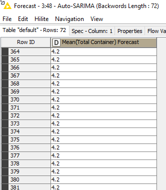
@veniapputrii I don’t know why SAutoArima makes the mistake to predict just the last value for the next 72 days:
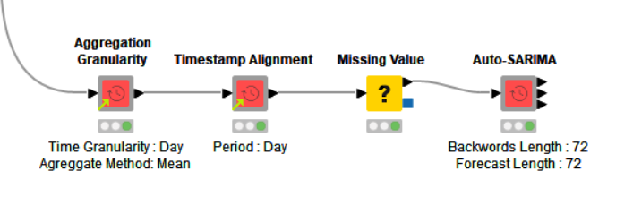
What I did is use an Auto Arima Learner and Predictor node.
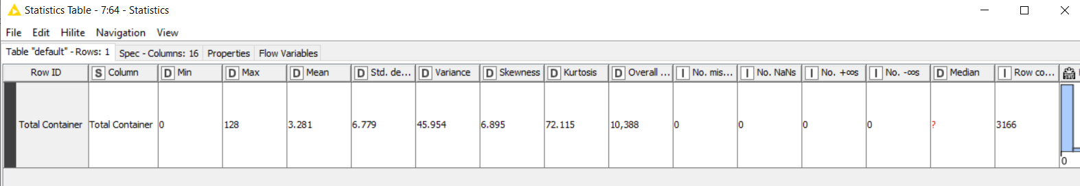
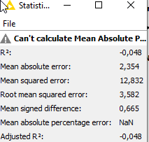
Also to see how good the models are, I split the time series and compared the predict to the real results and get the following metrics:
Which is not great when the standard deviation is 5,03 but not to bad.
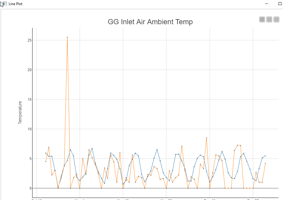
When I plot it it looks like this:
As you can see the main problem are the outliners in your data.
To be honest, its not a lot of data for such a big forecast horizon. You could try to augment to data, use different models ans so on, but I don’t thing this will make things that much better, BUT I don’t know what exactly you are looking for so thats up to you.
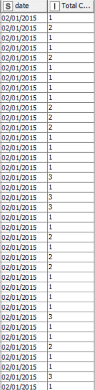
Veni, thank you for the data. It is a little bit difficult to comment definitively on your model without understanding the underlying process that generates the data. In the input data you have multiple records per day which you then average for the forecasting. Most of the numbers are integer and low valued, except for occasions when the numbers of large.
Most machine learning models assume that the input data is a continuous variable (i.e. a floating point number). When the variable are discrete (integer numbers) then there is a risk of significant quantisation nose when values are small. (i.e. the integer numbers cannot fit the best fit straight line and there is always a residual noise). This noise makes it very difficult to fit models to the data.
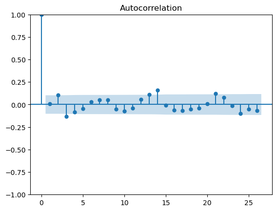
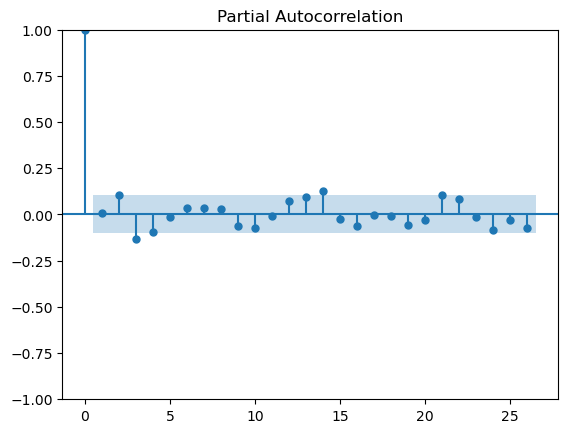
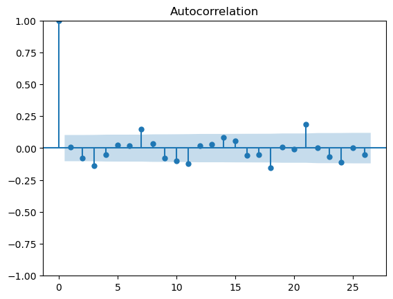
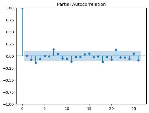
Also, without further information it is difficult to understand why you have taken the mean rather than the sum of values. Changing the calculation to sum gives a clearer time-series with a slightly more predictable pattern. I exported the data into a Python workflow and calculated the Auto Correlation (ACF) and Partial Autocorrelation (PCF) plots for both the data calculated with mean and sum (apologies, I don’t have this setup in KNIME and used the existing Python workflow for speed). This is shown below.
If the nodes are outside the blue significance band then the lag is significant. We would expect the bars for the ACF plot to diminish as the lags increase (this is used to determine the MA term) and the PACF plot to show significance for smaller lags, or at seasonal peaks.
The plots for the mean calculation
The plots for the sum calculation
There appears to be some structure in the data - perhaps a weekly/three weekly repeating pattern. However, with such small values and significant variance in the data there is too much noise to draw definitive conclusions and suggest an appropriate modelling approach.
You may need to look at how you collect data, what variables you are measuring and what you are trying to predict in order to identify the correct data and structures that will generate a meaningful forecast.