The Bar Chart node works best, if you reshape your data to have one column per year (i.e. group). I guess that would than be one row per month in your case, but I am just guessing here.
Then you can use the Color Manager node to assign colors to the column names. Finally, in the Bar Chart node, set Bar groups to Category values.
I hope this helps. If not, example data always helps to understand problems. Feel free to paste an exemplar table or a small workflow.
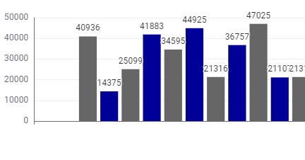
I would like to design my workflow in such a way that the end user can choose the year of the display themselves. In the example I have defined everything for 2024.
2024 = blue
2023 = grey
(the previous year should always be displayed in grey)
But if the user now selects 2023 then it should be blue and 2022 should be gray.
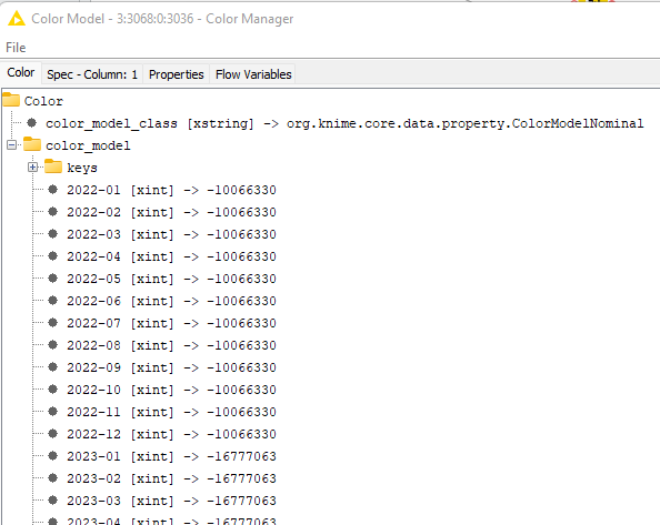
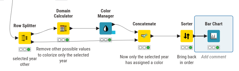
Ok, this is a bit difficult. The simplest way to solve this specific case (which came to my mind) is to assign a color only to the currently selected year and use the default color for the previous year.
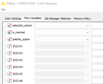
As a side note, we started to think about how to make cases like this easier with flow variables. This will take some time, but your use case is great input.
P.S. I noted that the Table View uses a different default color than all the other views and opened a ticket to fix this (internal reference UIEXT-1583).
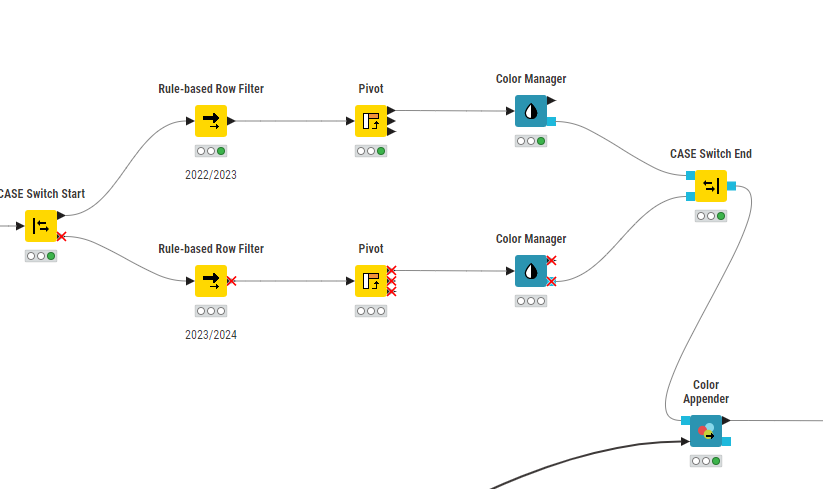
Since this report is only intended to compare two years, the number of possible color combinations is manageable. I aggregate my values with an pivot node and the result is much easier to handle. Two columns for two years and i created an “paralell dummy” where i could color my colums like i want and append the correkt color scheme to the report data. Example_Chart_coloring_solution.knwf (149.2 KB)
This report also displays many creditors which use the same or overlapping ledger accounts. bevor i used the color manager and sometimes the colors differed due to the different number of columns. Now I simply color every possible column and then apply the color scheme to the report data.
Thank you very much for your help and support in finding ideas for my workaround.