Hello there,
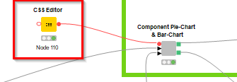
In most cases using CSS can help us only with styling what is surrounding the visualization, not the inside of it. This has to do with whether you are styling HTML tags rather than many SVG tags with no unique class. There might be a few exceptions to this (see below title inside of donut chart).
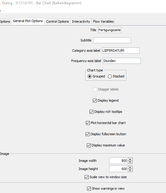
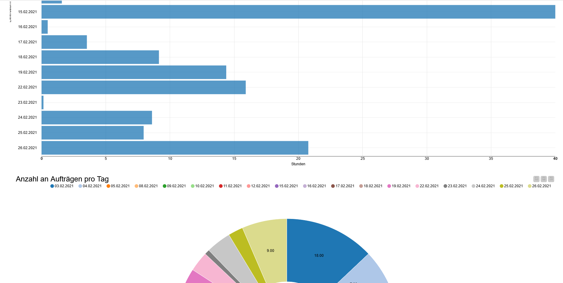
Bar Chart :
is the bar Chart view opened in a single window or in a composite view within a component?
Does the label issue happens in both cases?
If it is a single view does resizing the windows fixes anything? If in the composite view does changing the layout settings (position of views in columns and rows via the layout panel) improve the issue?
try using the node setting “Show maximum value” to fix the y axis range. Does this fix the issue for both axis?
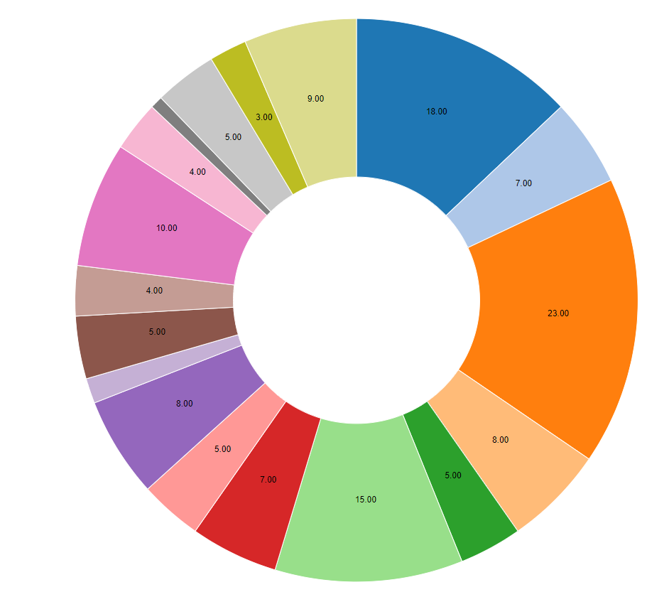
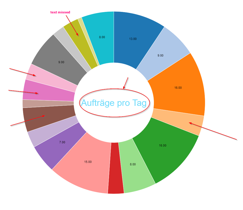
Pie Chart:
Did you try using the sunburst node instead? It is usually better designed but you need to edit it’s settings to only visualize a single categorical value and compute the number of occurrences rather than something else.
If you stick with the Pie/Donut Chart View node this should help you:
Labels on slices:
use node setting “Label Threshold” which manages how large a slice needs to be in order to have a label.
Styling title in middle of donut chart:
unfortunately not all the available classes are listed in the documentation. You might need to find out on your by looking at the code via browser dev tools. Not really user-friendly but it works. In this case this is the CSS code you need:
Both are displayed in a component-node together in a dashboard which is then
saved as HTML file and open in the Frefox browser. But the problem also occurs with the single graphics.
Regarding the bar chart issue with y axis label issue:
the x axis looks good now
I am opening a bug ticket on our end.
While we fix this please try to use vertical mode OR use shorter labels.
Currently you use “24.02.2021”. Try “24.02.21” for example.
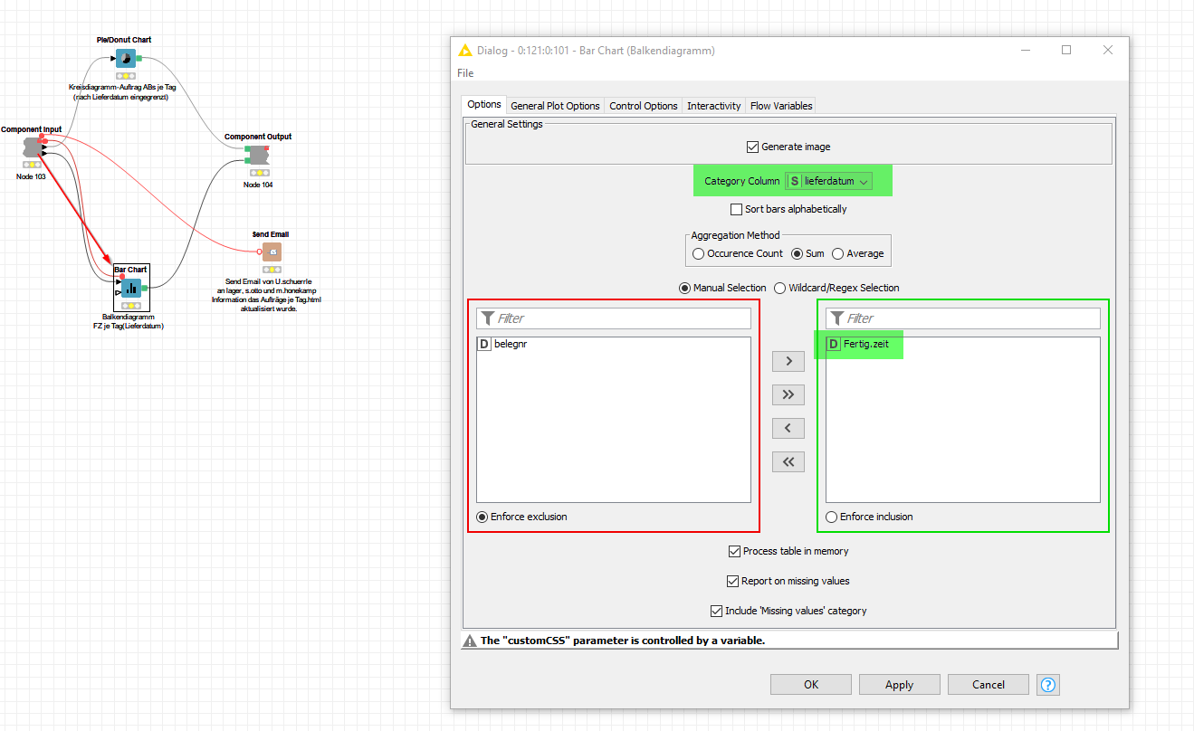
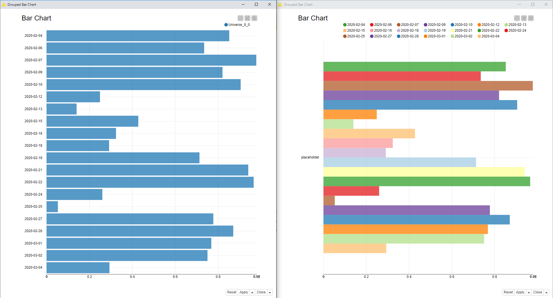
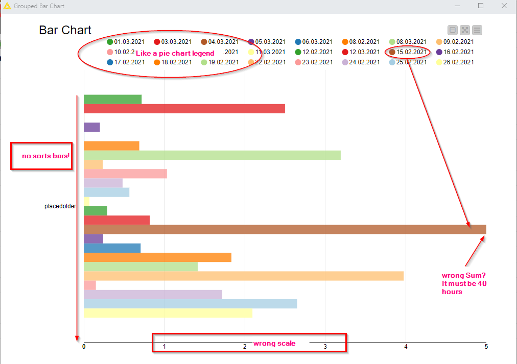
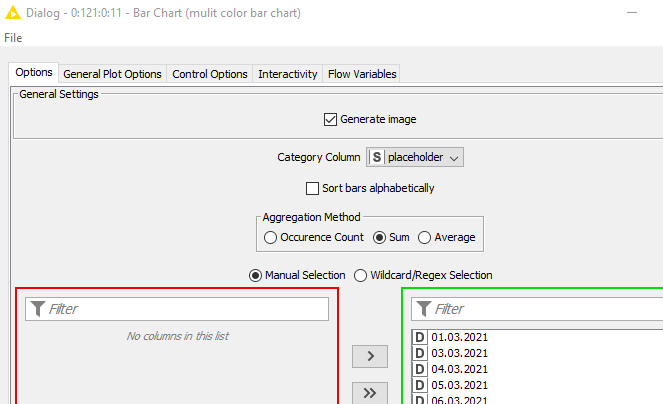
Regarding colors of bar chart
You need to learn how to use the optional color port of the bar chart and a color manager with the right palette. Example here in the lower branch:
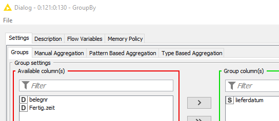
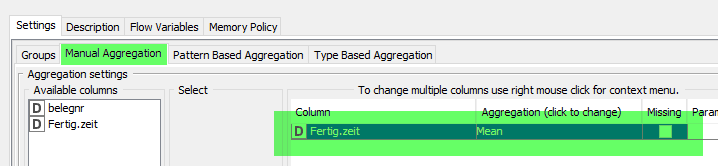
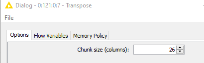
Besides that you need to use a groupby before the color manager to precompute the exact values the bar chart will display. Also a transpose node should help flipping the table as described below.
The BarChart input table should look like this:
1 row
1 numerical column for each bar
the height of the bar in each cell
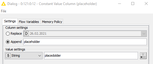
an additional categorial column with some string value as placeholder
then configure the bar chart to do partitions based on the placeholder categorical column and compute the average on the numerical columns with only one value. It is a bit of a painful workaround but it should work. Do you need an example?
Hi @USCHUKN1ME ,
sorry for not being clearer but i was not talking about the label that is the title on the y axis, rather about making shorter the labels appearing for each bar (timestamp with dates). Those need to be made shorter with a rule engine node before the actual bar chart node.
Try first the colored version of the bar chart and only then solve this shortening of the categorical values. Quite a bit will change when you will transpose the data like that and maybe it won’t be necessary anymore.
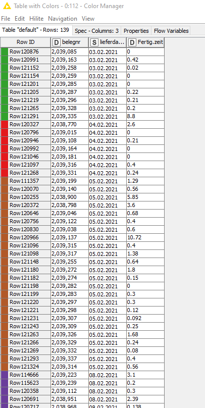
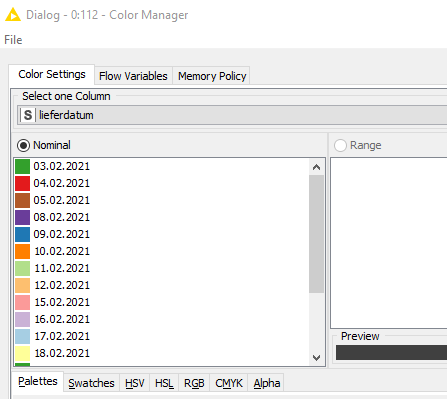
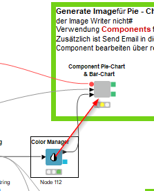
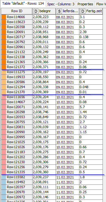
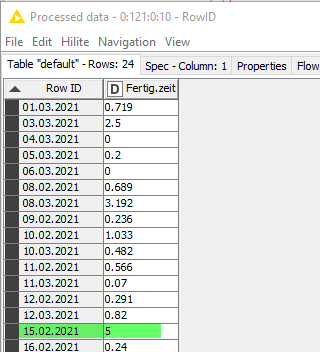
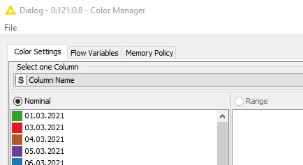
I thougt the result of the Color manager Node (table with color) is the way i want it.
Each delivery date “Column Lieferdatum” has been assigned its own color.


 perfect