data from an Excel file which is collected in a production area
it contains
where a problem occured (Place)
more than on instance possible
which problem occured (event)
more than on instance possible
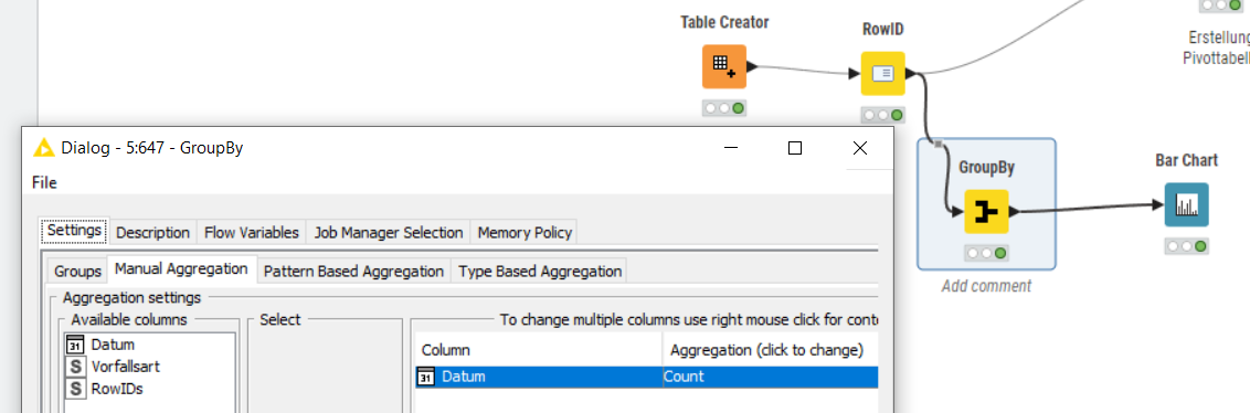
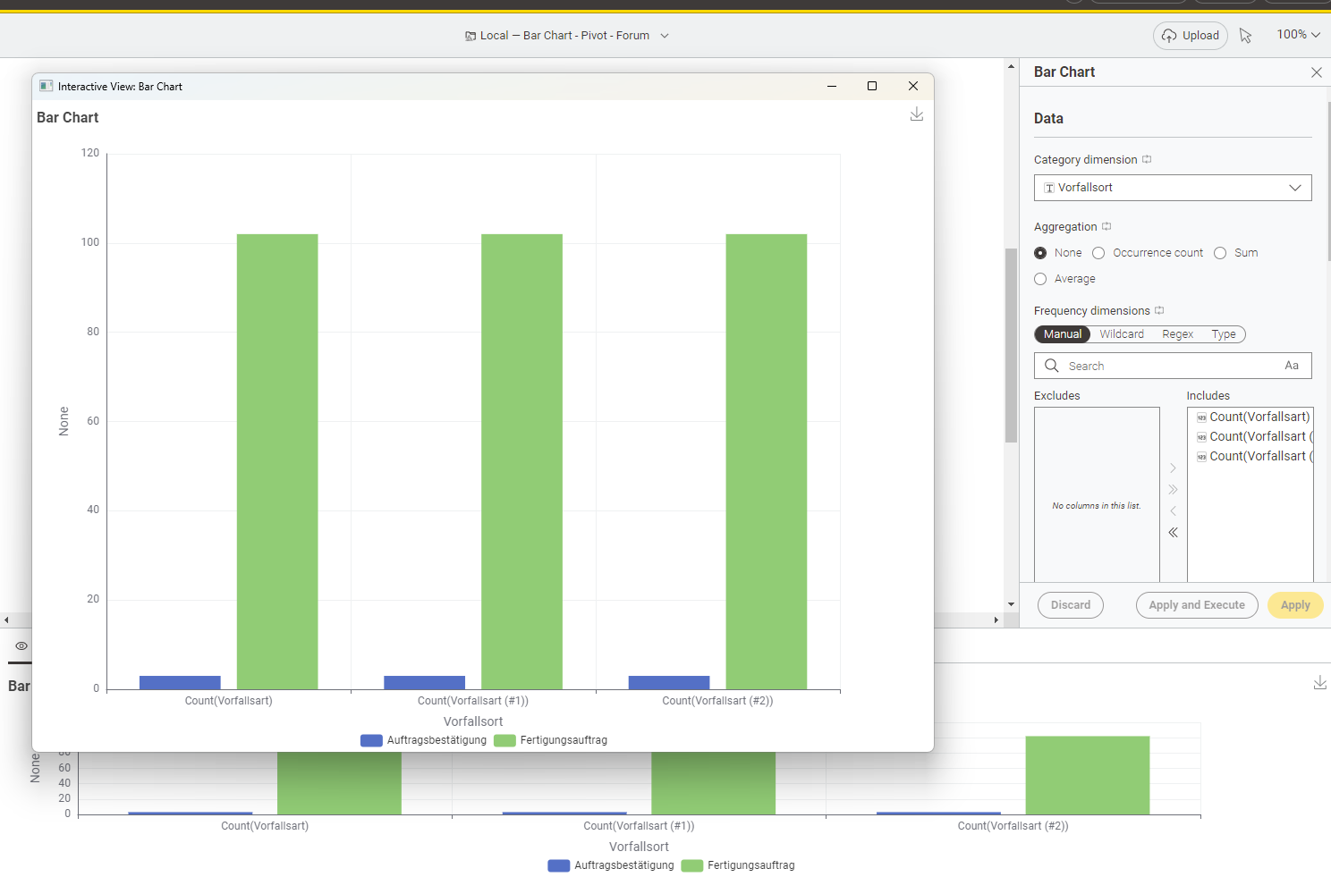
So far I have prepared the data, created a pivot table and made a bar chart for visualzation. For better understanding and a more precise presentation I would like to sort the data descending but until now I could not find a way to sort data in pivot or create a bar chart which shows data listed in a column and not in a row.
I tought I included it into the workflow… Can you tell me how I could include it so that it is available for you? I can not attach a link to the file even if I upload it to my public space.
to include some data into a workflow you can do this:
Grab a file explorer (e.g. windows explorer on Windows systems) and go to the workspace folder.
Navigate then to your current workflow.
(on my system the path looks like this “C:\Users\andi_KNIME\knime-workspace\Bar Chart - Pivot - Forum”)
Create a folder called “data” and copy the excel file into it.
Now it’s included and can be shared with someone else
thanks! But you added a table which is not related to the workflow.
Anyways.. I created one by myself which should have the structure of the table right before the unpivot node.
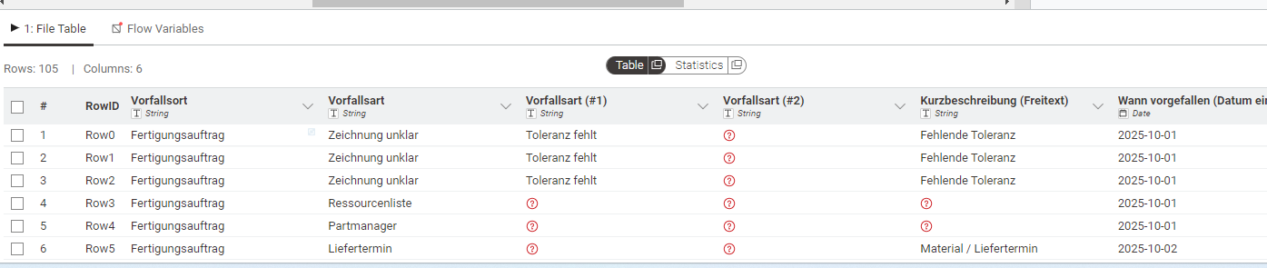
Thank you for the effort but I do have a data set which is a little bit more complex (don’t know why it is not included in the workflow - never done this before).
noch mal vielen Dank für deine Unterstützung und Geduld. Ich versuche es mal auf Deutsch zu erklären, vielleicht gelingt es mir dann besser:
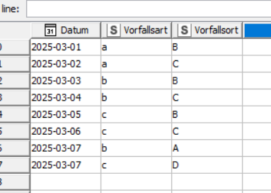
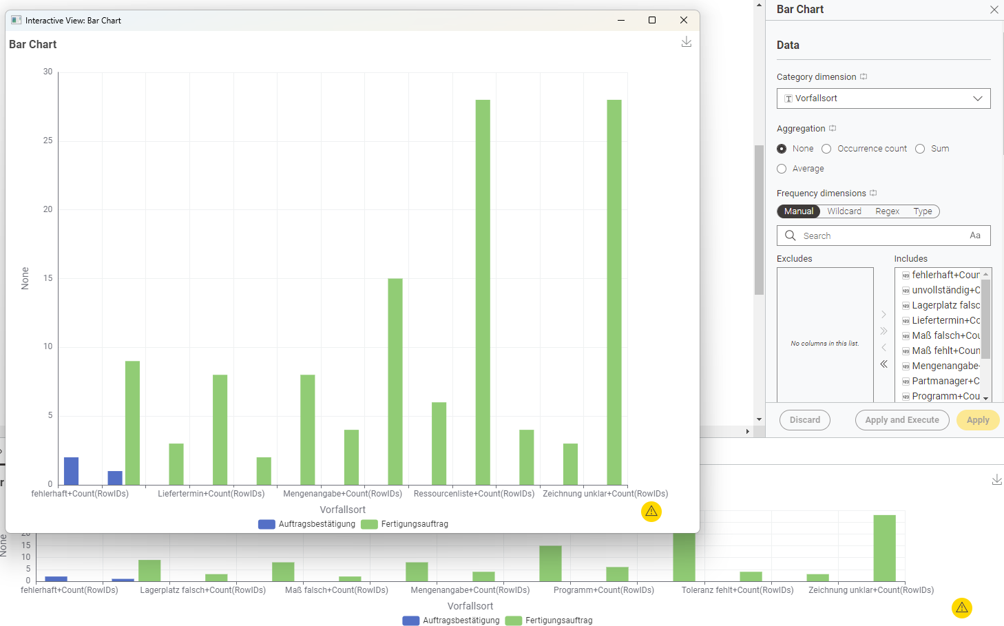
Die aufgezeichneten Daten stellen Ereignisse/Vorfälle in einer Fertigung dar. Die erste Unterscheidung in der Aufzeichnung erfolgt über den Vorfallsort (Fertigungsauftrag, Auftragsbestätigung), danach kommt die Vorfallsart (Toleranz fehlt, Zeichnung unklar,…). Die Auswertung an und für sich ist klar, habe ich gemacht und stellt kein Problem dar.
Mir geht es um eine “hübschere” Darstellung, auch um mehr Leute in meiner Firma von den Möglichkeiten und Kapazitäten von KNIME zu überzeugen, in der Form, dass ich die (aktuell zwei, durchaus möglich das es noch mehr werden, Vorfallsorte mit den dazugehörigen Vorfallsarten absteigend grafisch darstelle.
Ich schaffe es nicht, die Daten in jeder Spalte Vorfallsort separat absteigend zu sortieren, und in einer Grafik darzustellen.
Vielleicht ist diese Erklärung besser nachvollziehbar.
@GHoertner ein Ansatz könnte sein sich evt auch mit Hilfe von ChatGPT künstliche Daten erzeugen zu lassen die das Problem demonstrieren. Dann könnte man auch verstehen was ‘absteigend’ bedeutet. Dann vielleicht eine kurze Skizze welcher Ausgang erwartet wird.
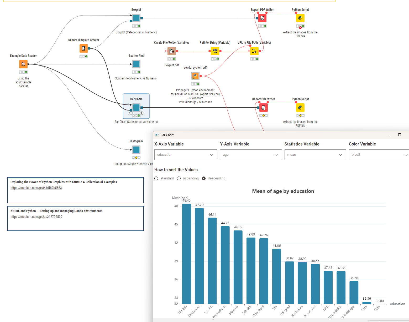
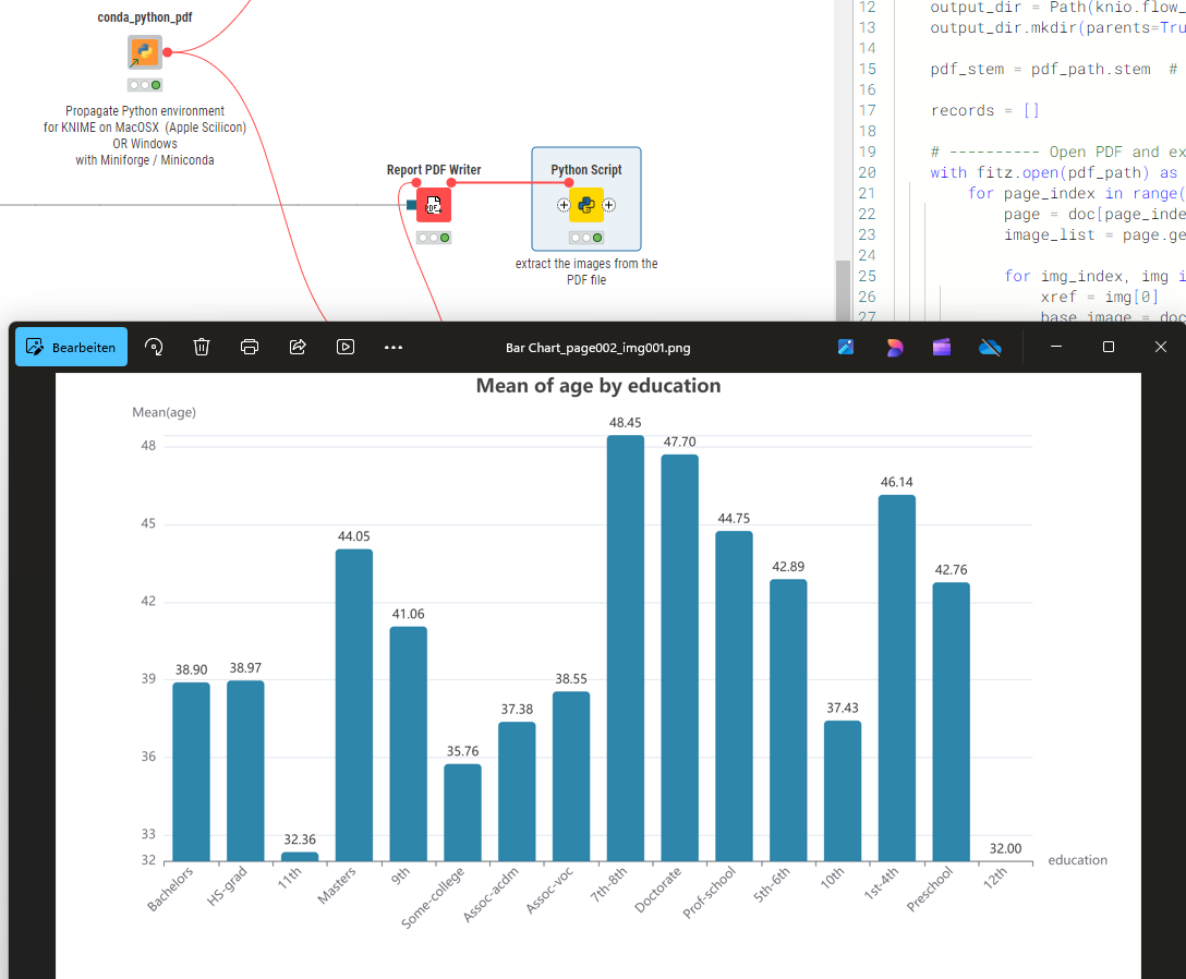
Was ich empfehlen kann ist heute Graphiken mit Python zu erzeugen und dann KNIME als Oberfläche der Teile zu nutzen die man flexible ändern können wird. Das ist einmaliger Aufwand und dann hat man das gewünschte Chart fertig.
Wenn du richtig hübsche Plots haben möchtest, nutze entweder wie von Markus beschrieben die Python Plots oder die Generic E-Charts. Beide kannst Du super mit Hilfe von K-AI oder den allgemeinen LLMs wie ChatGPT easy anpassen.
In deinen Posts konnte ich leider nicht erkennen, welche Darstellung wünschst.
Super Vorlagen und ein schönen Überblick findest du hier:
@ActionAndi this indeed is a good idea. KNIME is integrating the K-AI assistant with the E-Charts. It might be worth exploring that since they seem to be very powerful and with LLM support there might not be a need for massive coding - just chatting .
@GHoertner you could try and indeed use ECharts with Data Apps where you configure just a few things like the columns you want to use, the statistic and then the option to sort by the values.
@ActionAndi and @mlauber71 thanks a lot for your patience and ongoing support. I did not have time to try one or the other solution but I will tomorrw and will let you know if I could find a solution.