Hi all!
I really need some help How do you make a bar chart with two variables, one in each axe and at the same time being able to see the how respondents answered what… haha If it makes any sense?
E.g. I have a group of 166 respondents and two ordinal variables. I want to make a barchart showing their responses.
Hi, thank you so much for the quick response!
I´m still having a little trouble - can I send you the data set I’m trying to figure out?
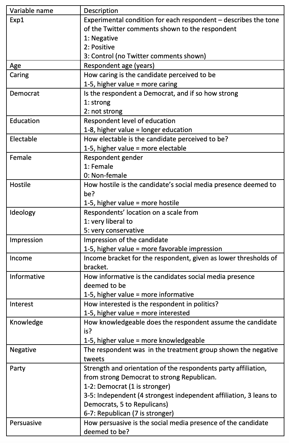
The variable called exp1 is divided into 1, 2, 3 which shows which group the respondents belong to (a positive group, a negative group and a control group)
I want to compare the positive (2) and negative (1) group and see what they answered to the variables called socialmedia (1-9) and vote (1-5). This means I will have two bar charts: one for the positive and one for the negative repondents group.
I would like to share the datafile with you, but don’t know how to share a csv-file in here haha
arhh Thanks!
I need to make the following test between some of the variables:
The variables I select for analysis should be subjected to descriptive, statistical analysis. For example, I should report measures of central tendency and dispersal.
Also I must conduct at least two bivariate analyses (e.g. comparison of means) which I tried to explain in the other messages I wrote earlier
Once again, thank you so much for taking your time to help me out!
I have checked and seems like an interesting data set you got there. Here is example workflow which can get you started with Bar Charts and your analysis. It features Bar Chart with income distribution for Negative and Positive Group. 2020_11_13_BarChartExample.knwf (75.3 KB)
For mean comparison check out t-test and/or ANOVA nodes. Use KNIME Hub to search for nodes and workflows.
 How do you make a bar chart with two variables, one in each axe and at the same time being able to see the how respondents answered what… haha If it makes any sense?