Hey I want to create a workflow which reads some data out of a database (or - if that’s easier for you - scrape the data from a website), and creates a timeline bar graph out of the data.
I have scraped data now I can’t understand how to create a timeline bar graph.
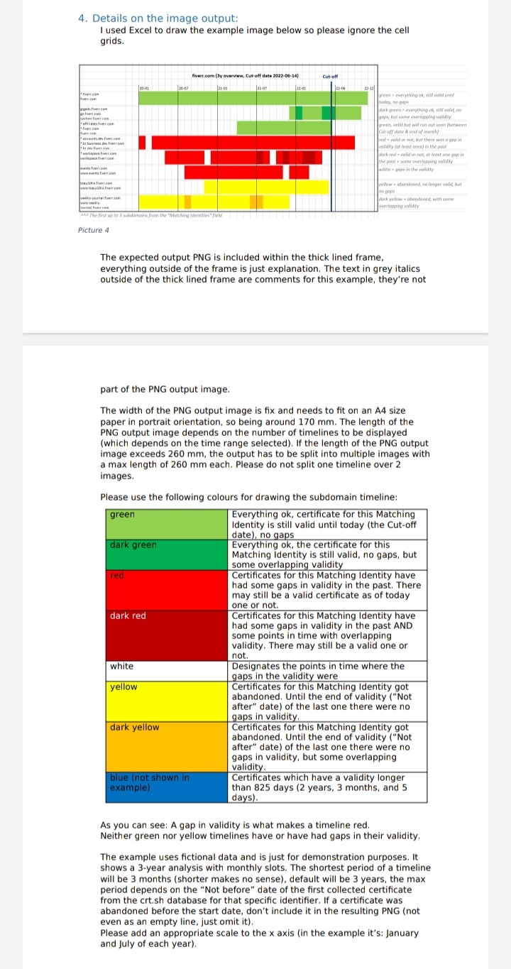
Please use the following colours for drawing the subdomain timeline:
Green:- Everything ok, certificate for this Matching
Identity is still valid until today (the Cut-off
date), no gaps
Dark green:- Everything ok, the certificate for this
Matching Identity is still valid, no gaps, but
some overlapping validity
red Certificates for this Matching Identity have
had some gaps in validity in the past. There
may still be a valid certificate as of today
one or not.
Dark red:- Certificates for this Matching Identity have
had some gaps in validity in the past AND
some points in time with overlapping
validity. There may still be a valid one or
not.
White:- Designates the points in time where the
gaps in the validity were
Yellow:- Certificates for this Matching Identity got
abandoned. Until the end of validity (“Not
after” date) of the last one there were no
gaps in validity.
Dark yellow:- Certificates for this Matching Identity got
abandoned. Until the end of validity (“Not
after” date) of the last one there were no
gaps in validity, but some overlapping
validity.
Blue:- (not shown in
example)
Certificates which have a validity longer
than 825 days (2 years, 3 months, and 5
days).
As you can see: A gap in validity is what makes a timeline red.
Neither green nor yellow timelines have or have had gaps in their validity.
The example uses fictional data and is just for demonstration purposes. It
shows a 3-year analysis with monthly slots. The shortest period of a timeline
will be 3 months (shorter makes no sense), default will be 3 years, the max
period depends on the “Not before” date of the first collected certificate
from the crt.sh database for that specific identifier. If a certificate was
abandoned before the start date, don’t include it in the resulting PNG (not
even as an empty line, just omit it).
Please add an appropriate scale to the x axis (in the example it’s: January
and July of each year).
Please add a vertical line at “today” and print “Cut-off date” at the top of it
to mark the point in time when the image was created.
Each PNG will have a header, consisting of the target name, the selected
time period and the Cut-off data (which is the date of the creation of the
PNG). The file name will be the target name plus the current timestamp plus
.png
Timelines are prepended with the first up to 3 lines of the “Matchting
Identities” field they belong to. The height of the timelines is fix for the
height of 3 lines of Matching Identities in 8 pt font, so around 50 pixels.