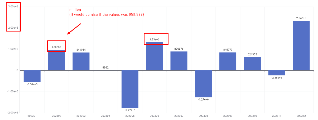
The best of both worlds would be to demonstrate the value with conditional formatting. For example, if the value is between 0 and 999.5, then display it as 99.5K; if it’s greater than 999,000, then display it as 1MM, and so on.
Since you’re using a bar chart, and in the configuration, the columns need to be in numerical style, I believe I can’t use strings.
However, if it were possible, at least displaying the value correctly would already be quite helpful.
The issue is that without information about the number formatting (like “K” or “MM”), the user won’t know if they’re in thousands or millions (I would have to explain it in the text).
One solution might be to divide the values by 1000 to make them smaller.
But I’d like to know if there’s any other way.
(However, I still think the “bar chart node” needs this improvement directly in its node configurations.)
great idea to use the K, M,… notation.
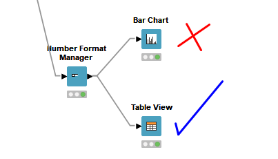
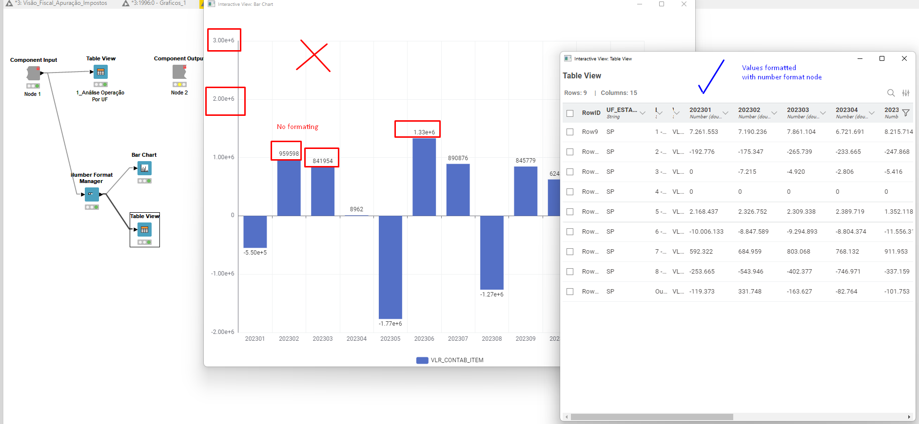
Recently, we introduced the Number Format Manager – KNIME Community Hub as a way to define how numbers are displayed (without changing the underlying data). To date, this is still rather limited and only works with the Table View – KNIME Community Hub .
There are plans to enhance this functionality (more formatting options, more compatible views), but we to not have a timeline for this, yet.
Best regards,
nan
P.S. I moved your post to the Feedback & Ideas section, such that it can be voted for.
Thank you for your response. I’ll be looking into the “number format” node.
Also, as constructive feedback:
I’ve been using Knime for about 2.5 years, and I find it wonderful. Let me briefly compare it with Power BI or Tableau.
In terms of ETL: Power BI has “Power Query,” Tableau has “Tableau Prep.” These are two great ETL tools, but Knime is far superior in this regard. With all its possibilities, executing ETL is much easier. Plus, Knime exports data to Excel, CSV, and the loops are the icing on the cake. It’s truly incredible.
However, when it comes to visualization, Knime falls short. Simple procedures and dashboard customization are much inferior.
I’m starting to understand and use Knime’s graphs, and I’m realizing it’s better to “import” the report into Power BI or Tableau to finalize the analysis. And I’m not talking about interactive panels here; static forms are still difficult to work with.
In my specific case, I’m creating a “Report PDF” using a loop by “State.” In other words, a PDF document with a header and other points. And this type of functionality isn’t available in Power BI, which is why Knime is better.
Sorry to bother you again.
I ran the “number formatting” node test, and it only worked for the “table view.”
But for the “bar chart,” it doesn’t work. It’s as if the “number formatting” node only works for certain nodes.
thanks for the nice feedback.
Yes, currently the Number Format Manager node only works with the Table View node. We plan to add support to more view nodes. I’ll add a +1 for you to the ticket (internal reference UIEXT-1680).