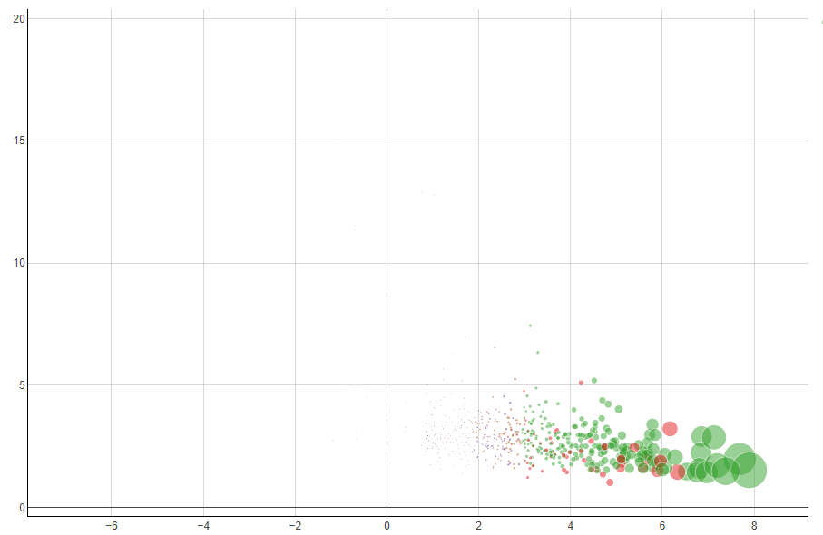
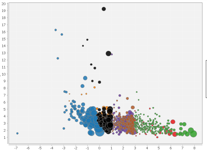
Knime has two differents nodes to generate bubble plots: Bubble Chart (Ploty) and Bubble chart(JFreeChart). This two node give different view of the bubble dispersion inside the plots.
I don’t fully understand their behaviour, in order to understand my doubts I report two snapshots of the same data plotted with the two different nodes.
In the first plot all data below “0” are invisible (bubble radii too small) but the second plot show theese data with bubbles almost of the same dimension of the green bubbles!!! Why?
The configurations of the two nodes are the standard one proposed by knime
first plot: Bubble size parameter 40
Secondo plot: Normalize the radius (in the first plot there isn’t the option of radius normalization)
The difference you are seeing comes down to how each node mathematically calculates the bubble sizes:
JFreeChart (Second Plot): The “Normalize the radius” option forces the absolute smallest value to take up 1% of the plot area, and the largest 5%. This minimum 1% floor inflates your tiny data points, making them look almost as big as the larger ones.
Plotly Chart (First Plot): The “Relative size” setting scales bubbles strictly proportional to your raw data without any minimum size limit. If the variance in your data is high, the smallest bubbles are rendered so tiny they become practically invisible next to the large ones.
Note: If you want to use the Plotly chart and still see the small bubbles, use a Math Formula/ Expression node beforehand to apply a square root or log() function (or something else) to your size column. This will compress the scale so the tiny bubbles stay visible!