There seems to be 5 standard chart types possible in Knime. I’ve created a bar chart so it shows the ups and downs as bars but does anyone know if you can define a starting point so that the chart has a starting point and end point?
I’m not familiar with charting in KNIME, but if there’s a stacked column chart you could create a second data series with 100% transparent bars - this is what I used to do in Excel (and occasionally still do) before they brought out their own Waterfall Chart type.
We don’t currently have a dedicated Waterfall Chart node, but we do have a ticket for this in our system - I’ve added a +1 from you on that ticket (AP-11833).
In the meantime, if you are not averse to coding, you could come up with something custom using the Plotly library in Python and a Python View node. For example:
When you say ticket, do you mean it’s in the process of being developed? Unfortunately I’m not familiar with Python.
Charts | KNIME Also, I’ve just seen this website which has more chart types listed than what I can see in my Knime v4.3.2 (only 5 types visible) - is this a version issue?
@susank As you might imagine, we have tickets for lots of different bug fixes and feature requests. I can’t promise when or if a particular ticket will be included in a future release, but when we add +1s based on user feedback, the developers definitely take this into consideration when prioritizing their work.
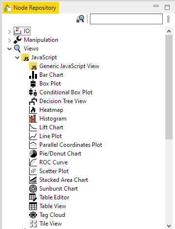
The website you found looks like it is specific to the BIRT Reporting Tool, which is included within KNIME. That said, you don’t need BIRT to generate visualizations with KNIME. Most of what you need is in the Views category in the node repository:
But there are also some additional nodes you can get your hands on using KNIME extensions, like the KNIME Plotly extension.
Maybe this blog post about creating interactive Data Apps in KNIME would be useful for you?
 I can’t promise when or if a particular ticket will be included in a future release, but when we add +1s based on user feedback, the developers definitely take this into consideration when prioritizing their work.