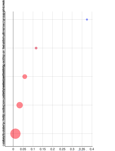
is it possible to change the orientation of the font when labeling axes in Plotly? Currently the labels of the Y-axis of my bubble chart are all on top of each other and I would like to show them horizontally (see image).
Hi,
you can do that using custom styles with the CSS Editor node. Please have a look at my post here: How to remove / change size of marks in Line Plot (Plotly). Instead of changing the color of dots, you have to find the class of the axis labels and then use the transform: rotate() CSS style to rotate the labels. However, this will probably lead to other problems, as there is not enough horizontal space for the rotated labels. For custom visualizations, I recommend the Generic JavaScript View node, you have to write your own JavaScript code, though.
Kind regards,
Alexander
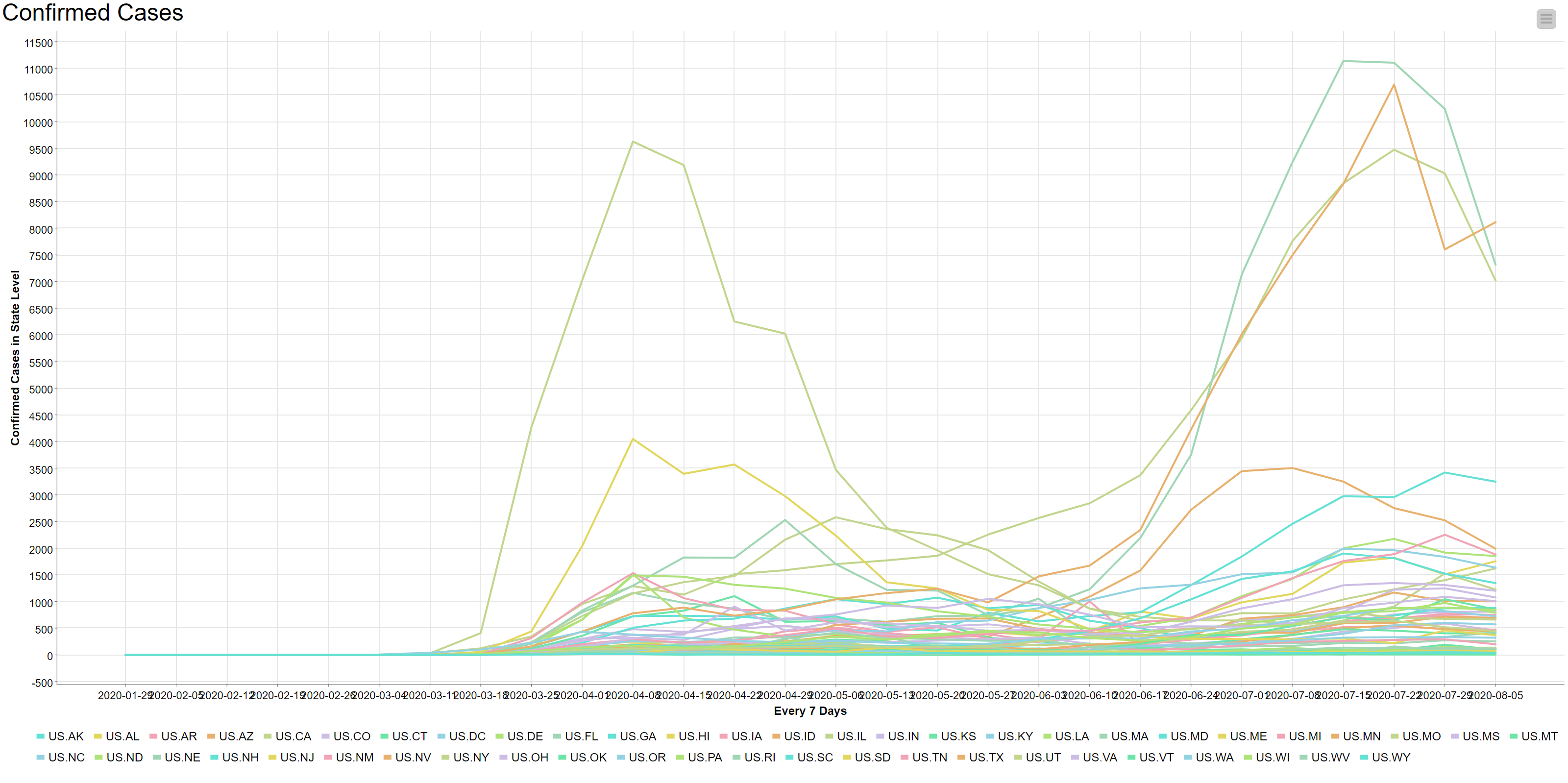
Hello @AlexanderFillbrunn. Thank you for your reply to this post and I know this might be too late for you to see but I ran into a similar problem a couple of days ago and I hope you can help me come to a quick and easy fix. My problem is the same one that @z_thiel describes but I don’t want to change the orientation of the labeling. I just want to edit the text labeling on the line plot, specifically removing 2020 from all of the labels and only having the month and date in the line plot. Please see the following figure for your reference.
If you would need any additional material or screenshots please let me know and I will be happy to provide them. Thank you so much and I look forward to hearing back from you soon!
If it helps I am using KNIME for COVID-19 research purposes and this is the same error that many of my colleagues are also facing. If you could troubleshoot this for me I could send them the instructions on how to fix it as well.
Hi Akhil,
it seems like the x-axis column is not a “real” date column but a string column, is that correct? In that case you can just remove the year using the String Manipulation node before passing it to the plot. You could use the substr() method in your expression with something like substr($xaxiscol$, indexOf($xaxiscol$, "-") + 1). This takes a substring (part of the text) starting from the position of the first dash increased by 1 (so the dash is not part of the extracted part).
If instead you can use the normal Line Plot node (not from the Plotly integration) and your column is a proper Date&Time column (you can convert using the String to Date&Time node), there is an option to format dates under the Axis Configuration tab of the node’s configuration dialog.
Kind regards,
Alexander