I have a csv file with four columns.
First column is time and it has to be plotted on x-axis
2nd column is a value which has to be plotted on y-axis let say whose scale is on right side - The style will be line chart for plotting values in 2nd column
3rd column is also a value whose values are to be plotted on another y-axis let say whose scale is on left side - The style of plotting should be column or histogram type for plotting 3rd column values
4th column has True and False labels. The values of this column doesn’t need to be plotted but I want to use them for sorting values of 3rd column, i.e. when value in 4th column is false, the plot of 3rd column is green and when value in 4th column is true, the plot of 3rd column will be in red.
I cannot figure out till yet how can I have a plot with two y-axes.
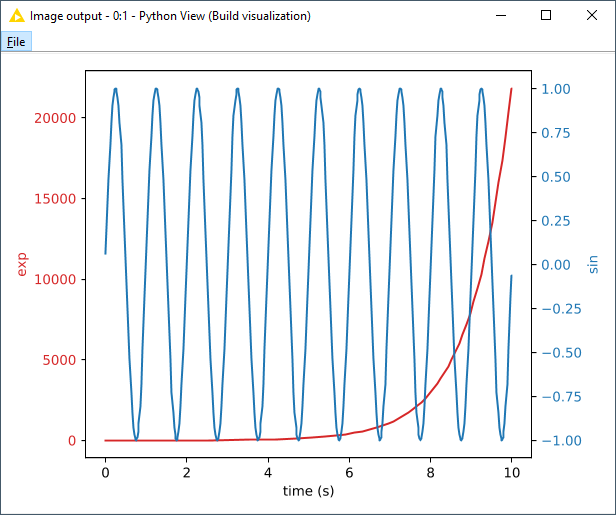
To my knowledge, there is no native KNIME node that will do what you’re trying to do. If you know Python, you can use a Python View node to code the visualization yourself.
@elsamuel Thanks
If we forget about 4th Column by supposing I have already sorted the data using two row filters, means I would have two data streams coming from two row filters. Is there anyway that I can combine two variables now ?
Yes I know python, I will give it a try for sure. Thanks for the tip
currently having 2 Y-axis on plots is not possible but there is ticket (internal reference: AP-12528) where I’ll add +1 for you. In case of any news someone will update this topic.I would follow @elsamuel’s suggestion to achieve what you want.