Hi KNIMERS,
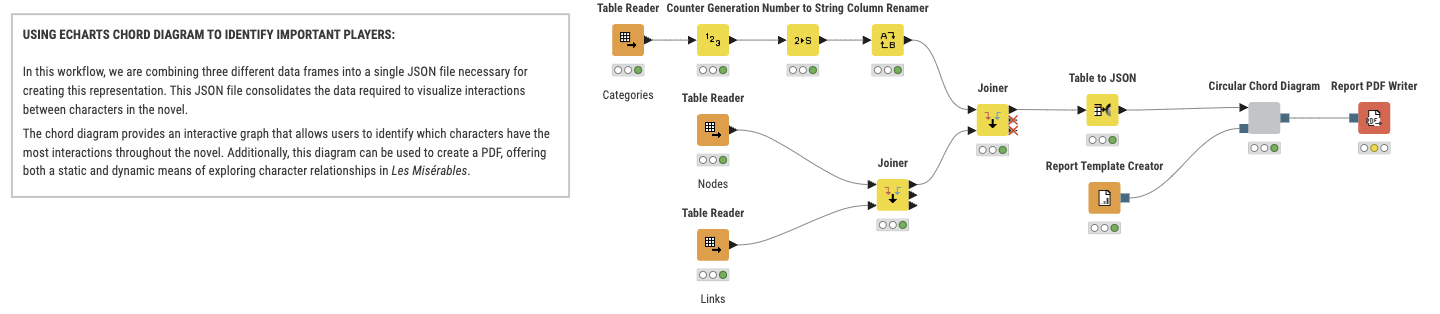
I just want to share some amazing and easy way to visualize complex data by combining the power of ECharts and KNIME.
You can download my workflow here:
Enjoy.
Hi KNIMERS,
I just want to share some amazing and easy way to visualize complex data by combining the power of ECharts and KNIME.
You can download my workflow here:
Enjoy.
This is really cool! I went ahead and moved your thread to the main KNIME Analytics Platform category since it’s more informational as opposed to a feature request (unless I’m reading you wrong).
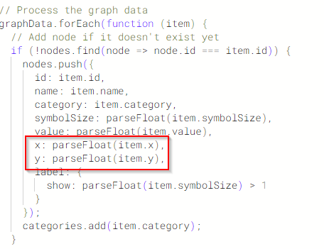
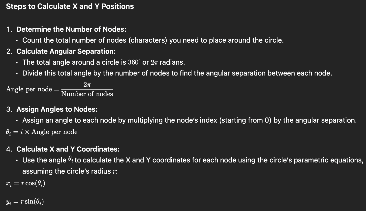
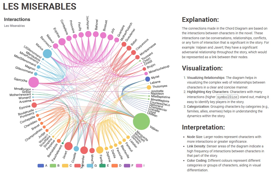
Awesome view on data - do I understand correct that the x / y columns determine the position of the different nodes? If so: Can you share how you managed to calculate the positions so that it matches up nicely in that circle?
Hi Martin,
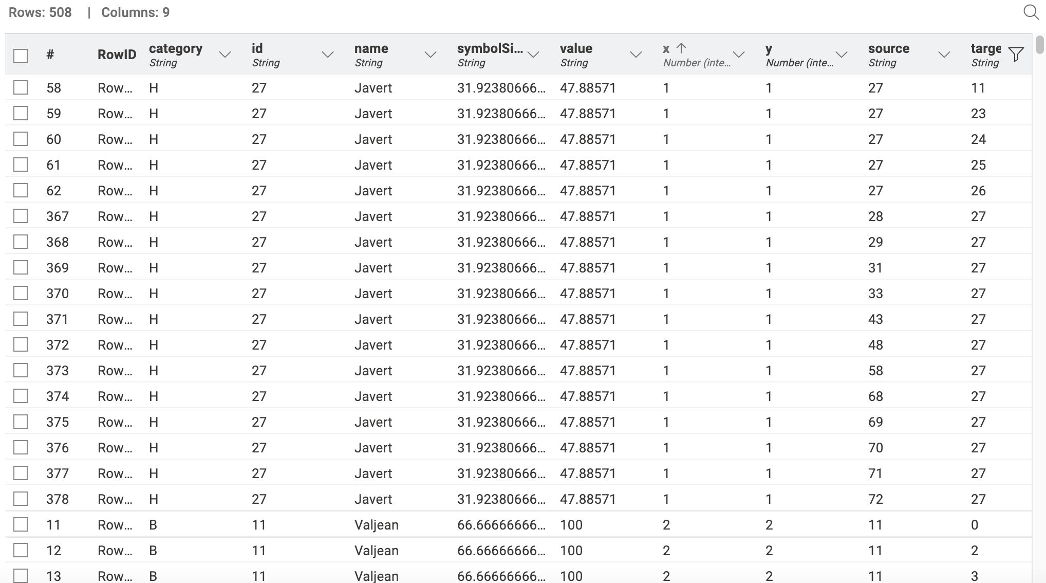
I did not prepare the data for this graph, there some available dataset that I used. However, you can calculate this using the following steps:
I hope that doesn’t make you sweat. Now, the real answer: these values are just indicators of positions and grouping. So replacing them by ordinal categories will produce exactly the same graph.
In Lehman terms. If you replace the X and Y values by 1, 2, 3 that represent the groups the result is exactly the same.
Then Final Final answer. The graph doesn’t actually require the X and Y values. ![]() you can actually erase those columns.
you can actually erase those columns.
I was looking why X and Y axis are not used and it is because they are needed for other graphs:
In that case you can calculate X an Y with a tSNE or UMAP methods if you have other factors that are not represented in the graph and you want to highlight.
Thanks a lot for investigating and providing further feedback - I was running on the assumption that its needed as I saw x / y being added to the node object in the js code, but if it works w/o x / y and the circle is auto-arranged, that makes it even more brilliant ![]()