Clustering visualization

Hi to everybody,

I am new in Knime, therefore, I need your valuable support :slight_smile:
I am clustering a time series and now I want to visualize my results. I was thinking about it this way where you have a multiple line plot of different profiles identified from the cluster. How can I implement this in Knime? Is there any combination of nodes that I can do it?

2021-04-23 13_40_11-TSrepr use case - Clustering time series representations in R – Peter Laurinec –

Hi Matthew, I don’t have much knowledge about time-series clustering, but I guess you can check the clustering algorithms that are available, such as the Knime natives ones:

image

or the Weka clustering nodes

image

Assuming that the above clustering algorithms are suitable, then you can employ the Line Plot node to compare the results.

Hope it helps

Time_Series_Clustering.knwf (90.0 KB)

Mau

2 Likes

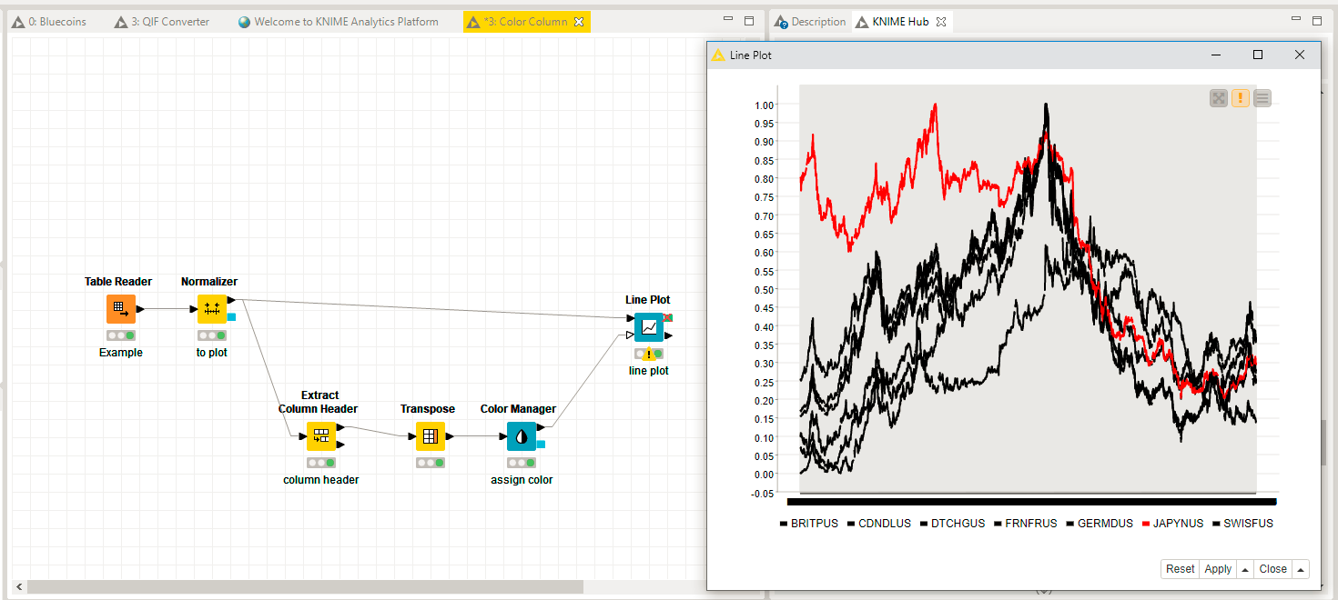
Hi @Matthew313, complementing @mauuuuu5’s answer, you can assign a color to your prototype using an idea that was suggested on this thread how to apply colors to different columns by @AlexanderFillbrunn

Color Column.knwf (802.7 KB)

4 Likes

@mauuuuu5 thank you for your response, yes I am using DBSCAN in my case and I am trying to figure it out as time series is a little bit complex as you have the time component that should be always in the visualization even though you are not clustering it (as a variable).

Thank you @iperez for your response, it seems very helpful :slight_smile:
I will try it out immediately

This topic was automatically closed 182 days after the last reply. New replies are no longer allowed.