I have a minor KNIME, but significant scientific, issue.
I have created a double y-axis line plot using Python view. (With a lot of help from the community - thank you for that.)
I lack color and legends on my plot.
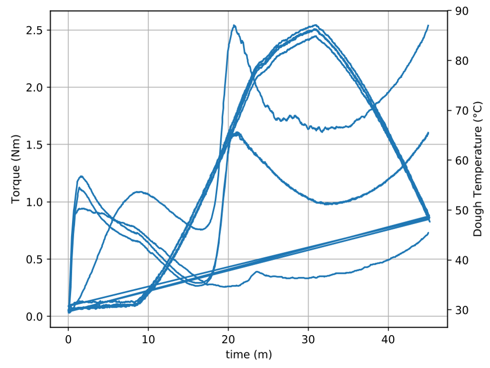
It is showing two measurements (temp and torque) from each sample and plotting them over time.
I would like to have a different color for each input. And of course shown in a legend.
Can anybody help me with that?
(Also. If anybody know why it draws those straight lines on the bottom picture, I would be very grateful. They only appear, when I plot more than one sample, but not on any of them individually)
Despite finding suitable topics on trustworthy forums, I have not been successful in implementing them.
It is always easier to discuss a working example that one can improve than study code screenshots and take a guess. Sometimes that can work buto more often it might not. So my suggestion would be to create a working example that examplifies your problem so the community might be able to help you with a real KNIME workflow. Typically then the quirks will show up.
Happy to see you again. Thank you for your assistance.
This will be the first time, I tried to reproduce my errors from a data generator, so I’m not fully aware if I’m excluding some vital information. It looks fine to me (except that the plot makes no sense).
For colors and legends it should work fine, though.
Essentially, I only added color arguments to the calls to plot (e.g., ax1.plot(t, data1, 'b'), where ‘b’ means blue), and added a legend to the figure via fig.legend(...) which takes an iterable of handles to the rendered lines (which are returned by plot) and an iterable of their corresponding labels.
It is undoubtedly me, that has expressed my self in a wrong way.
The red and blue solution I already had figured out. I would like them to be dynamic.
I would like each of my unique inputs to have a different color. Not just each of my list(/arrays?) of torque and temp to be different from each other.
I think it might make more sense, if I try to explain the normal situation.
I am investigating the connection between Torgue and Temperature in multiple flour samples.
Each of these flours should be distinguishable from each other - both in regards to torgue and temp. The only solution I can think of is dynamic coloring. Because I’m not working with a fixed number of samples each time. And giving them the same color for torque and temp will not work. Then I wouldn’t be able to tell the flours from each other.
I hope this clarified my needs and our misunderstanding.
The legend looks good. Thank you for that.
Would you happen to know, if I can control the placement of it? I would like it to be underneath my x axis text.
I can have so many different flour samples, that it will be a problem to have it inside the graph.
Your help is very appreciated, and I hope your can assist me again, now that my needs hopefully are clearer.