Hi,
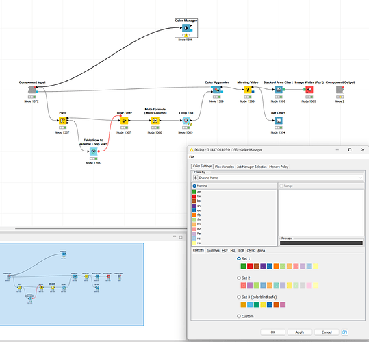
I pass the color model down the stream, transform the data for a column wise representation and append the data to the column names but it seems the colors are not appended correctly .
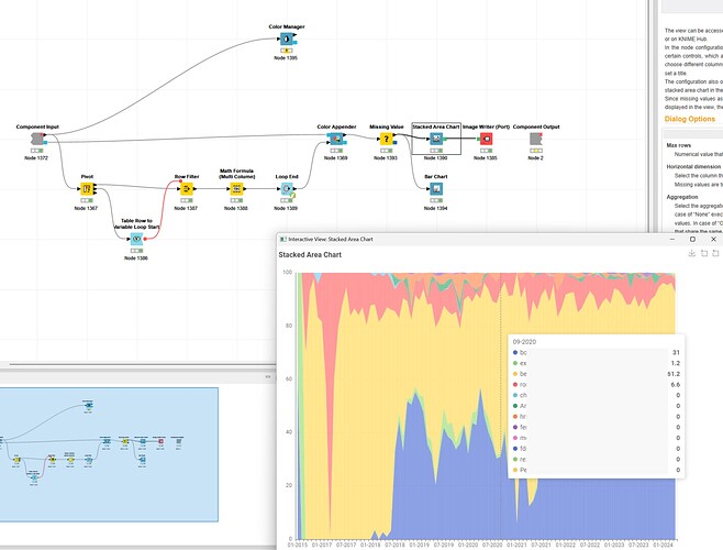
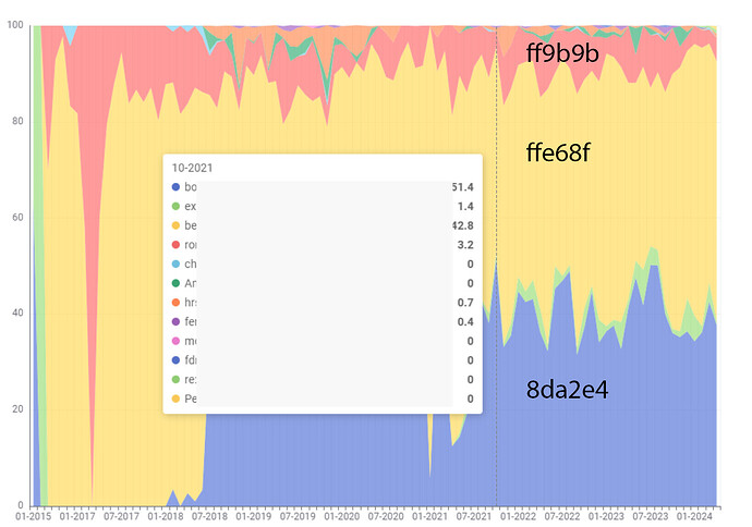
The anonymized data shows that the values / column starting with “be” should be red:
But here it is a light or slightly transparent (?) yellow.
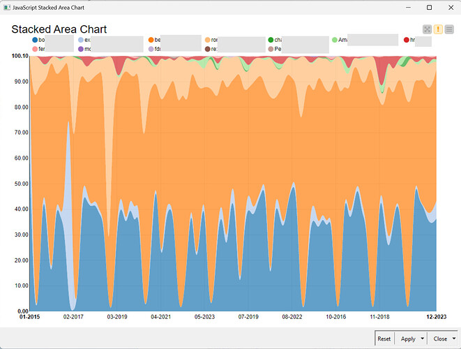
This is not exclusive to the new Stacked Area Chart as the same issue appears in JavaScript and Plotly based nodes too but all display different colors.
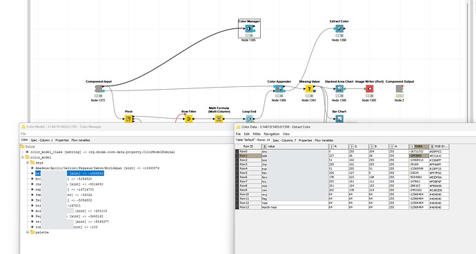
Extracting the appended color data and comparing it, it seems coherent.
Extracting the hex values what should be red “#E31A1C” is “#ffe68f”. Red “#ff9b9b” should be “#CAB2D6” and blue “#8da2e4” should be “#3366FF”.
Any idea what is happening?
Thanks
Mike
