Welcome to the forum, @NS_Kyllian.
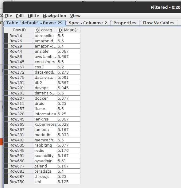
I have a dataset of numbers according to categories.
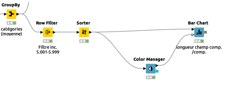
It is filtered and then sorted. […]
Second problem : range should be from number to 5.001 to 5.999 (it goes from 1 to 6)
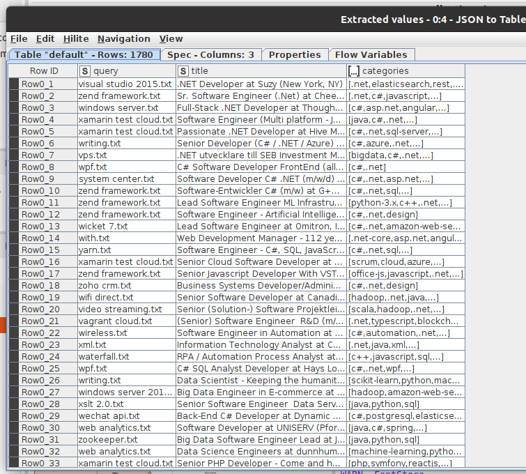
Can you share the workflow, or at least some data for us to work with?
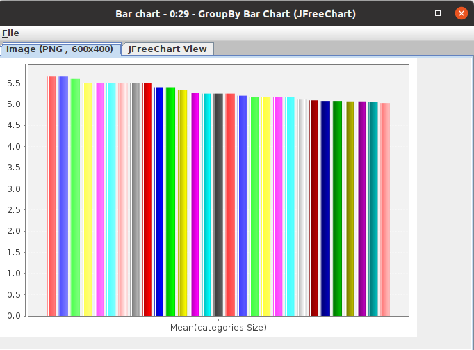
When I plug the color node to the bar chart node, it doesn’t display my colors on the plot 
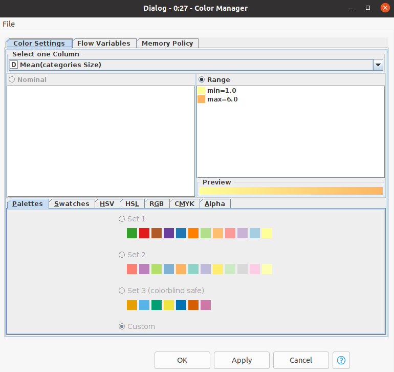
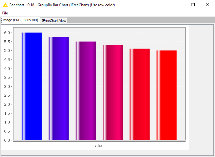
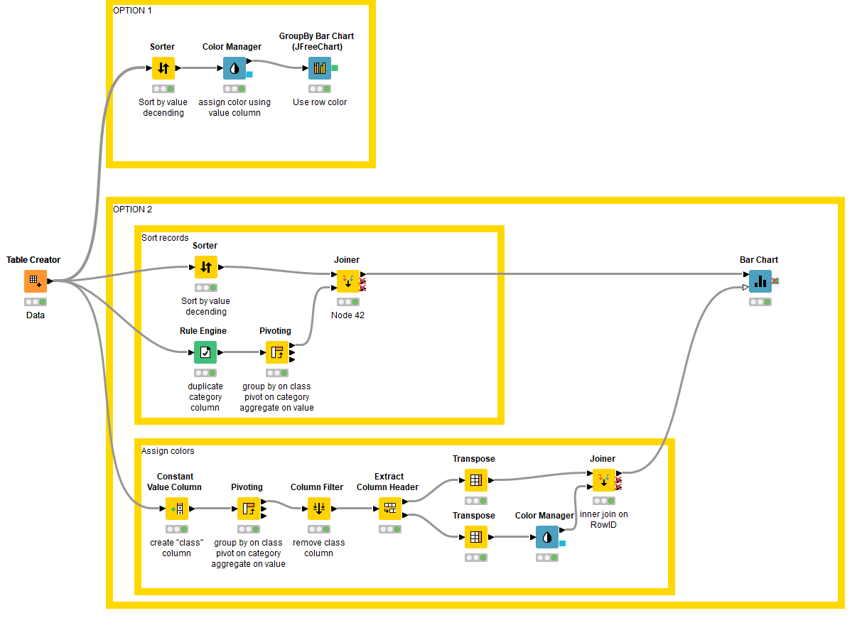
If you want to assign colors to a record based on its numerical value (as one would do in a scatter plot), then the simplest way is to follow the Color Manager node with a GroupBy Bar Chart node. Make sure that the Use row color option is selected.
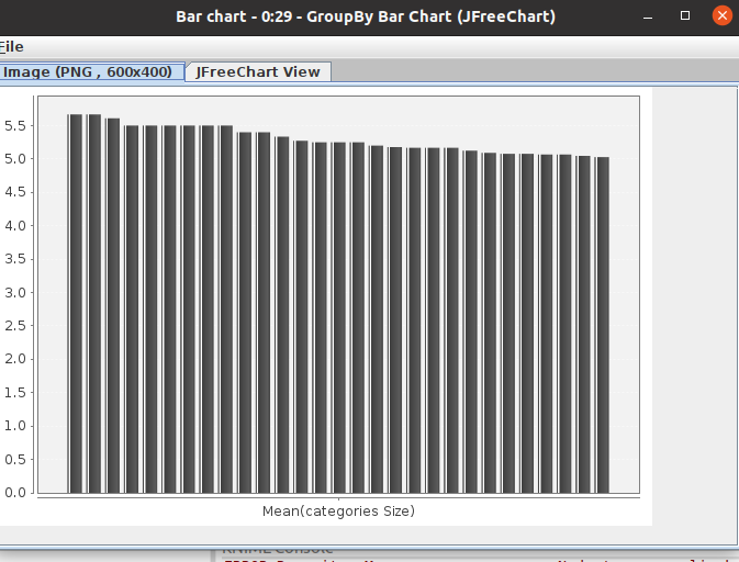
If you don’t like the way that chart looks, then I think that we need to take a step back.
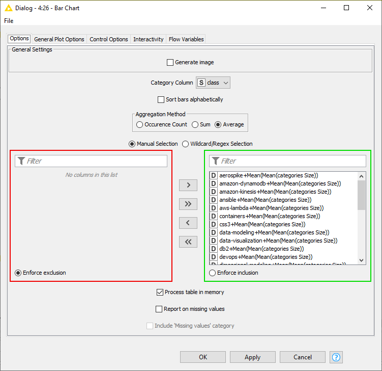
The description of the Bar Chart node for input port 1 says:
Data table containing one column with the column names of table which has in addition a color assigned.
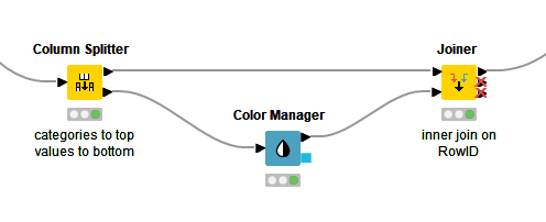
The Color Manager node alone does not satisfy this requirement. Therefore, we need to create this table which is essentially a (column header, column color) map to apply to the chart. Each column must have a color associated with it. The application of this is usually for applying colors to all the bars belonging to the same category, as a means of differentiating between categories, and the Extract Table Spec > Color Manager node approach suggested by @eamendola works fine for this.
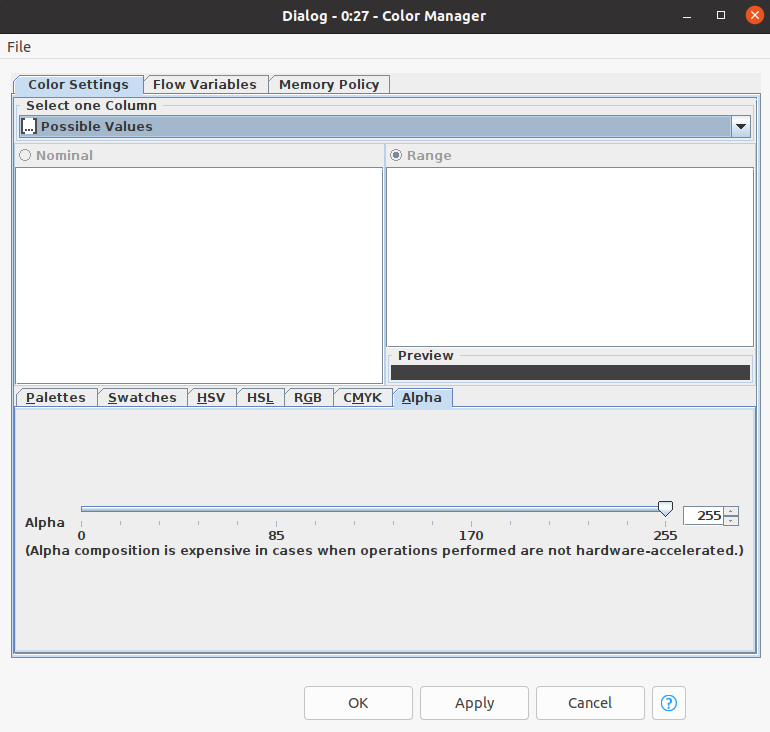
However, since you want to assign colors to a record based on its numerical value, this approach will not work. We have to do some extra creative steps to get your data in an appropriate format.
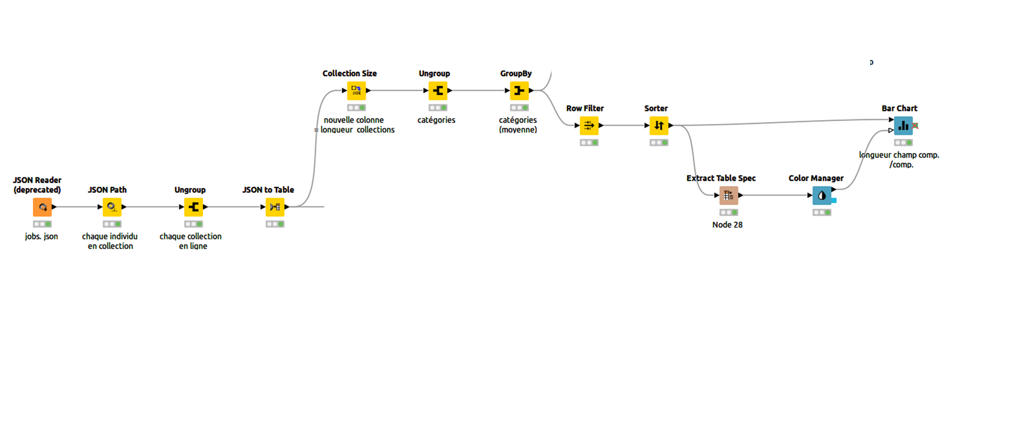
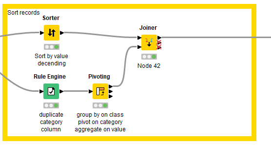
The workflow below should get you started: