Is it possible to use color manager or some other node to highlight anomalies in a chart? I want to be able to highlight a specific value on the X axis of a 3D plot so I can see what’s happening differently on that day.
Thanks!
Hi @JPorter -
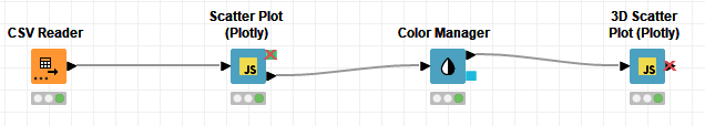
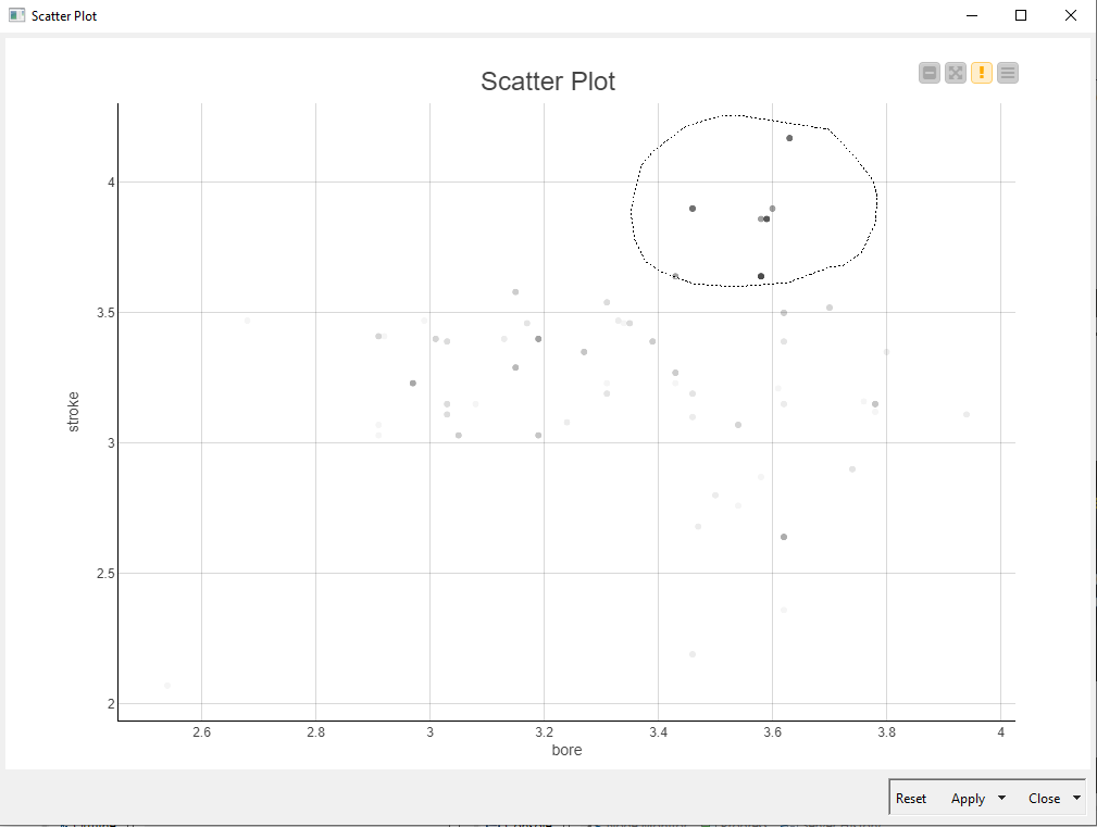
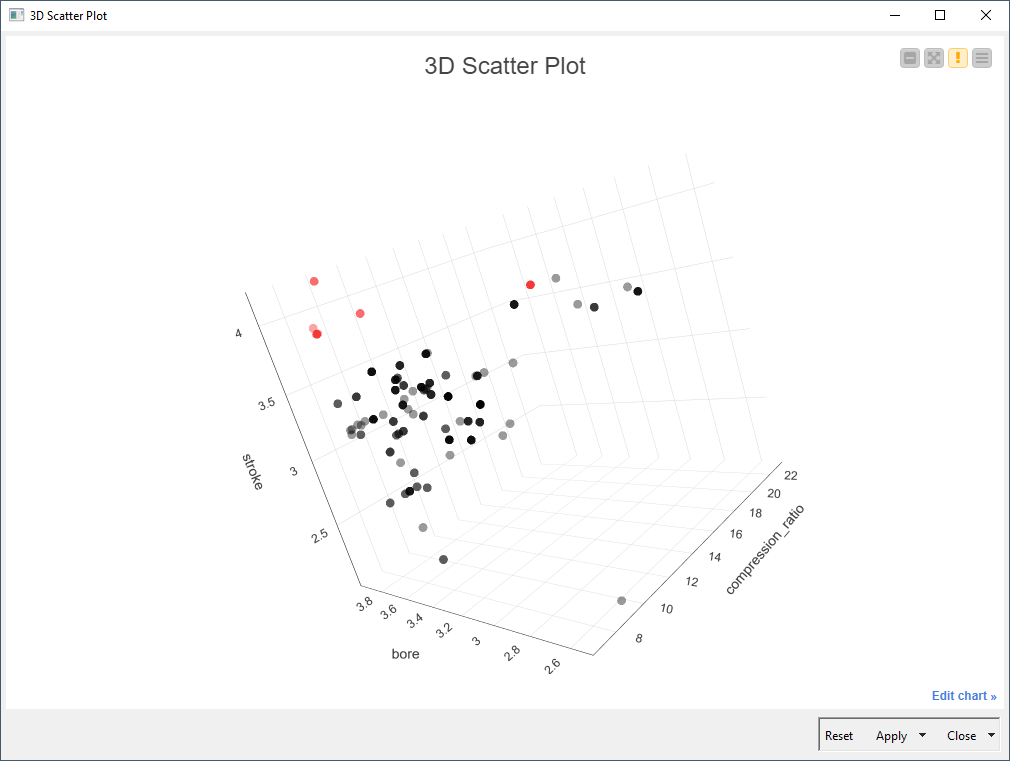
At the moment I can’t think of a straightforward way to do this, mainly because the 3D Scatter Plot doesn’t allow for interactive selection. What you could do as a limited workaround is make an interactive selection in a 2D plot first, then propagate the selections to the 3d chart.
Using the cars dataset as an example:
Maybe if you have a more specific example of what you’re trying to do we could come up with a more satisfactory workaround. Or maybe I haven’t understood your question properly at all?
This topic was automatically closed 90 days after the last reply. New replies are no longer allowed.