Hi, i’m a bit newbie but playing with boxplots i found the conditional boxplots very limiting in allowing only one numeric value and i wonder why the box plot is more limited that the silly excel boxplot.
I have for example 4 numeric values (tire pressure of a racing car) and I what to box plot them by session or buy run and i can do it bu only one pressure at time.
Hi @Riodda and welcome to the forum.
Perhaps a workflow like this would be helpful to you?
Well not really as the output is still one numeric value for 4 chategories.
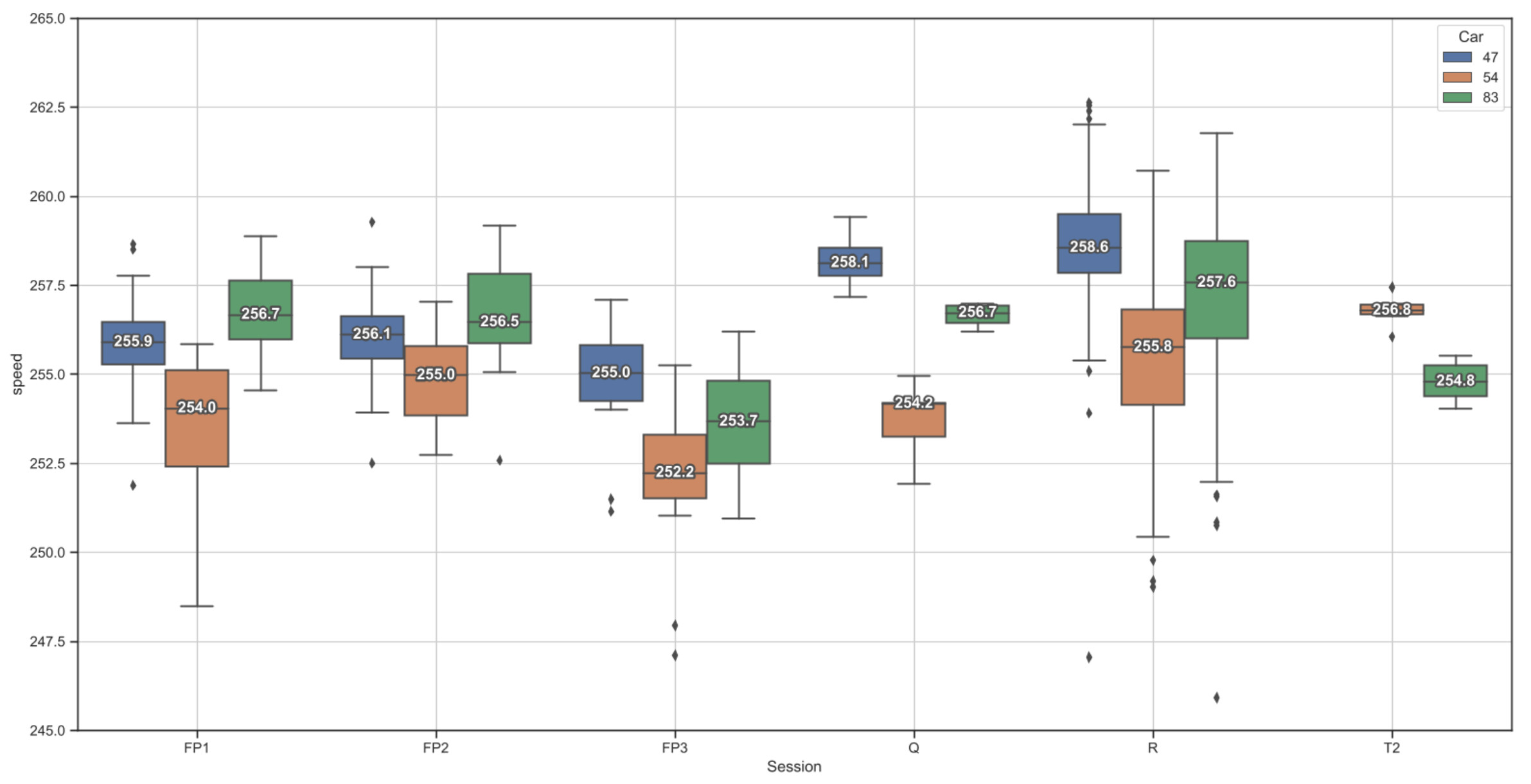
I need somethign more like this image
Where is have 4 numeric values and 6 categories

Ah, I understand. Right now I don’t believe our existing box plot nodes support that. You could most likely generate it with a Python View node using Plotly.
Yes, i’m looking into it but i was suprised that knime was with less functionality than M$ Excel !!!
I knife and forked a seabon snippet for doing what i need, i’m happy to share it to all that found the standard box plot so limiting.
from io import BytesIO
import seaborn as sns
import matplotlib.pyplot as plt
import matplotlib.patheffects as path_effects

def add_median_labels(ax, precision='.1f'):
    lines = ax.get_lines()
    boxes = [c for c in ax.get_children() if type(c).__name__ == 'PathPatch']
    lines_per_box = int(len(lines) / len(boxes))
    for median in lines[4:len(lines):lines_per_box]:
        x, y = (data.mean() for data in median.get_data())
        # choose value depending on horizontal or vertical plot orientation
        value = x if (median.get_xdata()[1] - median.get_xdata()[0]) == 0 else y
        text = ax.text(x, y, f'{value:{precision}}', ha='center', va='center',
                       fontweight='bold', color='white')
        # create median-colored border around white text for contrast
        text.set_path_effects([
            path_effects.Stroke(linewidth=3, foreground=median.get_color()),
            path_effects.Normal(),
        ])


sns.set(rc={'figure.figsize':(20,10)})
sns.set(style="ticks")
#sns_plot = sns.jointplot(x=input_table['speed'],
#                             y=input_table['LapTime'],
#                            fill=True,
#                             kind="kde")

sns_plot = sns.boxplot(x=input_table["Session"], y=input_table['speed'], hue=input_table["Car"],linewidth=1.5)
add_median_labels(sns_plot.axes)


sns_plot.set(ylim=(245, 265))
plt.grid()
# Create buffer to write into
buffer = BytesIO()
# Create plot and write it into the buffer
sns_plot.figure.savefig(buffer, format='svg')
# The output is the content of the buffer
output_image = buffer.getvalue()
1 Like
Thanks for sharing your solution! I can pass on your feedback about this node to our development team. 
1 Like
I think something interactive would be really cool.
1 Like