@BenCallisto I toyed around with my suggestion and came up with this:
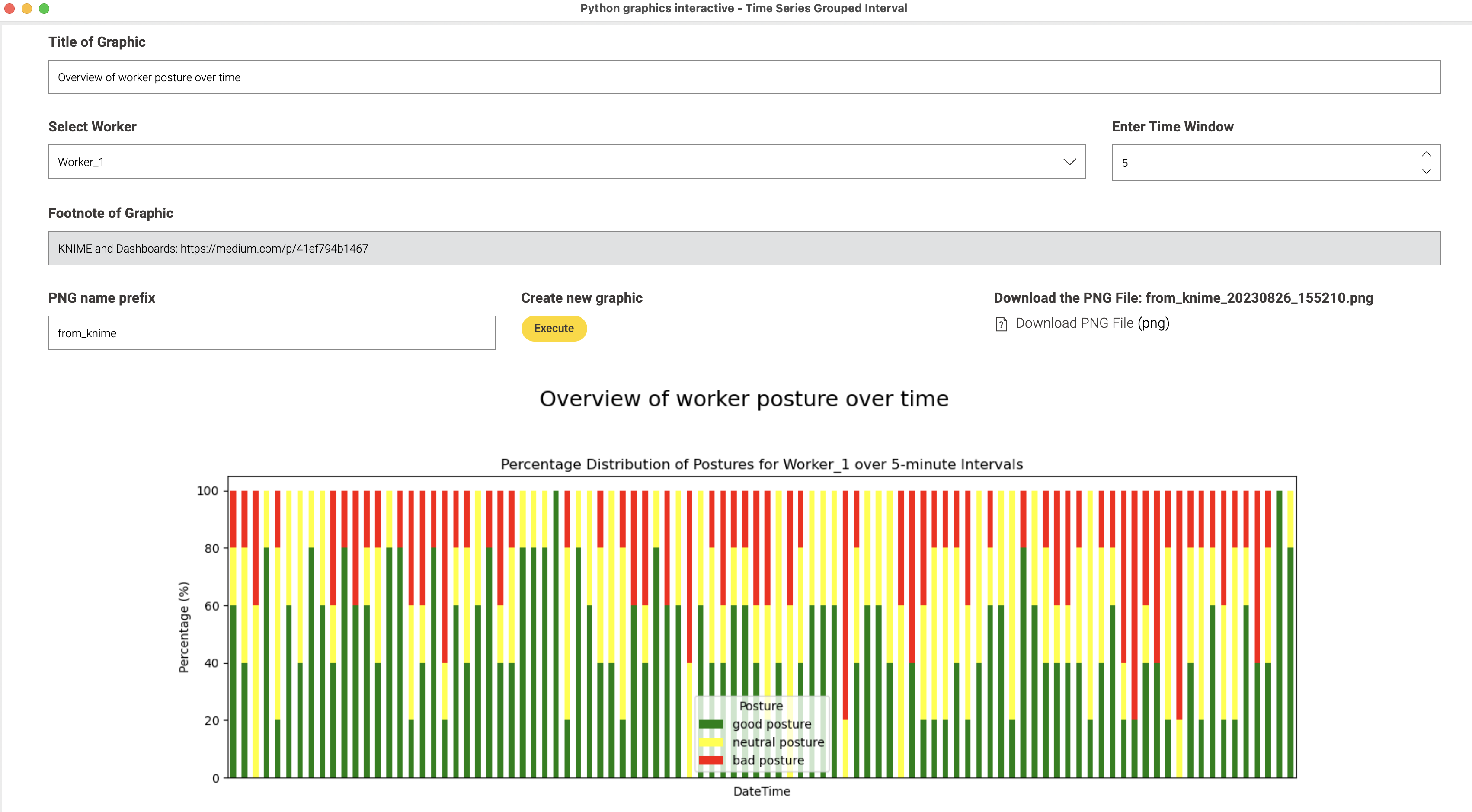
An interactive dashboard that would take three inputs: Worker, DateTime and Posture. You can configure the size of the time interval between 1 and 10 minutes (or more if you want) and then a graphic would be produced that you can inspect in the DataApp and can download with a name and a time stamp (you can set a prefix if you want).
You can change the values in the app and press the “Execute” button again and the values will change.
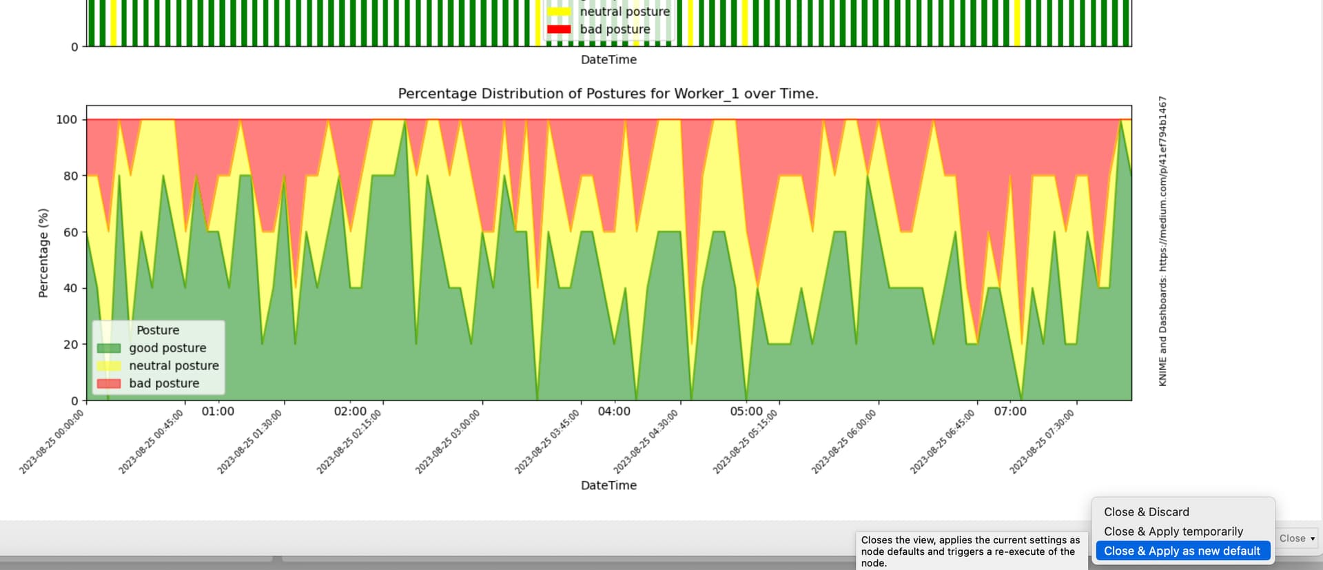
Upon closing you can store the selected values and continue with the workflow. The image also has a graphic that would show the data in a constant stream with every minute being represented:
Admittedly this has some Python code in it but most of that has been adapted from existing examples and the basic code has been discussed with ChatGPT. So it should be possible to feed the whole code into its prompt and ask for improvements and change. At the top there are some Flow Variables from KNIME being used to make the code interactive.
The widget nodes ‘building’ this dashboard look more complicated than they are. Look at this article and video.
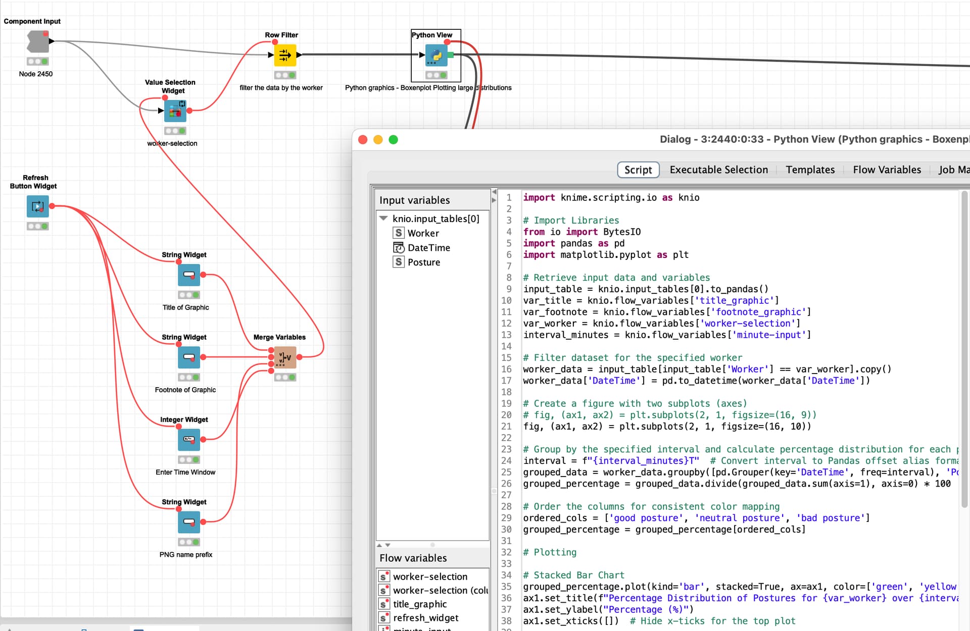
Yes this might be more than you have asked for - but if you master the art of adapting KNIME and some Python code (with AI help ![]() ) nothing can stop you in your endeavours. This could also work without the dashboard thing.
) nothing can stop you in your endeavours. This could also work without the dashboard thing.