Hello,
I have a problem.
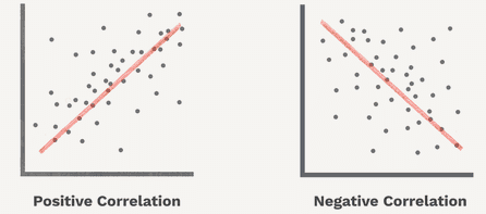
When I create a linear correlation, I want to display a plot with the correlation line and the values drawn in. Just to visualize.
I don’t know if Knime can do that at all,
so far I have only discovered the correlations matrix.
Hi Moritz,
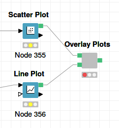
The Linear Regression Learner has a scatterplot view with a line drawn in the data. Does that help you? Otherwise I recommend you use KNIME’s R or Python View node to create the desired view.
Kind regards
Alexander
Another node you can use is the Scatter Matrix (local). It’s similar to a pairs plot in R, although it doesn’t draw in the regression line. Still, it’s useful if you just want a quick glance at relationships across several different pairs of variables.
 :
: