My teammates and I are trying to plot the correlations between our variables on Knime.
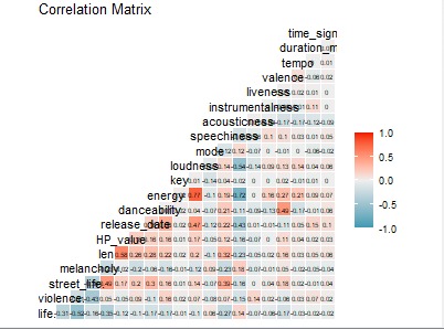
We tried by implementing the ggcorr function through the Table to R node, however we can’t find a way to reduce label text size and the output image is incredibly small (see attachment).
We also tried using other R functions like ggcorrplot and ggcorrmixed, but still encountered the same issue.
As we have several variables, is there a way to create a clearer image?