Hi,
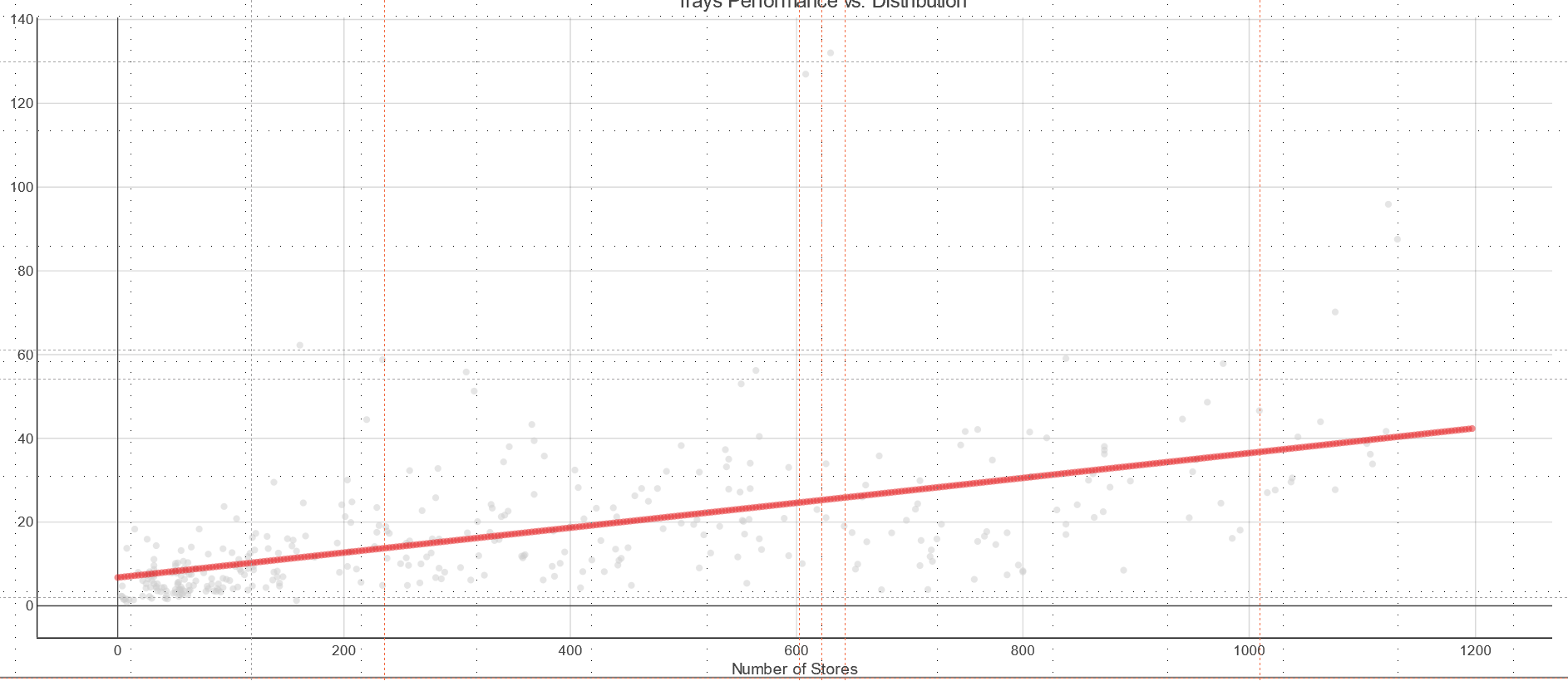
I wanted to create a chart showing scatter plot of data along with a line graph ( similar to the image). Can’t find a way to plot it?
What should I do?
Hi,
I wanted to create a chart showing scatter plot of data along with a line graph ( similar to the image). Can’t find a way to plot it?
What should I do?
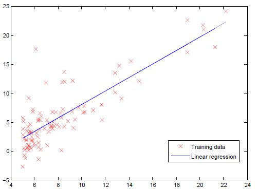
At the moment, the most flexible way would be to use a Python/R/JavaScript script to plot a scatter plot along with a line graph. In addition, if your particular use case is a linear regression, you can use the Linear Regression Learner node. Here you will find the “Linear Regression Scatterplot View” which displays the input data along with the regression line in a scatter plot.
Hello everyone. Currently we can only add the straight line to the correlation graph by Python/R/JavaScript script?
Hello @Marcelo_Linero,
and welcome to KNIME Community!
Correct. There’s a ticket in the system for it (AP-15096). I’ve added a +1 from you.
Br,
Ivan
Thank you @ipazin. +1 also from my side 
Done @gcincilla.
Ivan
Thank you @ipazin. We will be waiting for the solution.
Regards.
And another +1 if it helps
Request noted @dfaberjob.
Ivan
Kindly add a +1 for me.
Thanks!
I have often the same issue.
I end up adding a line of fake points (colored in different color) calculated with the regression coefficients.
The workflow looks like this:
On the main data table
If one adds a lot of points… they look like a line. But it’s a very poor solution.
Hope it helps
Ludovico
Done @zioludo.
Care to share workflow @zioludo? Maybe someone (or you if you want) can make a generic Component out of it and share it so others can benefit from it until proper solution is available…
Ivan
I will do! But please add +1 for me as well!
Tnx @zioludo. Request noted 
Ivan
I have developed a simple component that does the trick… with minimal configuration.
You can find it here:
(Can I upload the component only?)
Hello @zioludo,
nice one!
Yes you can. See here for more on sharing Components:
https://docs.knime.com/latest/analytics_platform_components_guide/index.html#sharing-components
Br,
Ivan
Done!
This new component converts the dots in a line.