Hi there,
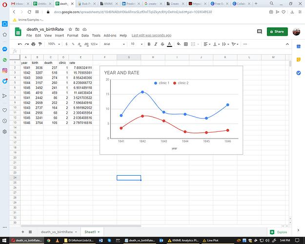
I have created my required graph in google sheet, see attached file
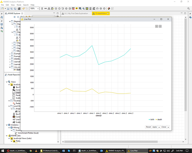
but I am unable to create the same graph in KNIME Analytics Platform, see attached screenshot.
Also csv file attached, please be so kind to let me know what mistake I am making in KNIME Workflow.
I am looking forward to hearing from you.
Many thanks,
Hi @raomohsinkhan ,
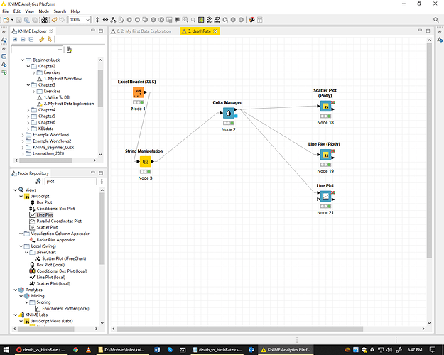
In KNIME you need to have the rates for the different clinics in different columns. The workflow reshapes your data and plots in a line plot.
Best
2 Likes
Hi Kathrin,
Thank you very much, it’s working fine. can you please let me know how to control x-axis values
I correct this by scrolling out. but by default it show round values.
Many thanks,
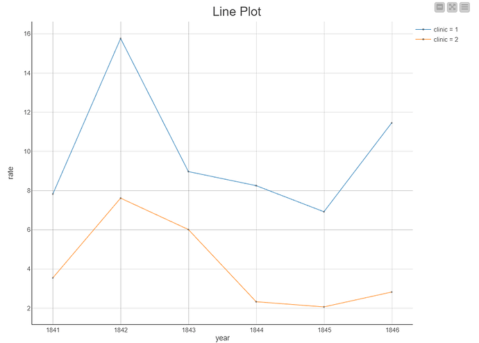
hello @raomohsinkhan the workaround here could be using the line plot plotly https://hub.knime.com/knime/extensions/org.knime.features.js.plotly/latest/org.knime.dynamic.js.v30.DynamicJSNodeFactory:635393c4
please find attached the image using this node, hope it helps answer your query
thanks
Please find the workflow here
1 Like
system
April 14, 2021, 2:54am
8
This topic was automatically closed 182 days after the last reply. New replies are no longer allowed.


