Hi there,
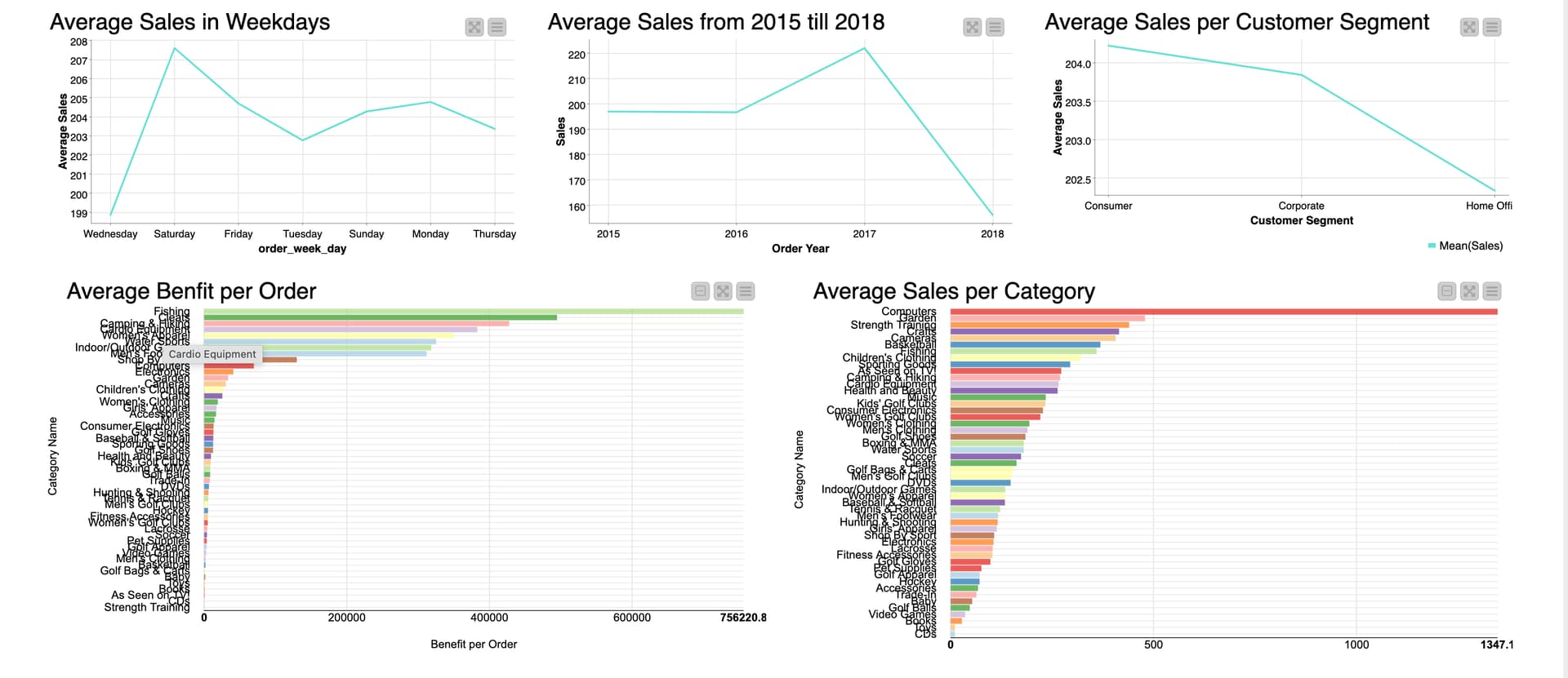
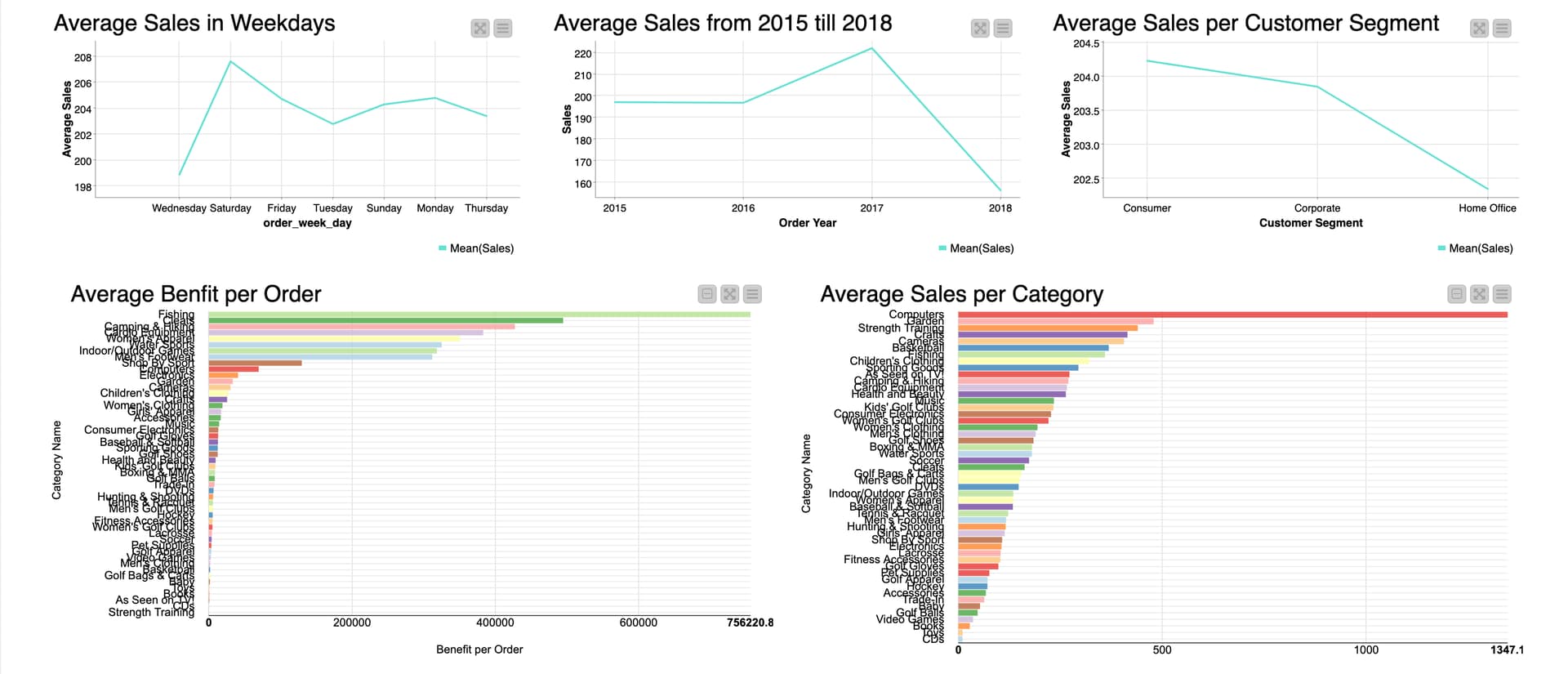
As you can see at the screenshot, the first 3 line plots are display in different sizes, How can I fix this?
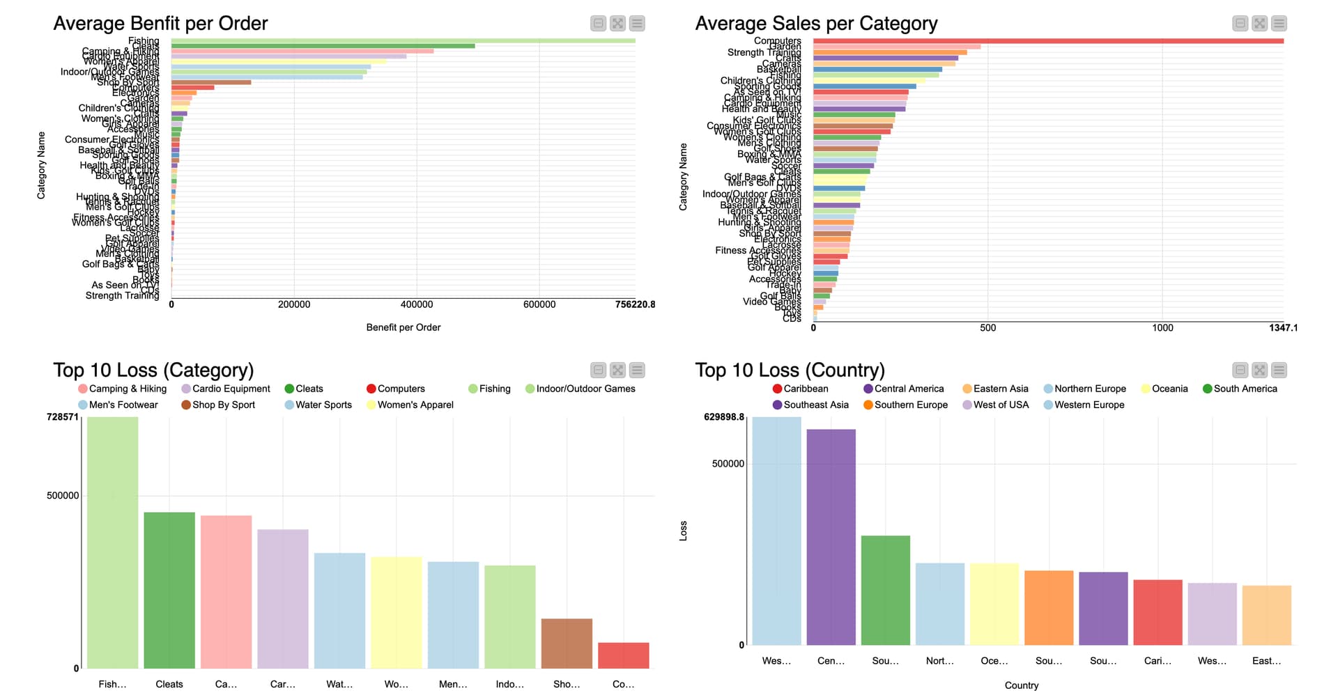
For the Bar charts, are there any suggestions to fix the names mixing up, without changing it displaying horizontal? (I tried the configuration on the bar chart itself to change the hight, but it doesnt change anything)
Hi @ppeng ,
You can try to adjust the layout of the composite view when you create the dashboard.
We have a guide on DataApps for beginners, and in this document, if you check step 5, it shows how you change the layout of the composite view.
@sanket_2012 thanks for helping out! But do you mean by to change the “display order”. Because I would like to make it stay this way and still trying to figure out why the bar charts aren’t having the same height