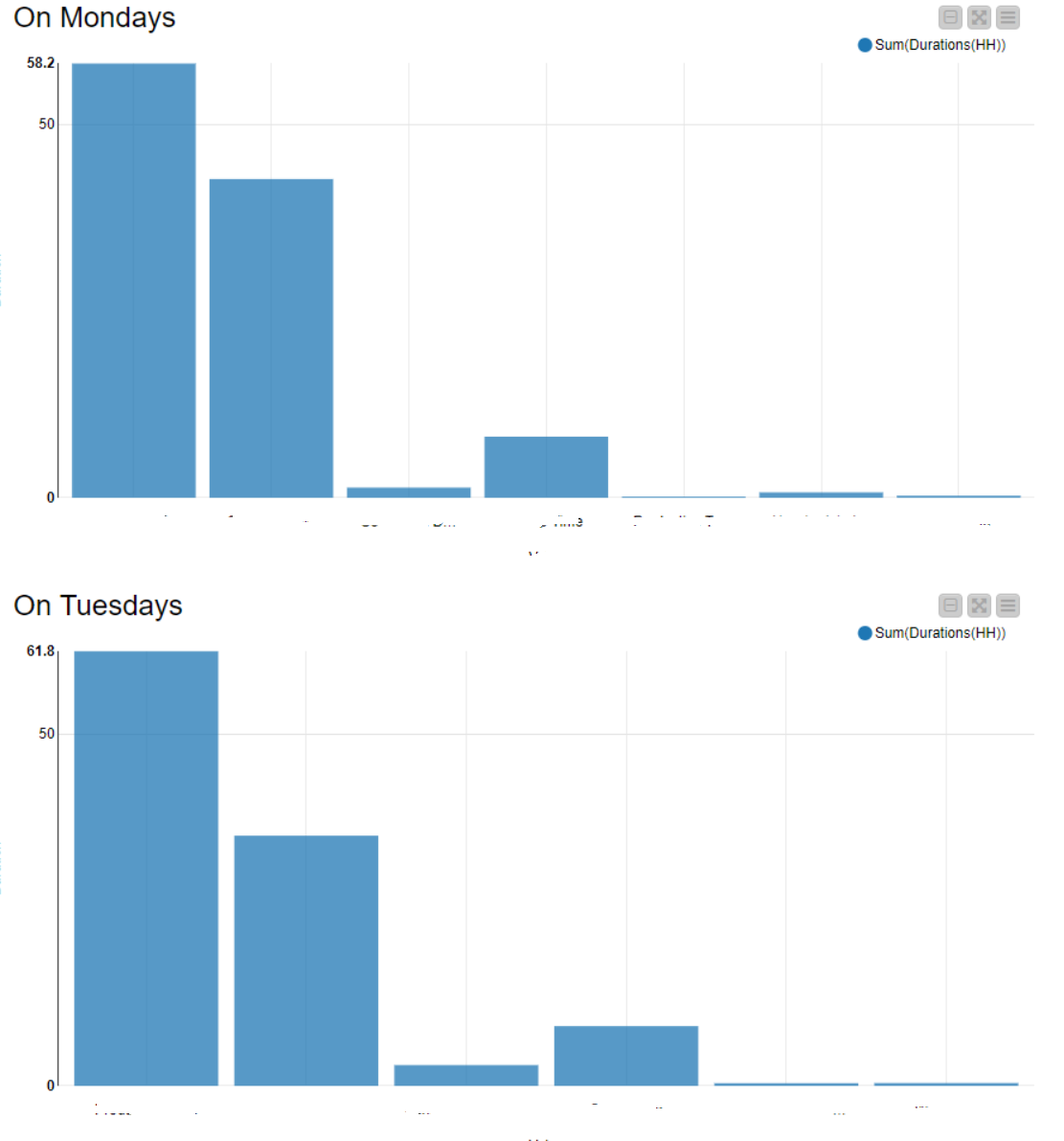
As you can see, I have a couple of values that get aggregated per Weekday (e.g. Sum Production on all Mondays / all Tuesdays and so on…).
Now I want to display the same aggragation for other values. For example I also want to have all Production Amounts (Good Parts / Bad Parts / Total Parts) per weekday.
To avoid getting an enormouse dashboard I would like to reuse the existing dashboards. Therefore i implemented a “Single Selection Widget” with a dropdown-list containing the possible options.
So basically the workflow I want is:
User chooses Value-Categories to display
Choose the relevant Columns for bar chart (this is where I am failing)
Filter per weekday (already existing)
Generate each bar chart (already existing)
So mostly it’s step 2) that I am failing on. I think I need something like a CASE-Switch. E.g.:
IF SELECTED == “production amount” → THEN: display columns Good Parts / Bad Parts / Total Parts.
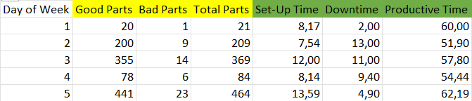
I already created a Table containing all values summed up per weekday (5 rows (one per weekday) and 18 columns containing the sum of the categorie at this day).
I can’t share the original data but I will provide a simplified version that follows the same structure
This is a simplified version with fake data:
To make it more clear I colored those columns that belong to the same Bar-Chart-Version. Day of Week is always the X-Axis.
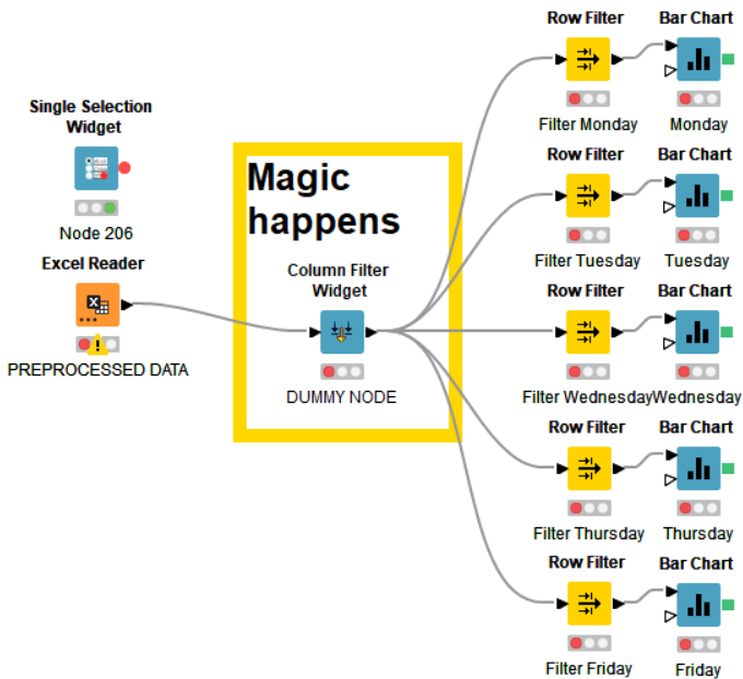
This is the corresponding workflow section of the dashboard:
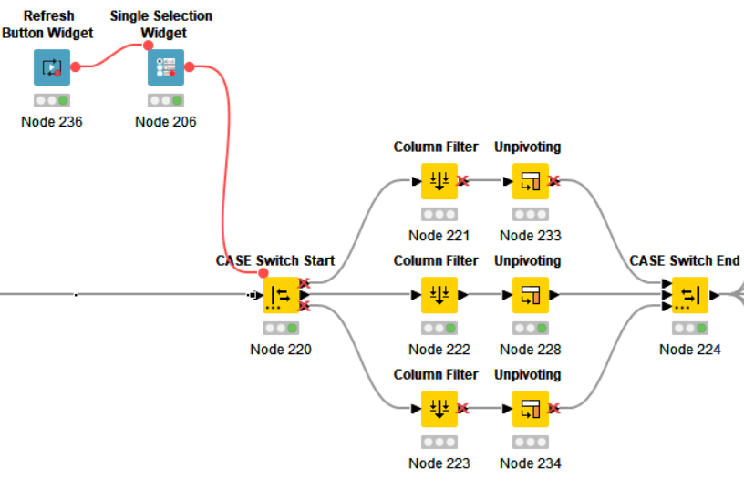
Basically the Single Selection Widget should trigger some magic (maybe an CASE-SWITCH or something like that?) that allows me to filter switch the Data-Set that gets send to the Bar Charts.
The best way I could figure out is to use an Start-/End-Case-Switch node and the Single Selection Widget.
The Case-Switch-Output follows the same order as the options are given in the Single Selection Widget.
Then you can simply use a column filter and choose what data to continue with.
By following up with bar charts you can now reuse existing bar charts with different data sets.