The #66daysofdata challenge is an interesting self-motivational approach to learning or deepening any branch of data science by dedicating 5-15 min. approx every day to complete a small task within a broader project.
Keen on deepening your knowledge of data exploration techniques? Fancy building interactive dashboards? Wonder no more, join the #66daysofdata challenge about data visualization with KNIME! You can find an overview of the project on the KNIME Blog (out on September 20th).
Feeling lost? Need help? Unsure how to proceed or configure a node? Feel free to post your questions in this forum thread or simply navigate the KNIME Forum - very likely someone else had a similar question before!
The Moderators of the #66daysofdata with KNIME
“Perseverance is not a long race; it is many short races one after the other.”
– Walter Elliot
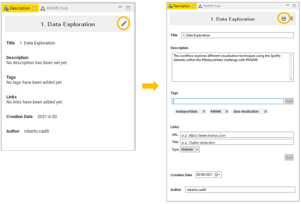
Some of you have been asking how to change the workflow’s metadata. This is absolutely useful for documentation, especially giving your workflow a meaningful title, description and tags. Have a look at the picture below if you want to know more.
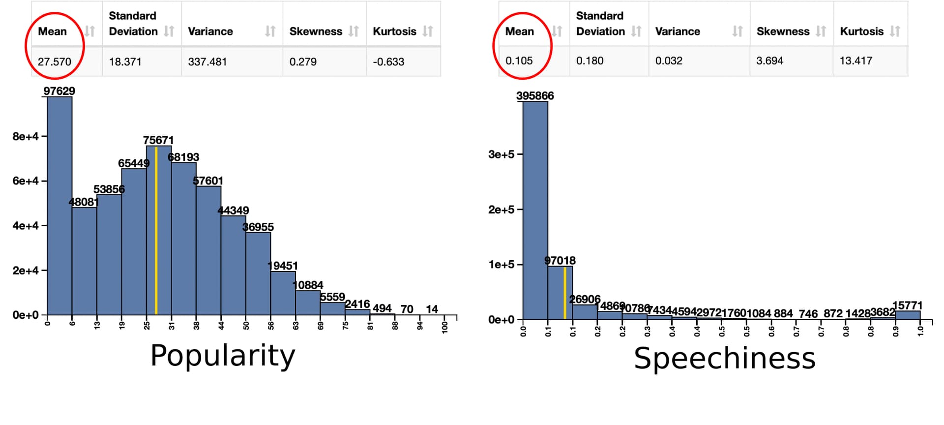
Day 10. Using the Data Explorer node, what is the average popularity of the songs in the tracks.csv dataset? What is the average speechiness? And what can this mean?
@rs1 Day 10. Using the Data Explorer node, what is the average popularity of the songs in the tracks.csv dataset? What is the average speechiness? And what can this mean?
The mean of those features is shown in the picture below (originally tweeted here by @humanoid_ivan)
The popularity of a song ranges from 0 to 100. An average value of 27.57 could sound low, but we probably have to consider the huge amount songs available out there and how few actually manage to break through.
I was instead surprised by the very low average of the speechness (0.105). Apparently words are really needless sometimes.
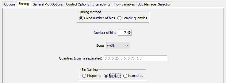
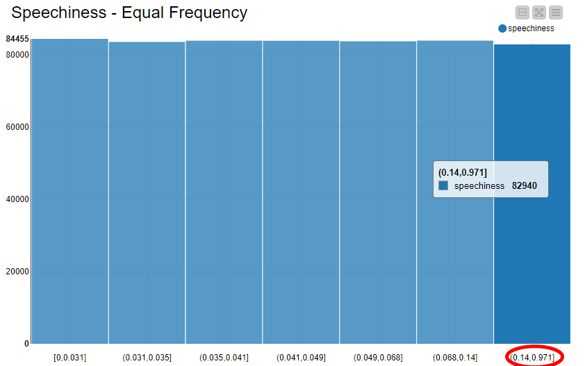
@rs1 Day 11. The histogram. This question came up on Twitter. Where to use the equal frequency…and what is the right bin size?
In the Binning tab of the Histogram node we can set the number of bins we want and whether they should be divided by equal width or frequency. Notice that it is possible to name bins according to the range they represent (Bin Naming: Borders).
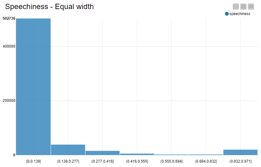
The equal width binning is the most common one for visual representation: dividing the data range into same-size bins, we can clearly see the data distribution. In the example below, we can see how most of the values fall into the [0, 0.139] range. Also notice the long tail due to few, very high values.
The equal frequency binning is less common when it comes to histograms, since it tends to generate a more flat visualization, like in the example below. However, information about the data distribution can be observed on the x-axis. Notice how the range of each bin is small, except for the very last one, which had to be “stretched” in order to include the higher values.
Although not particularly interesting for histograms per se, binning by equal frequency is still a valuable option when dealing with outliers.
Number of bins
The number of bins vary according to the data you are dealing with and the information you want to convey. There is no real fixed rule. The easiest way is trying out different values and visually inspecting the results.
Hi @JEdgar, here is the starting point for anyone interested in the #66daysofdata challenge with KNIME. It provides the description of the daily task, as well as links to resources to learn more (including videos).
I would also suggest to follow the hashtag on social media, to receive the posts of people who are currently taking part in the challenge.
I am currently running the #66daysOfData with #KNIME as a daily challenge for myself
Quick question: For day 32, where you want to create a pie chart and want to get rid of decimal places in the interactive view (when hovering over the slices).
I used the Pie/Donut Chart Node for this from the Views / JavaScript section in the node repository.
I turned off values, but when I hover over the slices, I - of course - can see the value per artist.
The values show decimals which from my personal view isn’t necessary (as the origianl column are integers anyway) - so the two 00s after the comma do not add any value to the pie chart / dashboard. Is there a way to get rid of them?
not sure I understand the question in day 46 of #66daysofdata ?
It reads
In a selected time window , find out the maximum number of years of activity for an artist and extract those artists that have been active that maximum number of years.
I guess, I am interpreting this wrong, but if I find out the max number of year for an artist and then extract the artists that have been active that max number of years, isn’t that exactly the same thing?
Or is artist A has been active 12 years (let’s say from 1990 to 2002) , here are other artists that also have been active from 1990 to 2002??