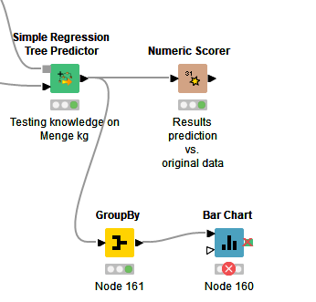
I am currently working on a workflow to forecast sales, which I also want to visualize in some form.
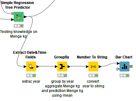
For the visualization, a Group By node in combination with a Bar Chart should do the trick (at least I believe so).
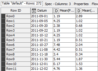
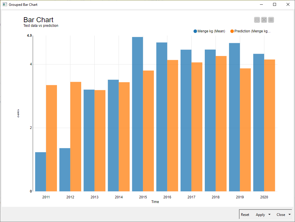
However, I haven’t found a way to merge the rows of the data table by average for each year, so that I only have a few data rows to visualize (average for 2011, 2012, 2013, …). I want to visualize the deviations between the test data and the prediction from the algorithm.
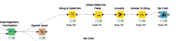
thanks for the help. I didn’t even know that “Extract Date&Time Fields” was a thing. My solution involved manually adding the year colums to the data sets . Yours is much more comfortable.
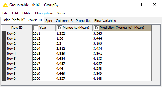
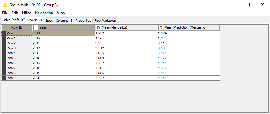
A quick question, your “prediction (menge kg) (mean)” column values in the group by table seem to be a lot higher than mine and I am unsure how that occured. Do you have an idea?
A quick question, your “prediction (menge kg) (mean)” column values in the group by table seem to be a lot higher than mine and I am unsure how that occured. Do you have an idea?
I don’t really know. If you used the same data and process, the values should be the same. What values did you get?
It seems to me that you’re using a different excel file for product data, that I don’t have access to. If the content of that file is different then the result of the workflow will be different.
What is the result when use the original data file?