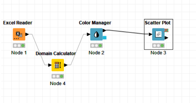
Hi,
Can anybody provide the configuration window for the scatter plot example provided in the “Data Visualization 101: Five Easy Plots to Get to Know Your Data” - please see image attached.
Thank you,
George
Hi,
Can anybody provide the configuration window for the scatter plot example provided in the “Data Visualization 101: Five Easy Plots to Get to Know Your Data” - please see image attached.
Thank you,
George
Hi @GeorgeVP90 -
I talked to the author of the blog post you referenced (for the curious, it’s here: Data Visualization 101: Five Easy Plots to Get to Know Your Data | KNIME) and the original workflow that generated these visualizations is lost to the mists of time. 
That said, I took a similar dataset, adjusted it, and created a workflow for you that produces roughly the same plots. I hope it helps - please let me know if you have questions.
ColorManagerPlottingExample.knwf (76.9 KB)
Hello,
Thank you very much for the solution.
One little obstacle - the color manager node does not allow for the selection of the relevant series column (of nominal values). Is there a limitation of series that can be selected or what is the reason for this issue
Thanks,
George
That’s strange. Is it possible for you to upload your workflow and associated data, or is the data confidential?
The data is confidential, however I think I found a related topic on this issue that suggests the use of the Domain Calculator node.
It works now (I cannot exactly explain the reason why)
Thank you for your help

Glad you found a way. Sometimes if there are a large number of classes in a particular field - say greater than 60 or so - the Color Manager many not handle them properly unless the Domain Calculator is applied.
This topic was automatically closed 182 days after the last reply. New replies are no longer allowed.